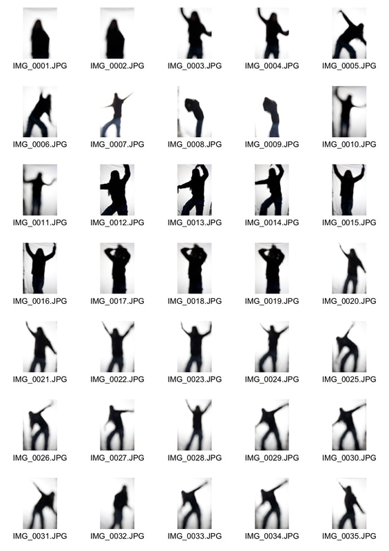
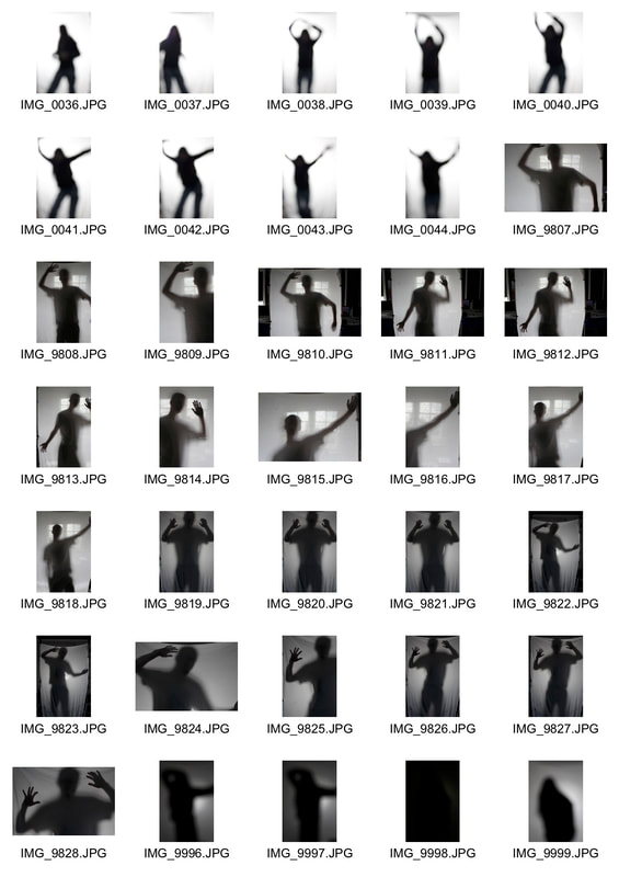
Word list:
-Broken. -Graffiti
-Space. -Reflection
-Nature -People
-Isolation -Emotions
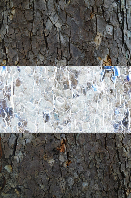
-Textures -Portraits
-Darkness. -Shadow
-Night -Blur
-Lights -Distortion
-Colours -Light and shadow
-Brutalist -Nature
-Shapes -Figures
-Abandoned. -Shapes
-Eerie -Lines
-Focus -Lit up
-Space. -Reflection
-Nature -People
-Isolation -Emotions
-Textures -Portraits
-Darkness. -Shadow
-Night -Blur
-Lights -Distortion
-Colours -Light and shadow
-Brutalist -Nature
-Shapes -Figures
-Abandoned. -Shapes
-Eerie -Lines
-Focus -Lit up
Exibitions:
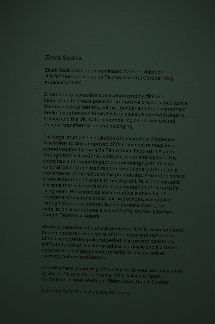
'A brief moment'
|
|
|
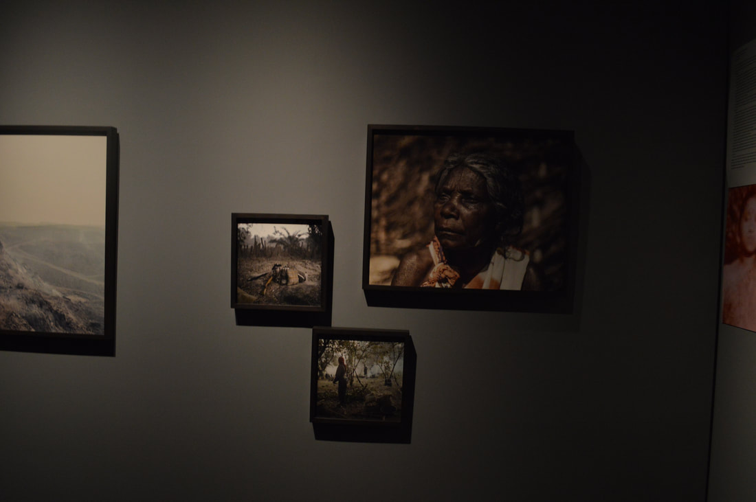
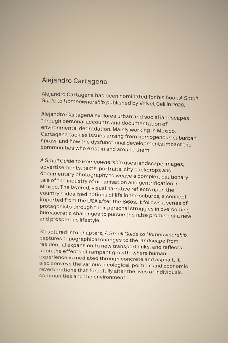
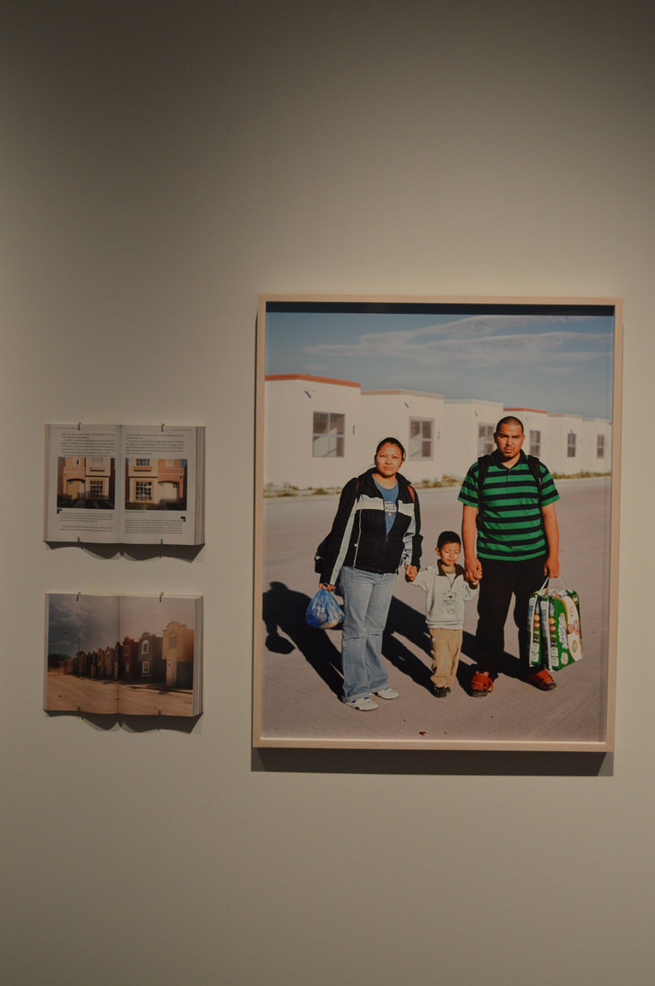
'A small guide to homeownership'
|
|
|
|
|
'Blueprints'
|
|
|
Fashion and advertising
|
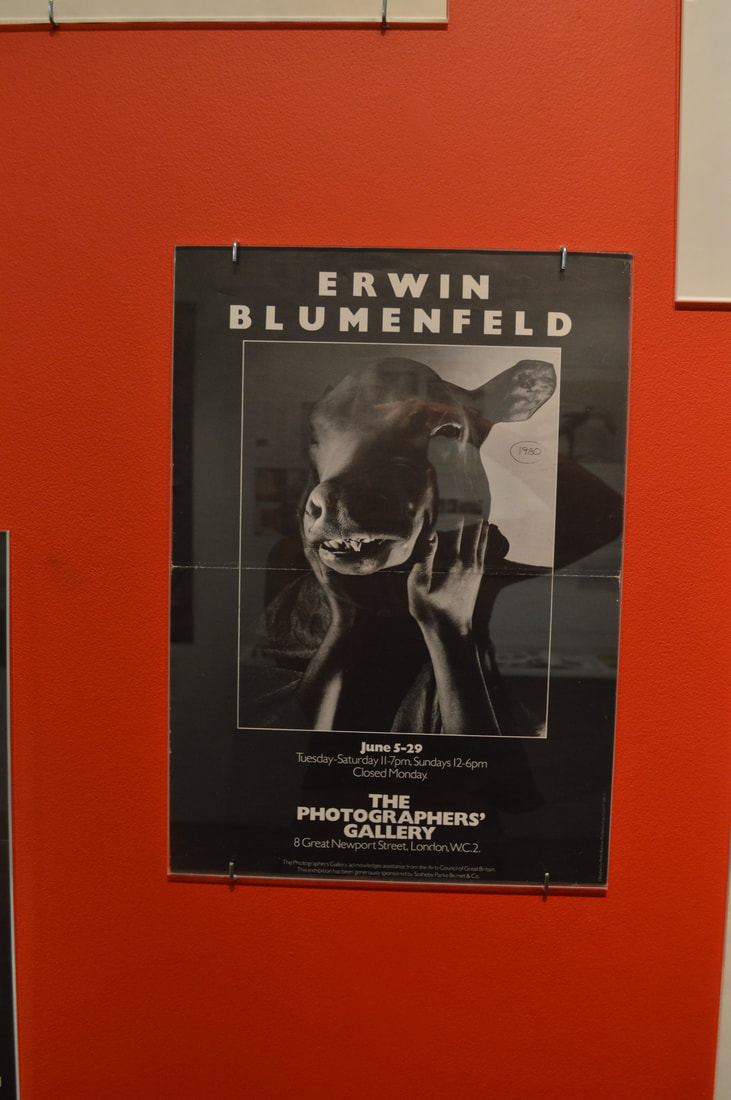
|
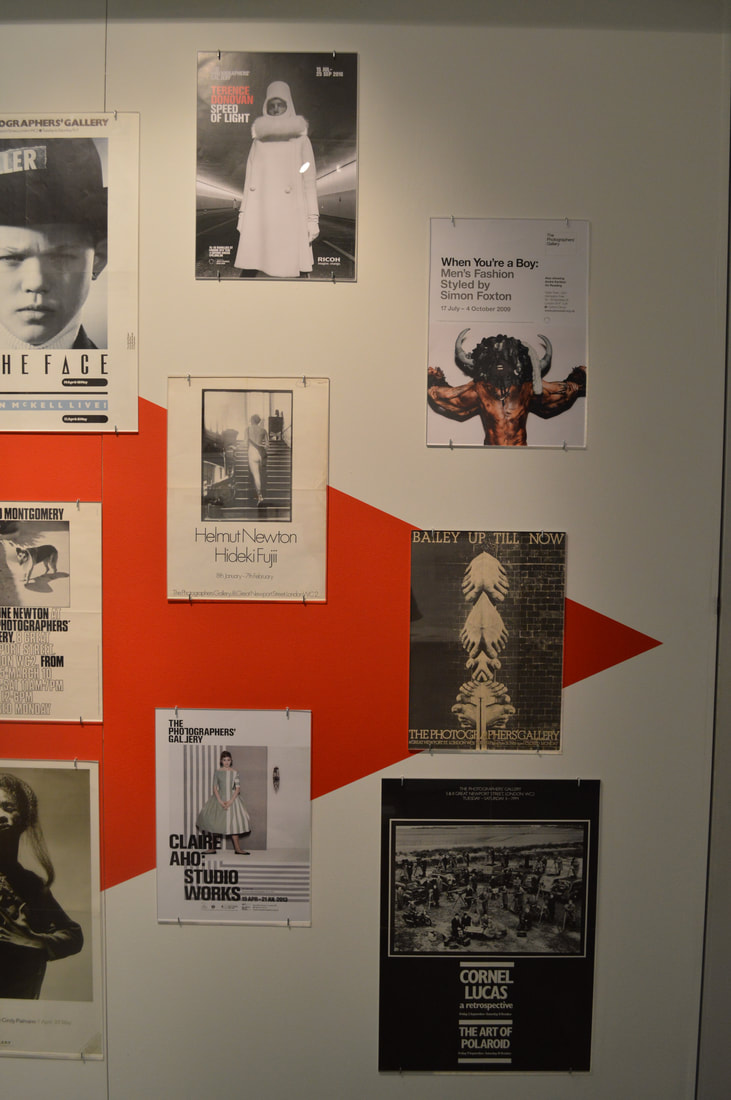
|
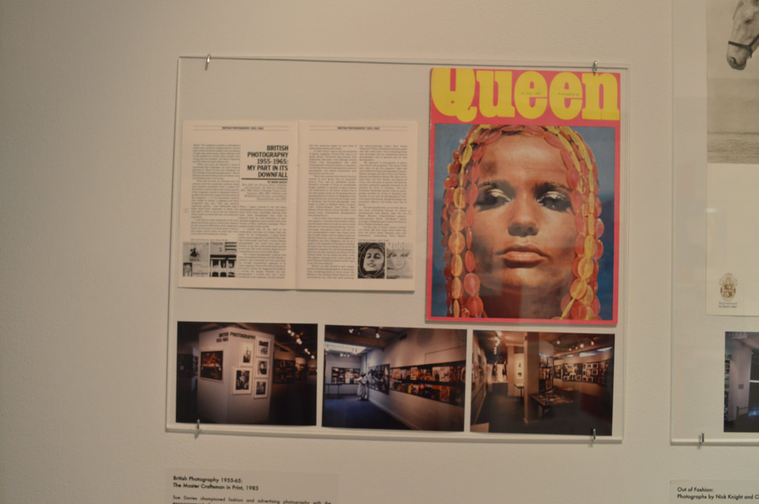
|
|
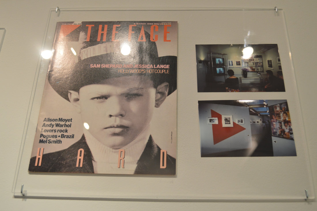
"The Picture Library"
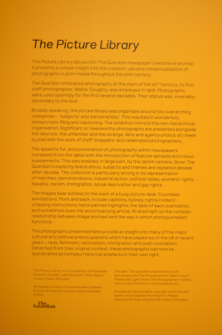
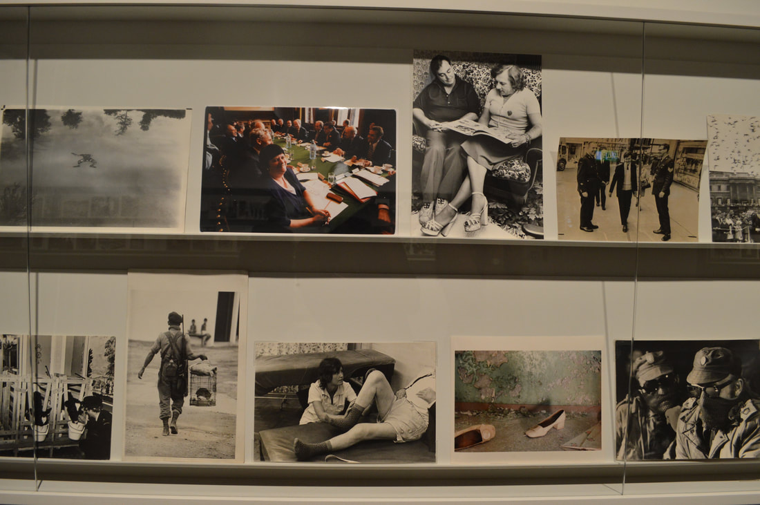
|
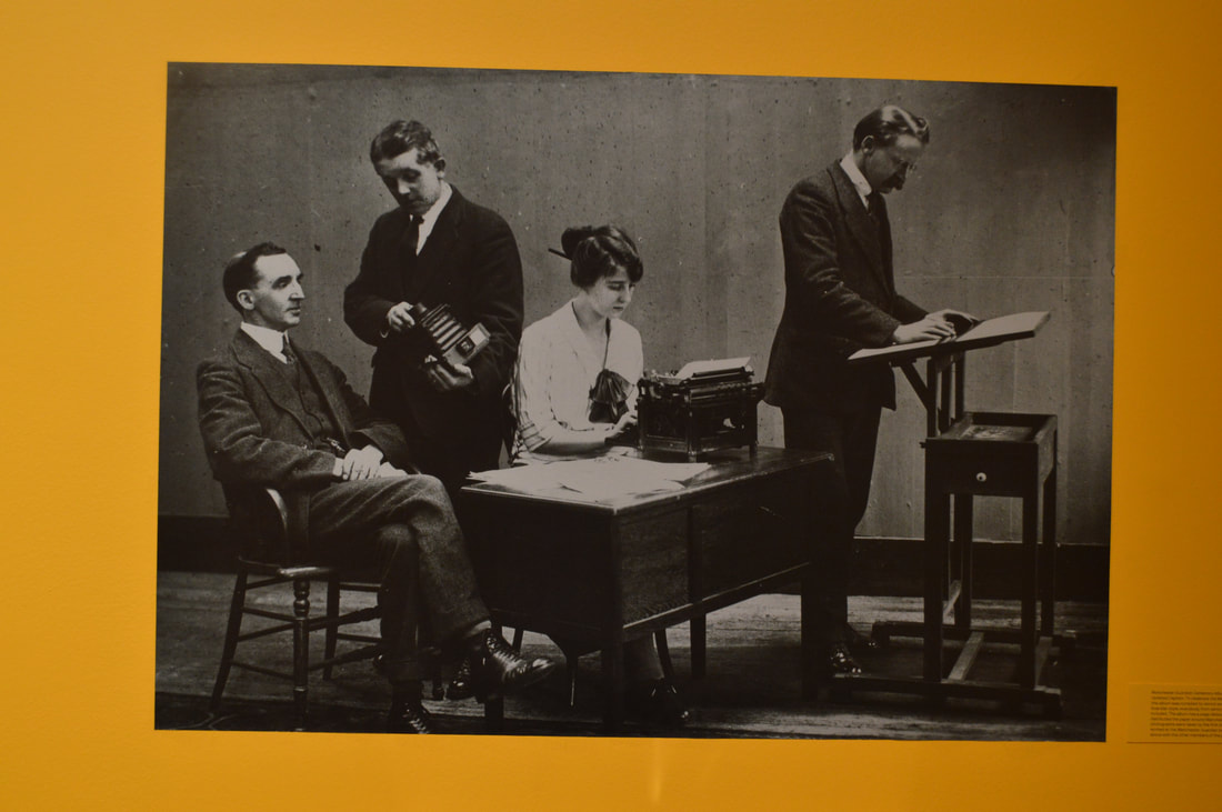
|
|
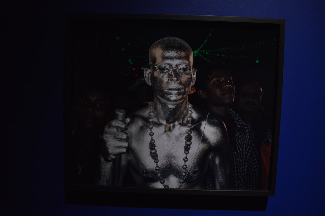
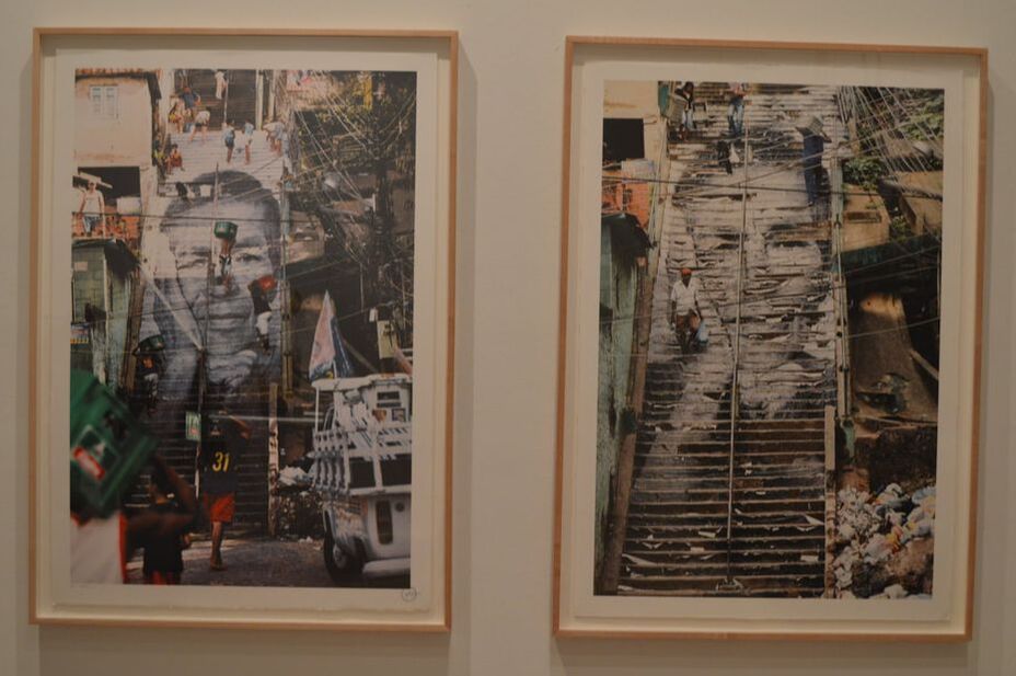
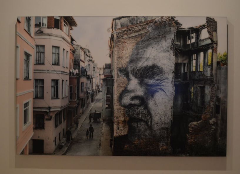
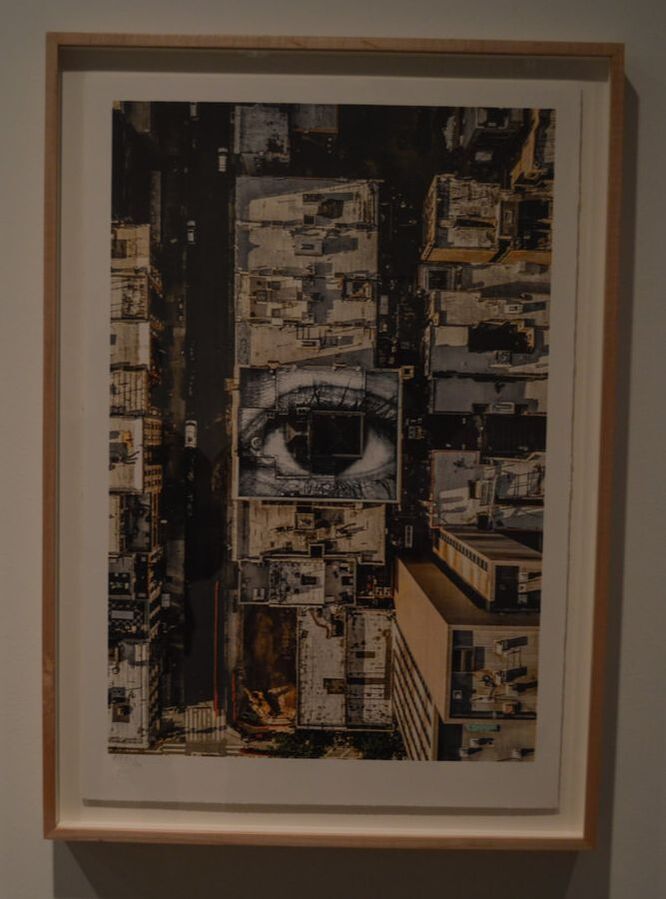
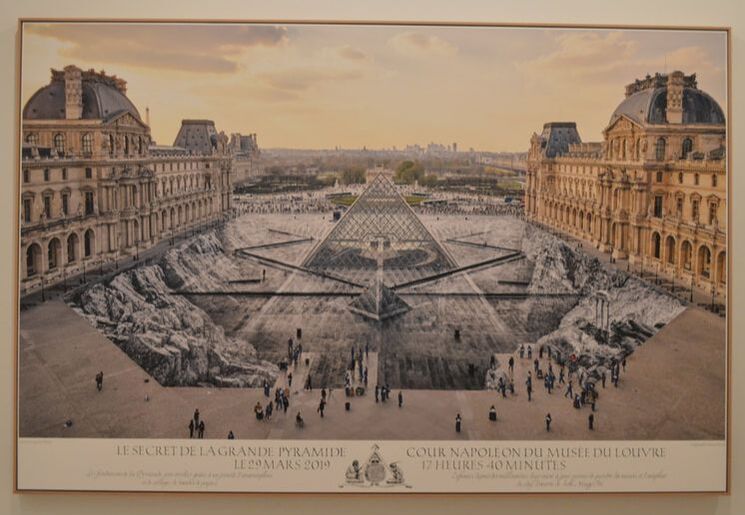
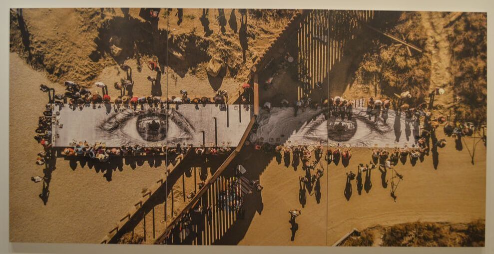
JR Exhibition : Saatchi gallery
JR is a revolutionist fighting for equality and the end of poverty through his powerful and impactful work.
JR is a revolutionist fighting for equality and the end of poverty through his powerful and impactful work.
|
|
|
|
|
|
|
|
3 words:
1.Eerie
Gregory Crewdson:
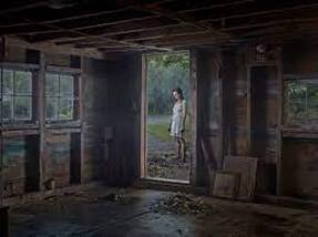
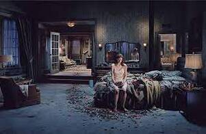
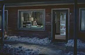
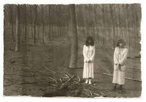
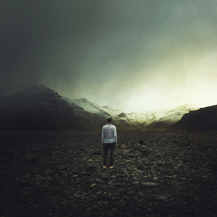
Crewdson was an American photographer who's work has been described as a psychological inter zone between the everyday and the uncanny. His series 'Twilight' ,shot between 1998 to 2002, focusses on what the viewers would view as an alone, isolated figure in a desolate area filled with darkness. He requires help from a large set of crew in order to help him achieve these images from a staged scene. The use of having an alone figure as the centre of the image creates an unnerving, paranormal effect to his images . Twilight was created as a means of attempting to find meaning in the world that we live in today. The pictures are staged to explain the anxiety, fear, and desire of the subjects, which probably helps to explain why the photographs are so charged emotionally.
Crewdson was an American photographer who's work has been described as a psychological inter zone between the everyday and the uncanny. His series 'Twilight' ,shot between 1998 to 2002, focusses on what the viewers would view as an alone, isolated figure in a desolate area filled with darkness. He requires help from a large set of crew in order to help him achieve these images from a staged scene. The use of having an alone figure as the centre of the image creates an unnerving, paranormal effect to his images . Twilight was created as a means of attempting to find meaning in the world that we live in today. The pictures are staged to explain the anxiety, fear, and desire of the subjects, which probably helps to explain why the photographs are so charged emotionally.
|
|
|
Debrah Tureville:
|
|
|
My response:
For this response I took inspiration from the work of Gregory Crewsdon from his series 'twilight'. I visited parks and train station where I felt I could really capture eerie images like Crewdon. In each of my images I placed a lone figure in the centre to increase the anonymity and desolation of my photographs. I then took my images to photoshop and firstly turned them to black and white. Then using the curves tool to create more contrasted tones within my images and creating more shadows. I felt this then increased the eerie nature of my images and enhanced the effect of isolation.
For this response I took inspiration from the work of Gregory Crewsdon from his series 'twilight'. I visited parks and train station where I felt I could really capture eerie images like Crewdon. In each of my images I placed a lone figure in the centre to increase the anonymity and desolation of my photographs. I then took my images to photoshop and firstly turned them to black and white. Then using the curves tool to create more contrasted tones within my images and creating more shadows. I felt this then increased the eerie nature of my images and enhanced the effect of isolation.
|
|
|
|
|
|
|
|
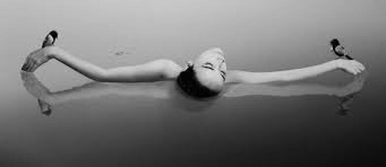
2.Figures
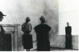
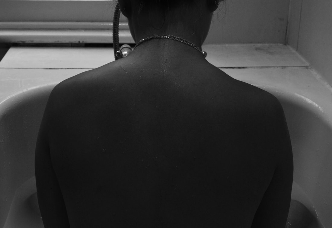
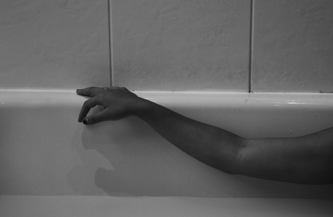
Noell Oszvald:
Oszvald is a Hungarian visual artist who uses the photographic medium to portray her emotions. She prefers to use black and white as having images in colour may be distracting and therefore keeps the images in their bare essence. Her compositions focus on straight lines as she wanted there to be no hierarchy with the components in her images. The sobriety of her images creates feeling of loneliness however created the use of the lone figure could have a complex hidden meaning behind the images . She has implied that the use of a minimalist approach in her work created an on going sense of calmness in all her images
Oszvald is a Hungarian visual artist who uses the photographic medium to portray her emotions. She prefers to use black and white as having images in colour may be distracting and therefore keeps the images in their bare essence. Her compositions focus on straight lines as she wanted there to be no hierarchy with the components in her images. The sobriety of her images creates feeling of loneliness however created the use of the lone figure could have a complex hidden meaning behind the images . She has implied that the use of a minimalist approach in her work created an on going sense of calmness in all her images
|
|
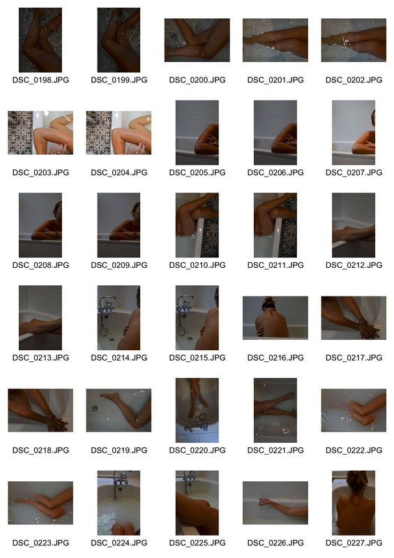
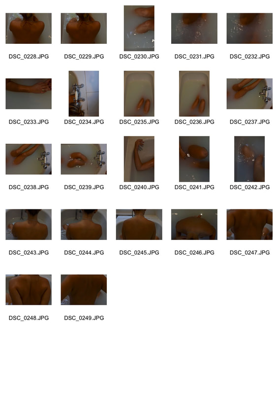
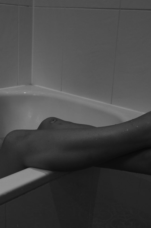
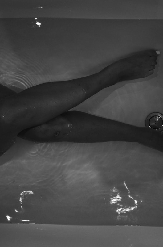
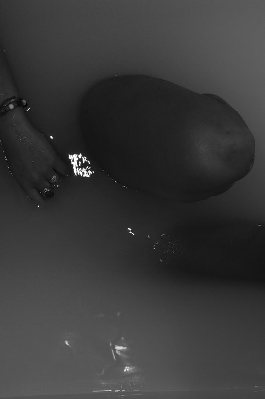
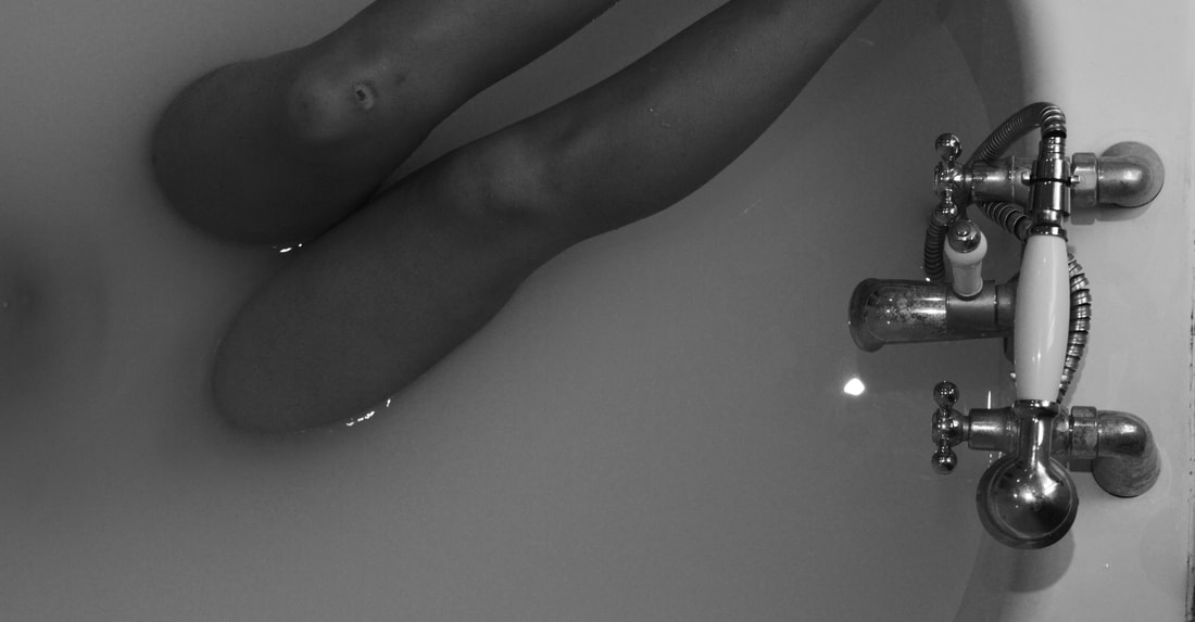
My response:
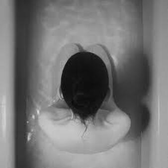
For this strand I looked at the work of Noell Oszvald, were a placed my model in a bath and photographed different parts of her body. I didn't want to capture the models face in my images as I felt it could have taken away from the whole aspect of this development .In some of my images I had poured milk in the bath to exaggerate the body parts coming out of the water. After photographing my images i placed them in photoshop put them in black and white and increased the contrast slightly. I put them in black and white as Ozvald also did to avoid the colours being a distraction to the image.
For this strand I looked at the work of Noell Oszvald, were a placed my model in a bath and photographed different parts of her body. I didn't want to capture the models face in my images as I felt it could have taken away from the whole aspect of this development .In some of my images I had poured milk in the bath to exaggerate the body parts coming out of the water. After photographing my images i placed them in photoshop put them in black and white and increased the contrast slightly. I put them in black and white as Ozvald also did to avoid the colours being a distraction to the image.
|
|
|
|
|
|
|
|
3.Textures
|
|
|
|
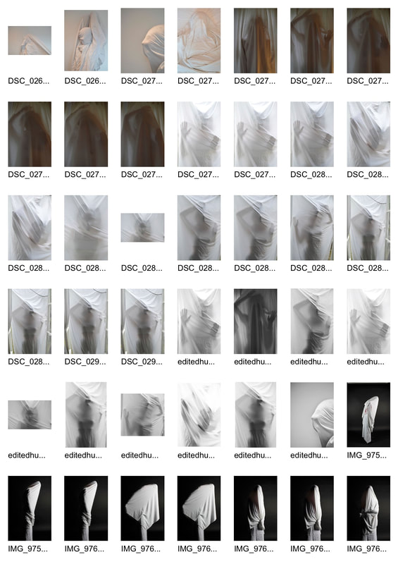
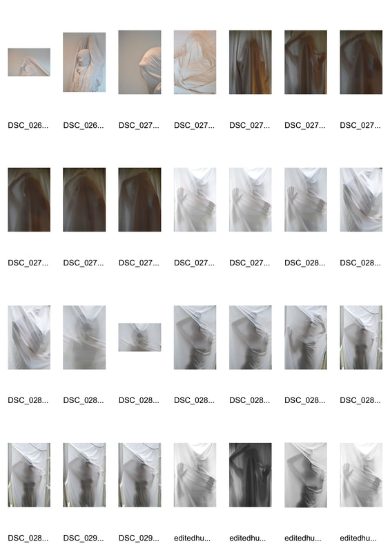
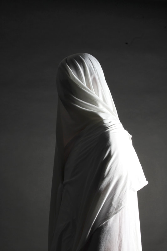
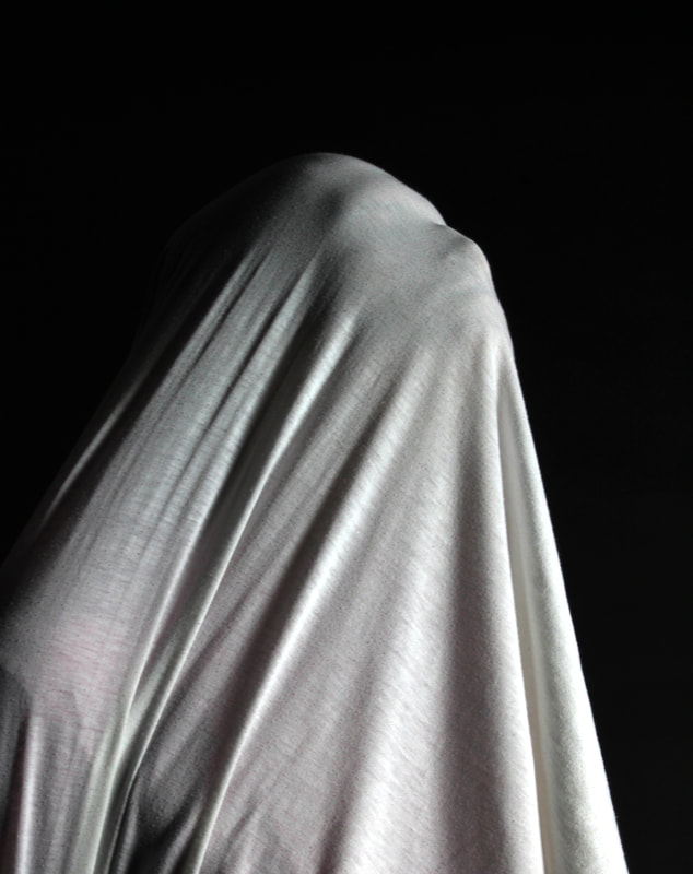
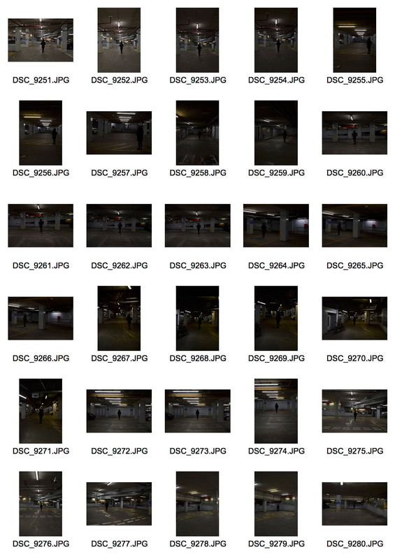
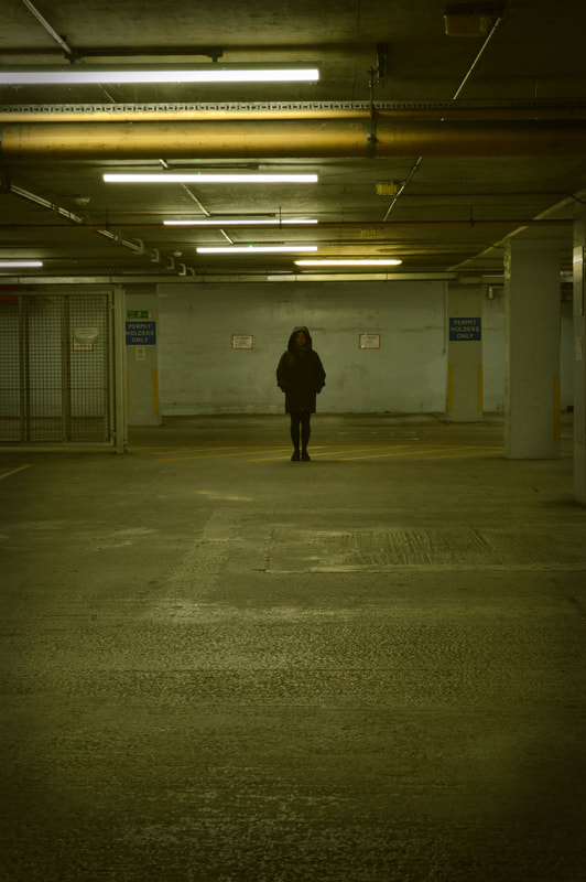
Development 1 : Figures
Joakim Heltne:
|
|
|
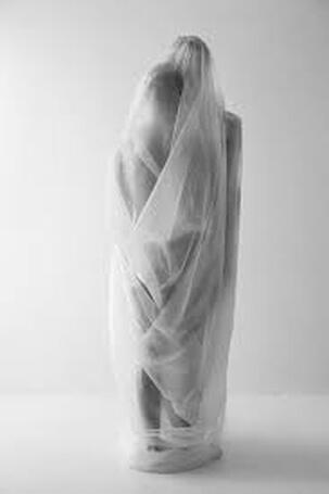
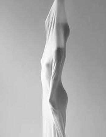
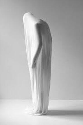
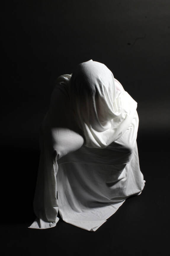
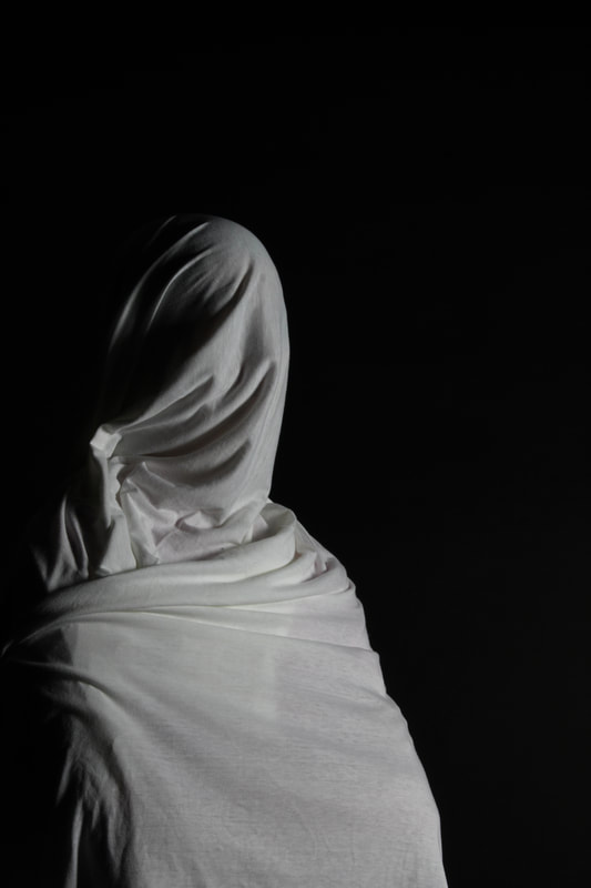
Joakim Heltne is a Norwegian photographer who initiated my interest in figures. She creates human sculptural images, doing this by using a white sheet to cover her models and then places them into interesting positions against a white background, in an institutional setting. She has her figures tightly wrapped so you are able to see the outline of their bodies. Helne first sparked my interest in this specific theme due to the use of a lone figure. It created a barrier between the viewer and the subject, creating a sense of isolation. This inability to identify the subject's emotional state can create a sense of uneasiness for the viewer by emphasising the distance one may feel when isolating themselves. In many of Helte's images he used other ways of creating sculptures using a person, for example wrapping them in plastic or tape. However these all come together and form magnificent look-like sculptures from real human beings. The use of using the human body as a canvas is what Helte used to explore the way different materials can sculpt the body to form different abstract shapes. .The effectiveness of shooting in a studio has aided Heltne's photography by really being able to emphasise the silhouette of the human body. Being able to use intense lights enhances this, preventing the subject from blending in with the white background.These images create many different meanings such as a sense of surrealism, ‘how we choose to show ourselves and cover ourselves’. This may link very well to today's society and the use of social media and the way it creates a feeling of loneliness in one's own thoughts. The difference in tones of white throughout Heltnes' image add another fascinating aspect to her work. I would like to develop Heltne’s work and create ones of my own.
My response:
|
|
|
|

|
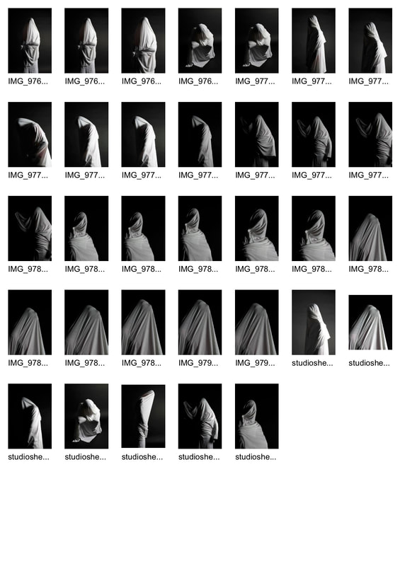
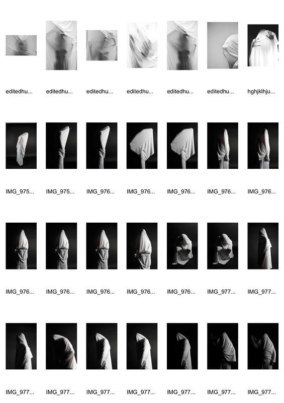
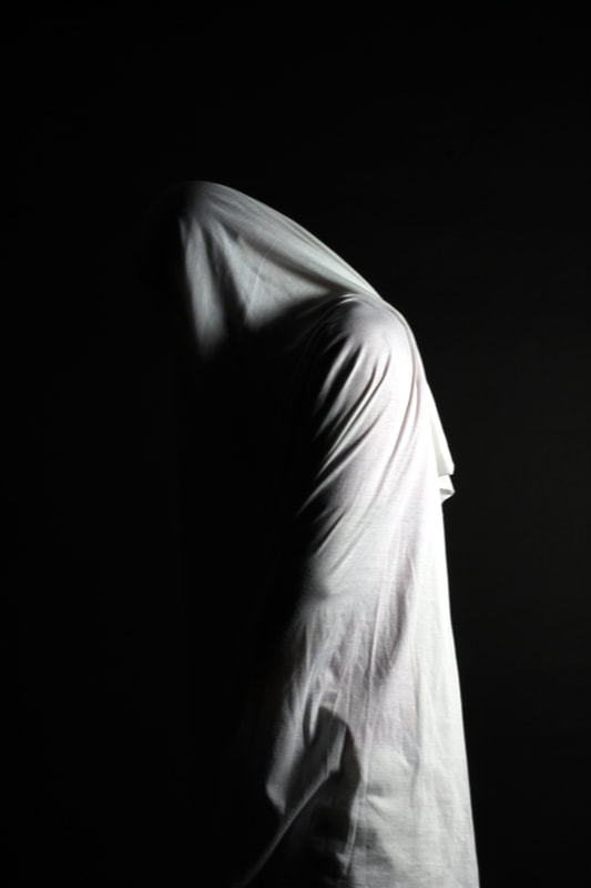
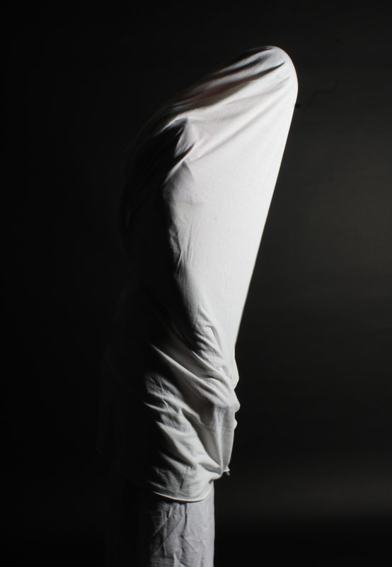
For my response to Heltne I took with me the use of a white elasticated sheet in order to show the outline of the human body. I took inspiration from Helte by using a white sheet in order to produce look-like sculptures of my models. I first started it at home, placing a white sheet up outside so I was able to get the natural light behind it. I did this in order to capture a sort of silhouette of the human body behind the sheet. I then made my model place her body up against it to show the shape of her body. It was much harder doing this at home as the light did not make it easy to really show the shaping of her body as well as not having the correct sort of sheet that I wanted in order to create a similar response to HeltneThis shoot began my interest in using lone figures in my world theme project. Her technique inspired me and the way she used elasticated material in which I mirrored in my own work. However what I chose to do differently from Heltnes work was use a black background instead of white. I felt this helped me from losing touch of the subject's outlines and creating more definition of the model's body. The contrast of bright white sheets and a black background enables the viewer to really see the outline of the human structure.I felt what i could improve in my images is wrapping the sheet around my subjects tighter, as you would be able to see the silhouette more. I feel like I could have also created more abstract shapes, having my model stand in various ways. This would have enabled him to create more sculpture-like images as shown in Prestes’s work .
This work has encouraged me to look at more photographer who shoot lone figures and and the outline of there bodies. I want too look at ways of shooting distorted figures in studio environments and there silhoettes.
This work has encouraged me to look at more photographer who shoot lone figures and and the outline of there bodies. I want too look at ways of shooting distorted figures in studio environments and there silhoettes.
|
|

|
|
|
|
|
|
|
|
|
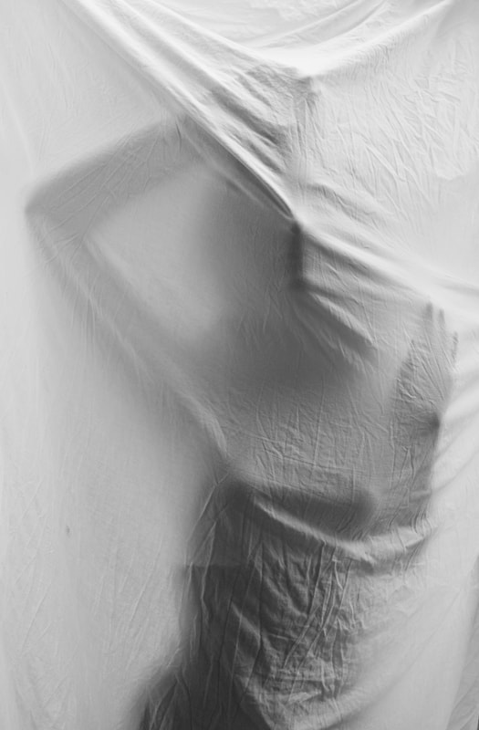
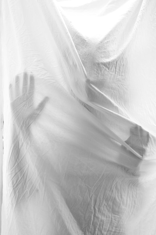
Development 2
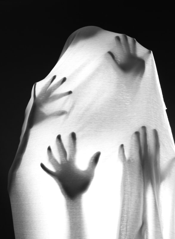
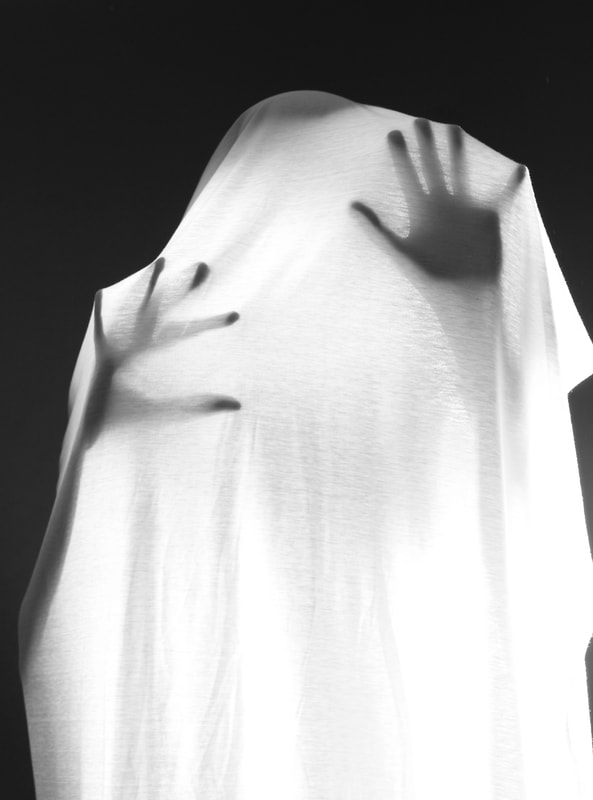
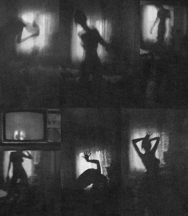
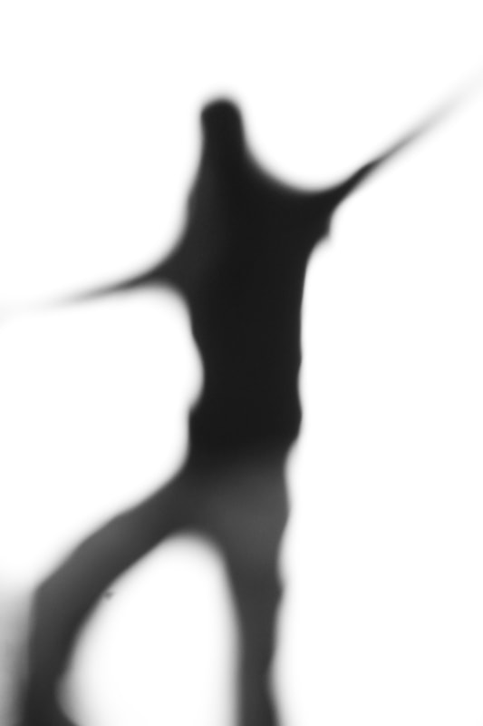
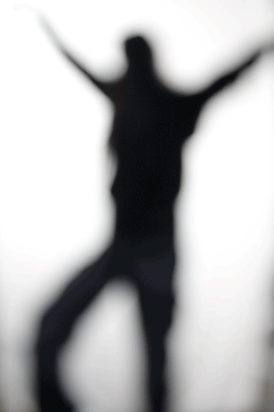
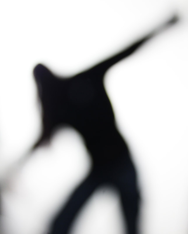
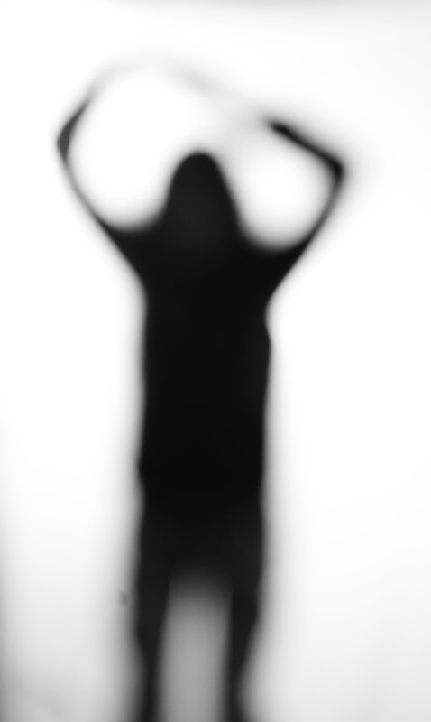
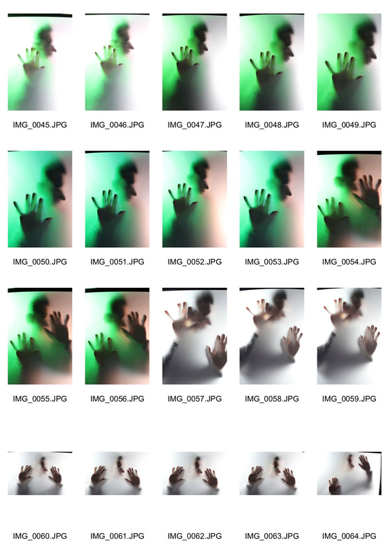
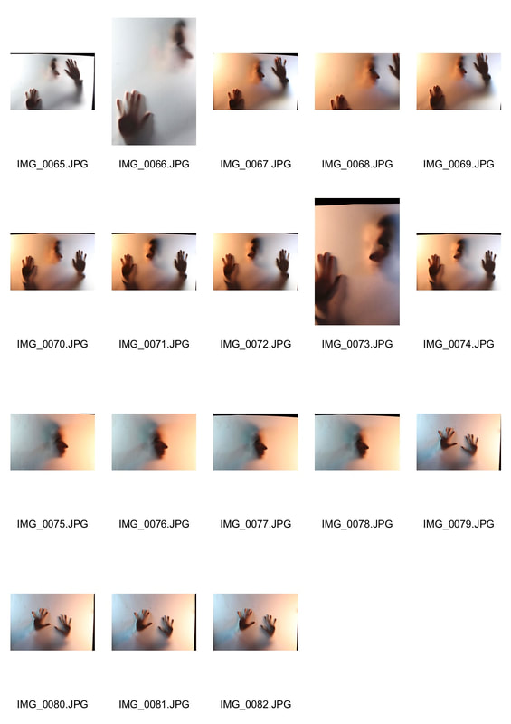
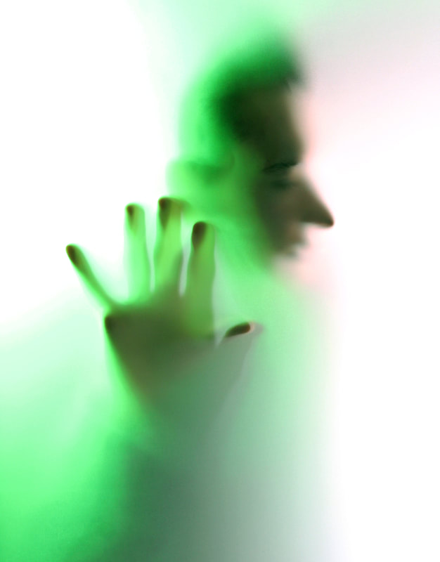
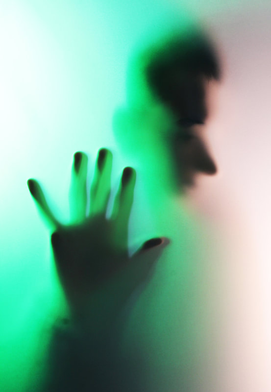
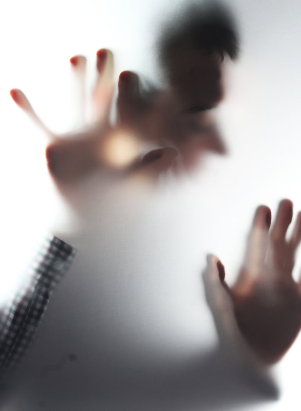
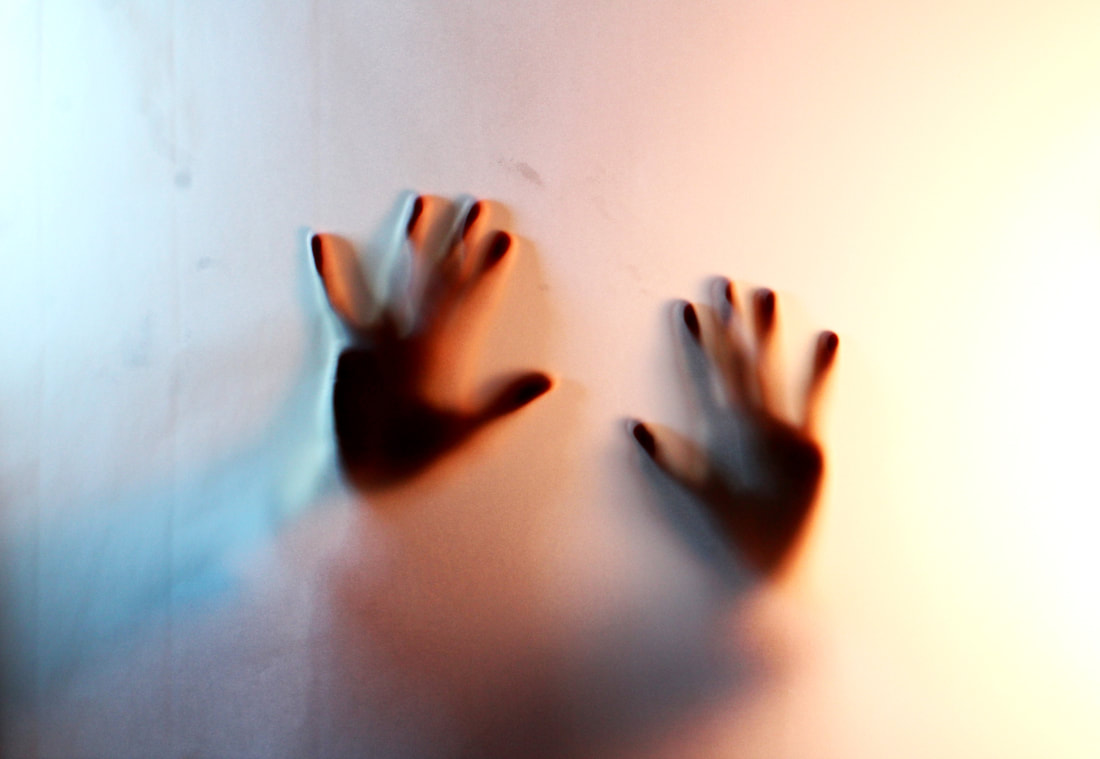
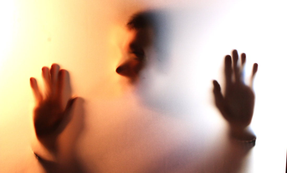
Emotions by Shvetle: Blurred Silhouette
First response using white sheet:
|
|
For this response I took inspiration from the image above of a blurred silhouette. I took these images in the studio where I placed a white sheet in front of the studio light so I was able to capture the outline of my models body more prominently. I asked my model create abstracts stances therefore being easier to see the differences outlines of her body i.e the length of her arms. I did this to ensure that it was still easy to identify that it is a human body. In order to create the blurred effect like the image above I deliberately out of focussed my images so instead of their silhouette having a sharp line it sort of just fades which I feel makes the image more uncanny. This response has encouraged me to look at other ways of distorting the lone figure in the studio rather that just blurring them digitally. For my next development I will use certain slightly transparent materials to form these sort of images such as tracing paper. As well as this because my images lack any colour I may want to bring in some bright colour using coloured lights to make my images more interesting.
|
Stills:
|
GIF:
|
|
|
Development 3
Second response using tracing paper:
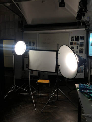
Set up:
|
|
|
|
|
|
For this shoot I took inspiration from the blurred silhouette images as well. In the shoot I placed a sheet of tracing paper in front of my subject and shone two light from either side of them. In some of the images I used just as white light, however in other I used two contrasting colours to emphasise the shape of the silhouette. In this shoot I like how some parts of my subject are in focus as he is touching the tracing paper and that some aren't where he is further away. If I were to improve this shoot I would take more images indifferent poses .
Development 4
Thomas Vannost:
|
|
My response:
|
|
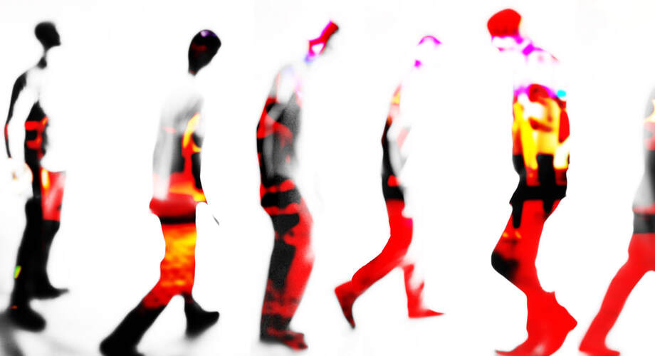
For this response I took inspiration from Thomas Vanoost through the layering process of his images creating a sort of still image in motion. In my process of I used photoshop to layer my images. I firstly selected my image copied it and pasted it on top of the image. I then moved my image slightly and brought the opacity of it down to 39% thus being able to see both the background layer and layer 1. I repeated this process several times therefore created a sort of glitched image of figures walking. You are able to see the outline of the figure but not rlly identify any of the faces of the figures. This development was more of an experiment of whether I was more interested in shooting several figures in one shot or staying with having one lone figure in my images.
Development 5
Sven Pfrommer:
|
|
|
My response:
For this response I took inspiration from artist Sven Pfrommer where he has very blurred figured walking. My first two attempts of trying this did not turn out well. This was because the background of my images was to busy do wasn't able to get a the figures standing out as much. In this development I wanted to experiments with mixing two of my responses together. Merging the last response inspired by Thomas Vanost and my emotions by Shvettle response. This is because I had several figures in the frame but blurred so are you are unable to see any of their features In the first images I played around with the hue/saturation, the brightness/contrast, the levels and the curves. For the second image I did the same however also used the layering tool to make it more abstract. My last image I felt was the most representative of the outcome I intended to have . For this images I shot some silhouette images in the studio of some one walking. I then placed a handful of these action image side by side on top of the top image I created, this was so I was able to get the figures to be colourful. in photoshop I then changed the top layers to lighten so the silhouette was transparent rather than black. This allowed you to see though to the coloured background. Once this was done I turned down opacity and the brightness so you could not see the background of my silhouette which was which. Lastly I increased the contrasts to exaggerate the outline of my figures.
For this response I took inspiration from artist Sven Pfrommer where he has very blurred figured walking. My first two attempts of trying this did not turn out well. This was because the background of my images was to busy do wasn't able to get a the figures standing out as much. In this development I wanted to experiments with mixing two of my responses together. Merging the last response inspired by Thomas Vanost and my emotions by Shvettle response. This is because I had several figures in the frame but blurred so are you are unable to see any of their features In the first images I played around with the hue/saturation, the brightness/contrast, the levels and the curves. For the second image I did the same however also used the layering tool to make it more abstract. My last image I felt was the most representative of the outcome I intended to have . For this images I shot some silhouette images in the studio of some one walking. I then placed a handful of these action image side by side on top of the top image I created, this was so I was able to get the figures to be colourful. in photoshop I then changed the top layers to lighten so the silhouette was transparent rather than black. This allowed you to see though to the coloured background. Once this was done I turned down opacity and the brightness so you could not see the background of my silhouette which was which. Lastly I increased the contrasts to exaggerate the outline of my figures.
Development 6
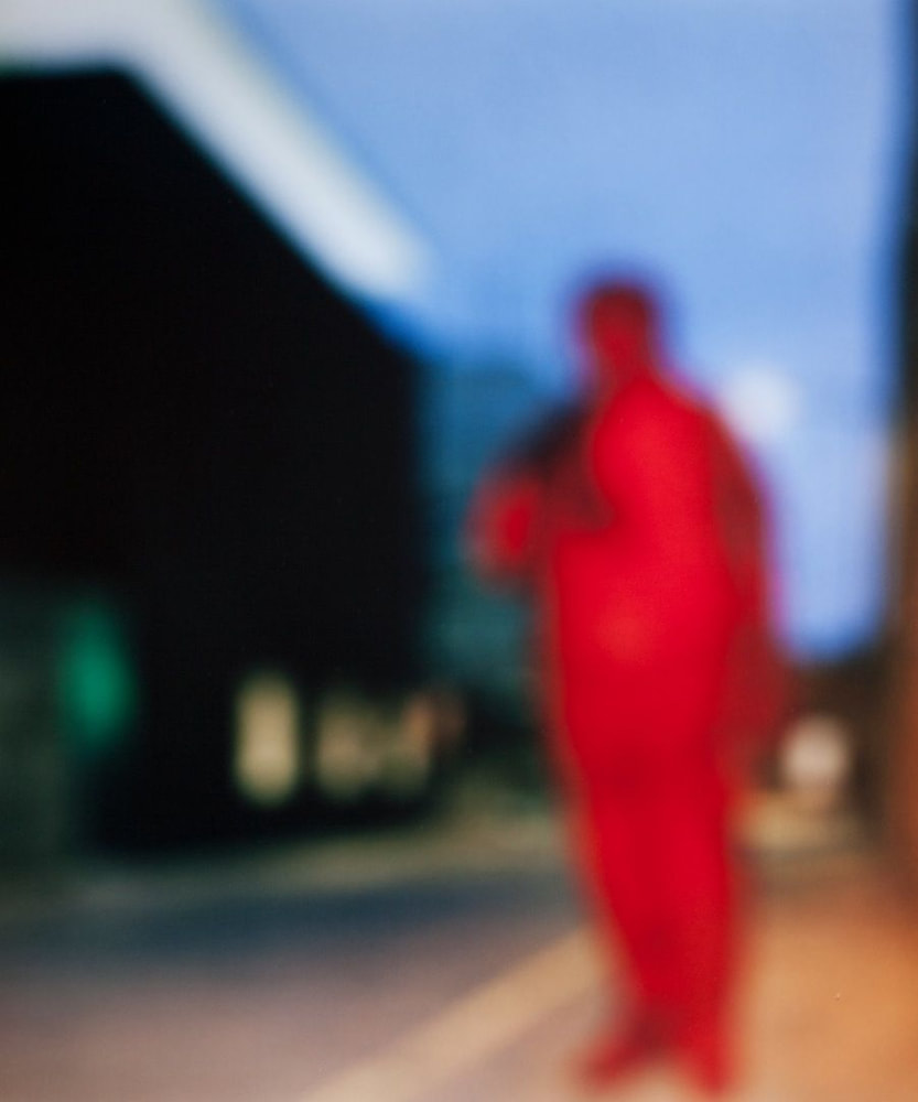
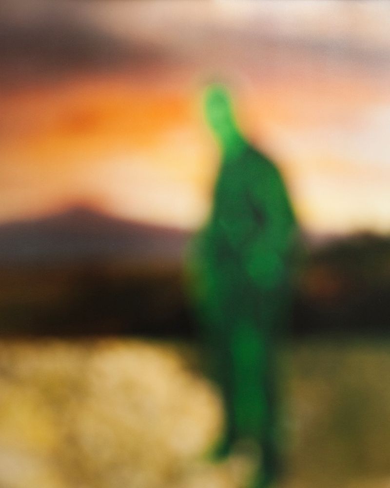
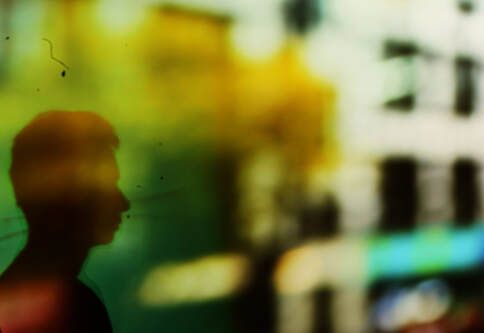
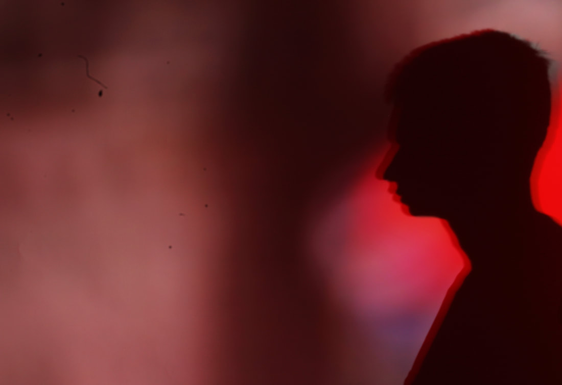
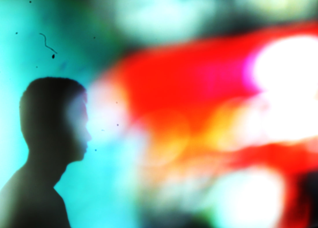
Bill Armstrong:
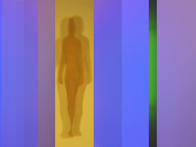
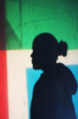
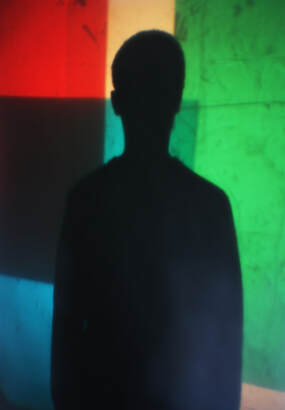
Armstrong is a New York fine arts photographer who is well known for his blurred colour photography.For this shoot I am interested in his series 'Partial appearances'. In this project he implies it is a meditation on self, identity and the psychological state of in-betweenness that reflects the typical nature of of contemporary life.
Armstrong is a New York fine arts photographer who is well known for his blurred colour photography.For this shoot I am interested in his series 'Partial appearances'. In this project he implies it is a meditation on self, identity and the psychological state of in-betweenness that reflects the typical nature of of contemporary life.
'Partial appearance'
|
|
|
1st response:In studio
Using the studio:
|
|
|
For this response I took inspiration from photographer Bill Armstrong with his coloured collaged silhouettes. In the studio I used a white background and using a Light projector I projected different coloured shapes onto the white. I then had a my model stand in front of the light to create a silhouette on the backdrop as well as having the coloured shapes there as well.
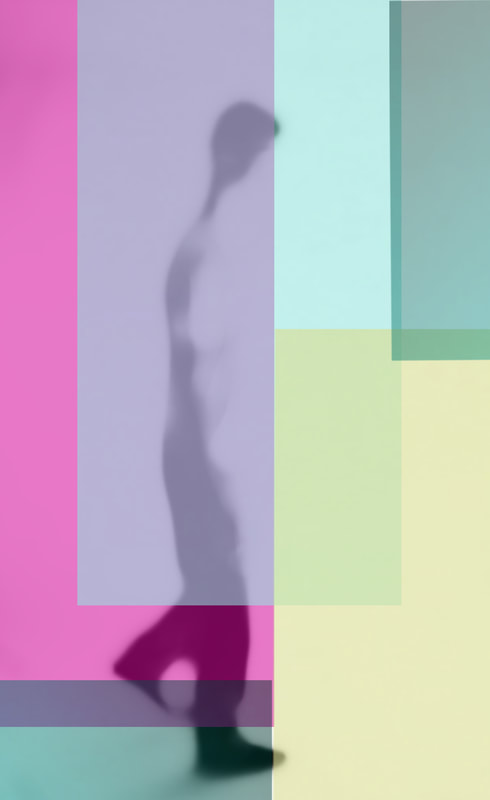
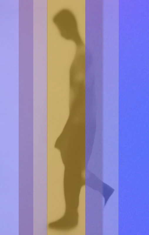
Development 7
Response using photoshop:
|
|
|
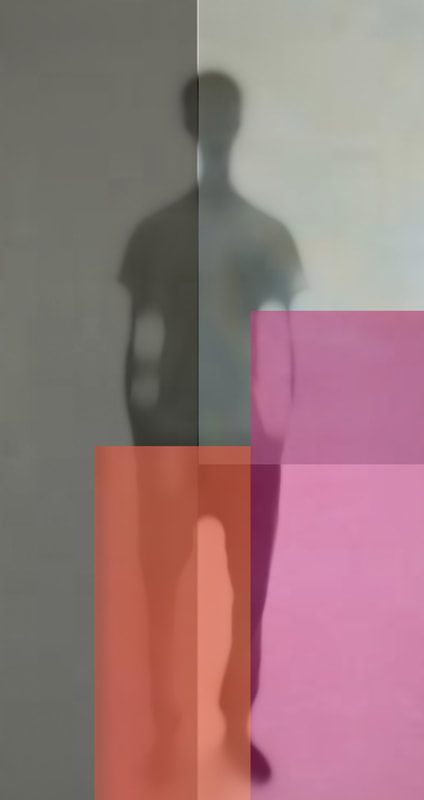
Instead of using the studio to create the lighting for my images I used photoshop. I took blurred silhouette images in the studio first and then went on to edit them on photoshop. I firstly increased the brightness and contrast to exaggerate the silhouette. I then took different shaped and coloured blocks and places then on top of my images. Lastly I lowered the opacity so you were able to see the silhouettes under the blocks.
Development 8
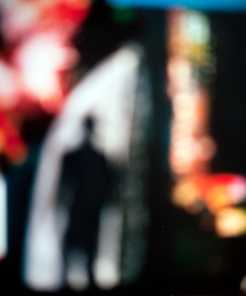
Bill Armstrong:Film noir
|
|
|
My response:
For this development I went down down oxford street and took blurred images of the urban building. I then projected these images onto a white background in the studio. I had a model stand in front of t
For this development I went down down oxford street and took blurred images of the urban building. I then projected these images onto a white background in the studio. I had a model stand in front of t
|
|
|
|
|
|
|
1st response:
I didn't really like this shoot as I was unable to achieve the outcome I wanted. This is because we did not have a projector to then project my images onto the white back drop so we had to used a proctor from an angle to project my images. This only allowed me to get certain angles top capture hence why I only have side angled images. The actual projection was also slanted as well therefore I had to zoom in a lot so u wouldn't be able to see the white backdrop and only the projection. When I reshoot this development I will use a projector that I can place right in front of the backdrop and will also capture the whole of my model in my images. This shoot has inspired me to look at shooting images on lone figures in urban environments instead of having projected environments will shadows/silhouettes on them.
I didn't really like this shoot as I was unable to achieve the outcome I wanted. This is because we did not have a projector to then project my images onto the white back drop so we had to used a proctor from an angle to project my images. This only allowed me to get certain angles top capture hence why I only have side angled images. The actual projection was also slanted as well therefore I had to zoom in a lot so u wouldn't be able to see the white backdrop and only the projection. When I reshoot this development I will use a projector that I can place right in front of the backdrop and will also capture the whole of my model in my images. This shoot has inspired me to look at shooting images on lone figures in urban environments instead of having projected environments will shadows/silhouettes on them.
|
|
|
Development 9
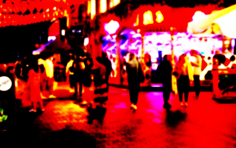
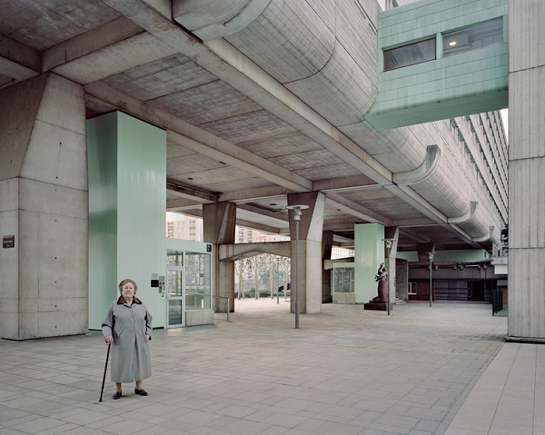
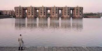
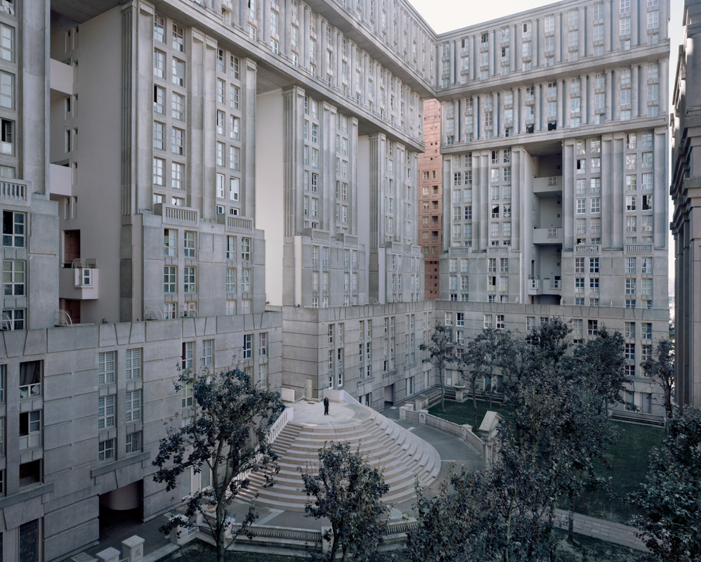
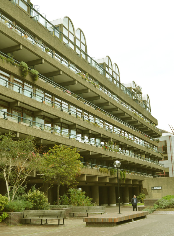
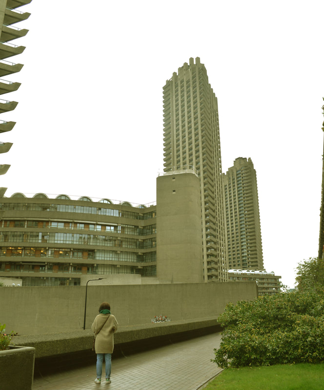
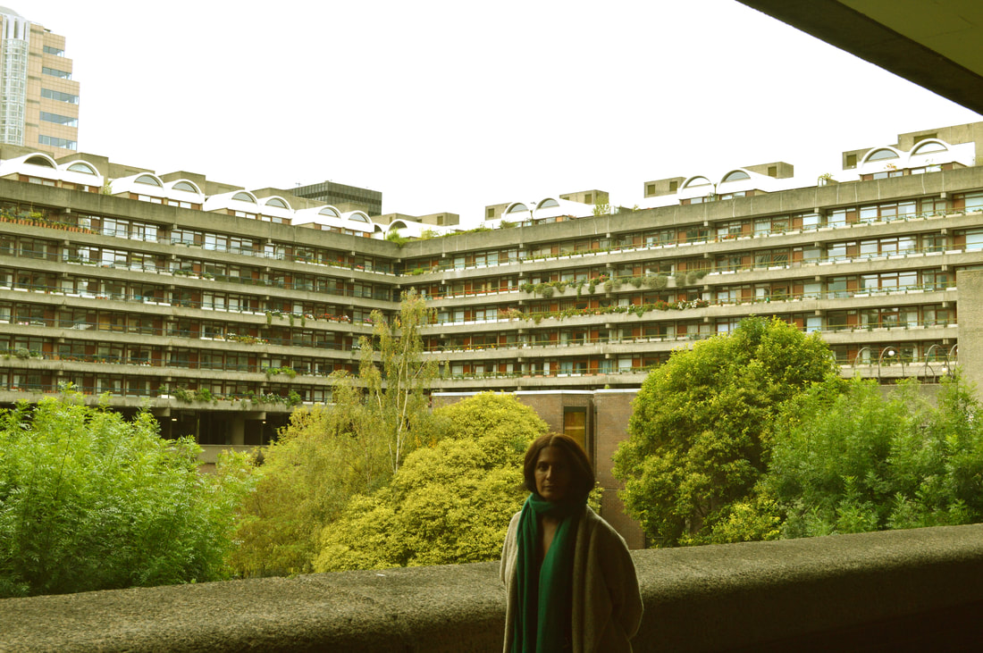
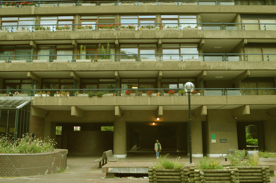
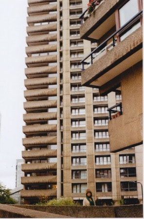
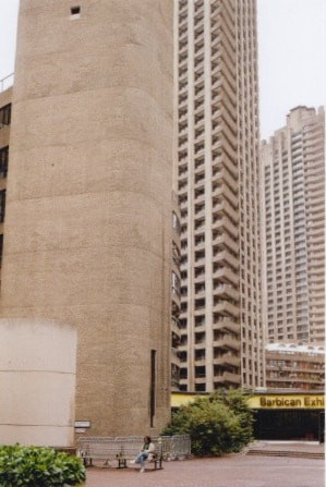
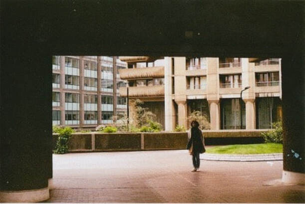
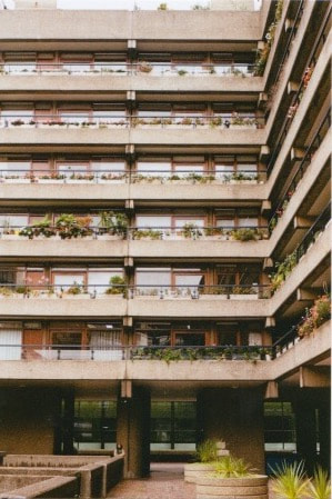
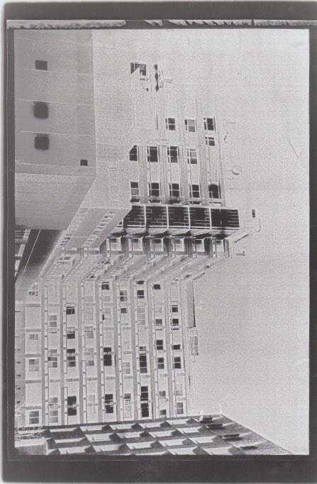
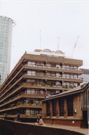
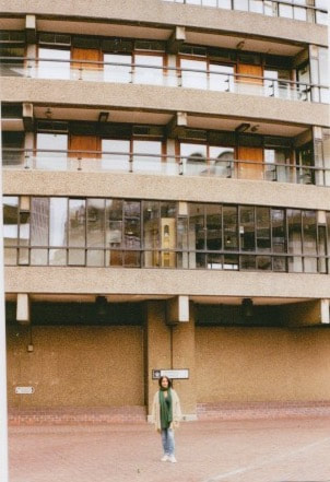
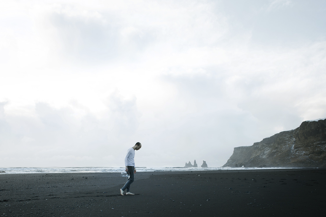
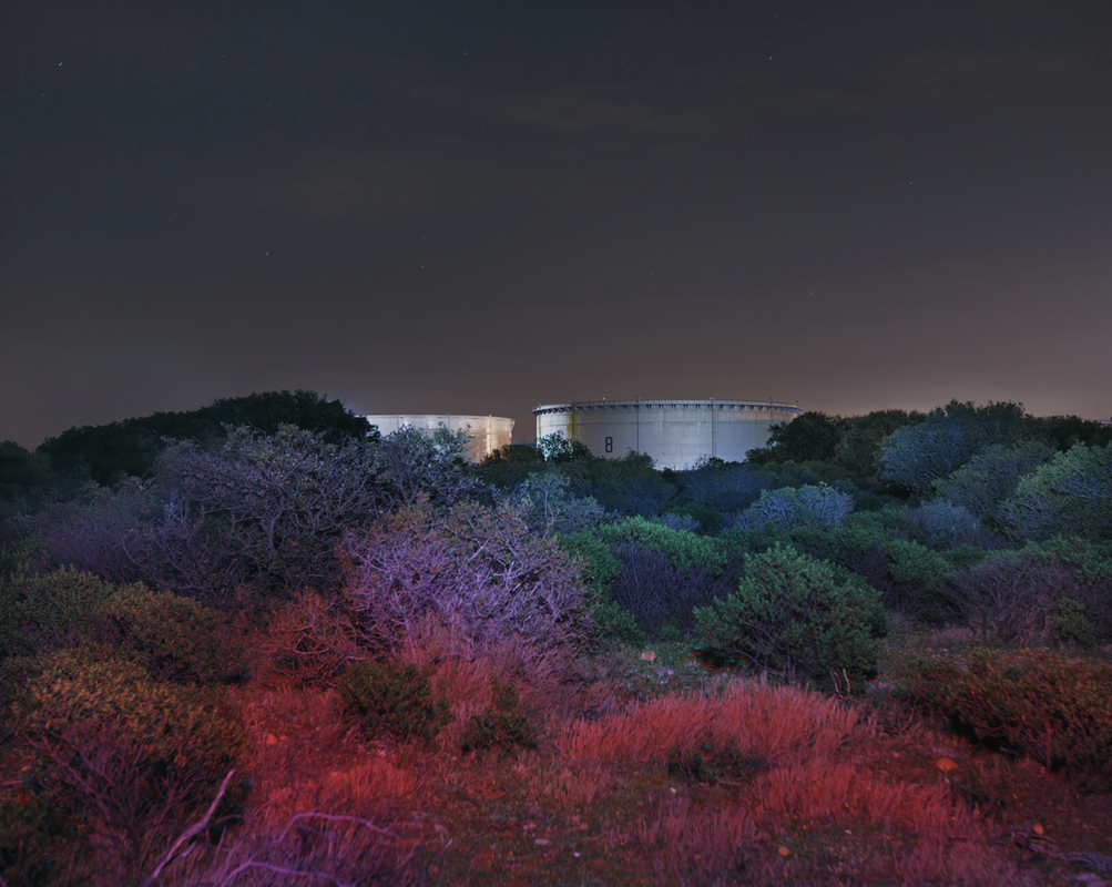
‘Souvenir D’un futur’ was a project created to show the lives of senior citizens in Paris housing estates, which consisted of large, ‘looming edifies’ .These modernist buildings came with a lot of stigma and were marginalized in the public opinion. Kronental was first fascinated by what he thought to be interesting, out of the ordinary buildings that were built initially for the housing crisis in Paris after the overwhelming urban and international immigration, which started soon after the end of the Second World War in the 1950s to 1980s. However as he got more into this his focus turned to the senior citizens and their lives growing up in the large housing estates. His centre of attention turned to the residents who had spent many of their years of their lives in these vast buildings, describing ‘ the expression of melancholy and the passage of time on their faces’. The juxtaposition of the futuristic vessels and the elderly could ‘reveal the poetry of aging environments which are slowly vanishing, and with them’ . What interested me in his photography was the way in which he placed his subject. Having his figures far away from the camera exemplified the contrast/scale between man and the city and the overpowering effect it can have. This intense, overwhelming influence of the large concrete structures as if they are ‘gobbling the human’ ,with a lone figure enhances the feeling of isolation, which may link to a sense of loneliness in a world of 7 billion people in one's own emotion. He also chose to shoot early in the morning, ‘on the one hand, to have the sensation of the district emptied of its inhabitants, and on the other hand, to get the soft and magic lights that, to my taste, poetize the city, glorify it and give it some mystery’. This is one of the aspects I took forward when looking at Kronental into further projects.
|
|
|
|
|
|
|
|
|
|
|
|
|
|
Film camera response:
|
|
|
|
|
|
|
|
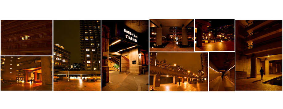
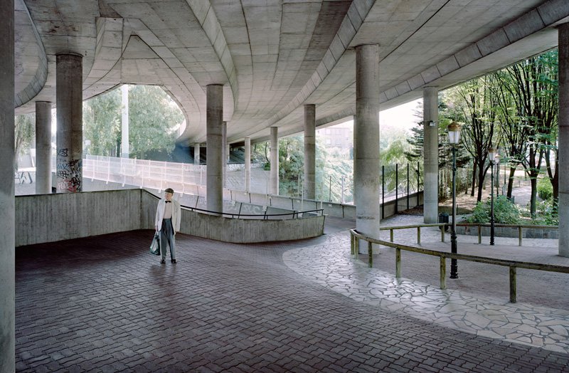
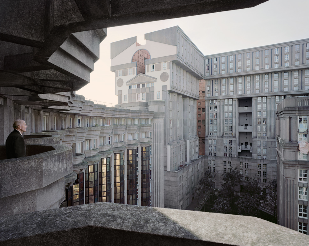
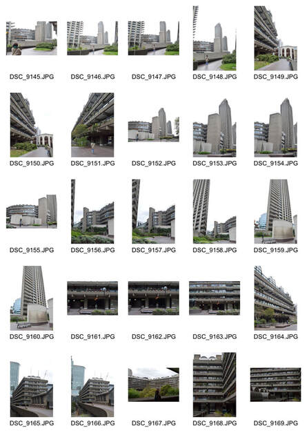
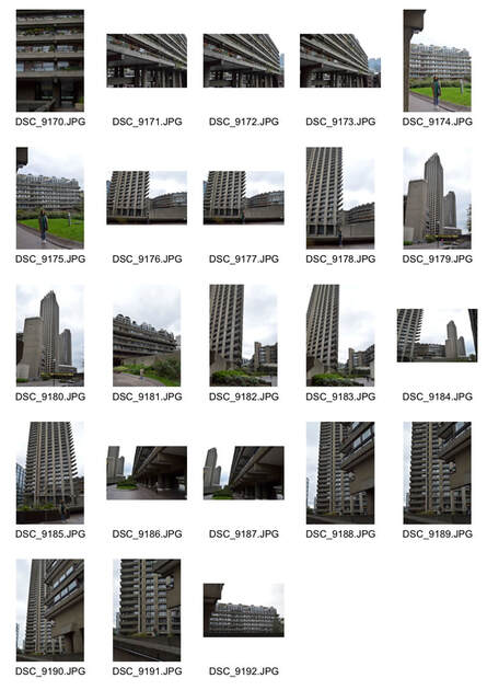
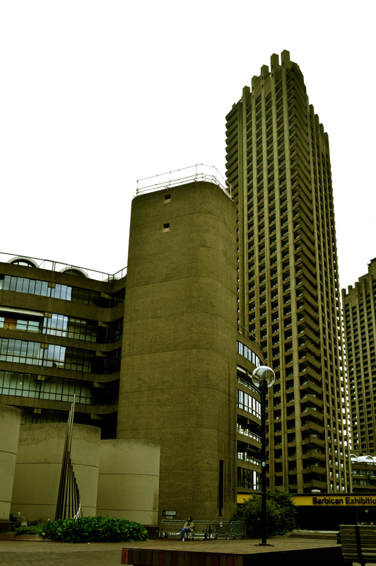
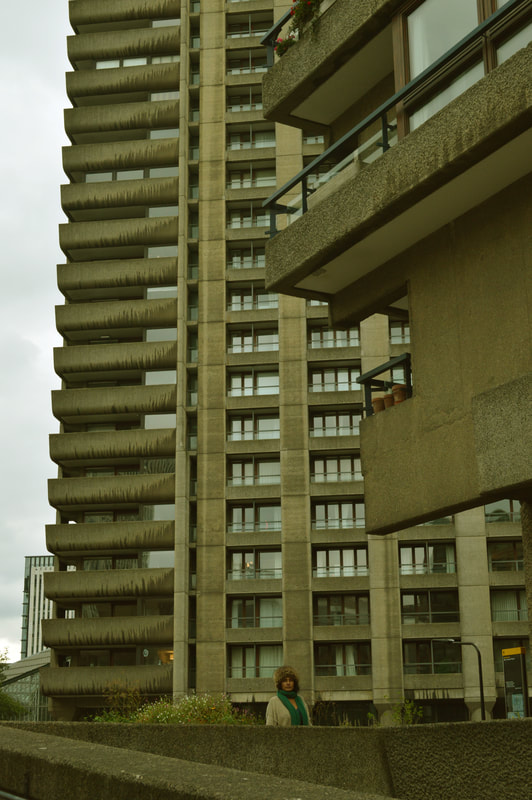
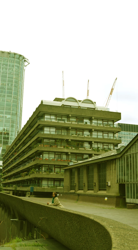
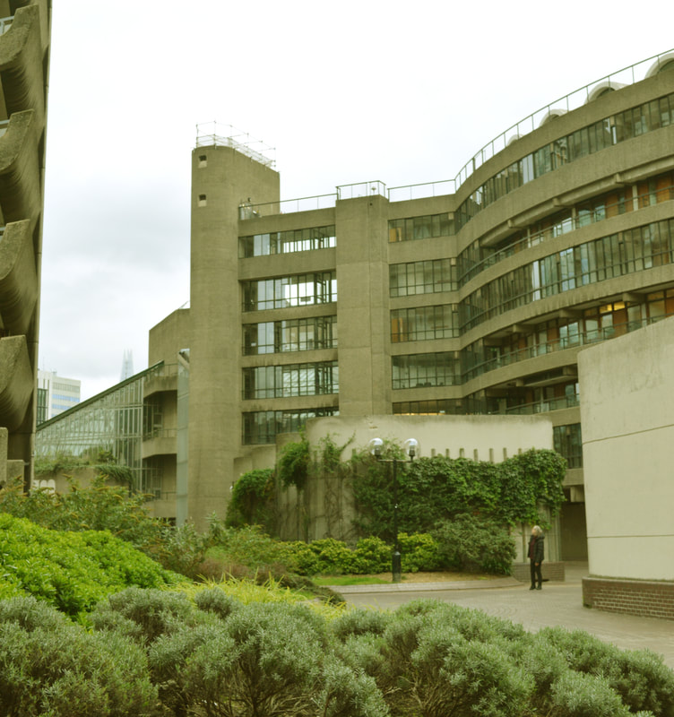
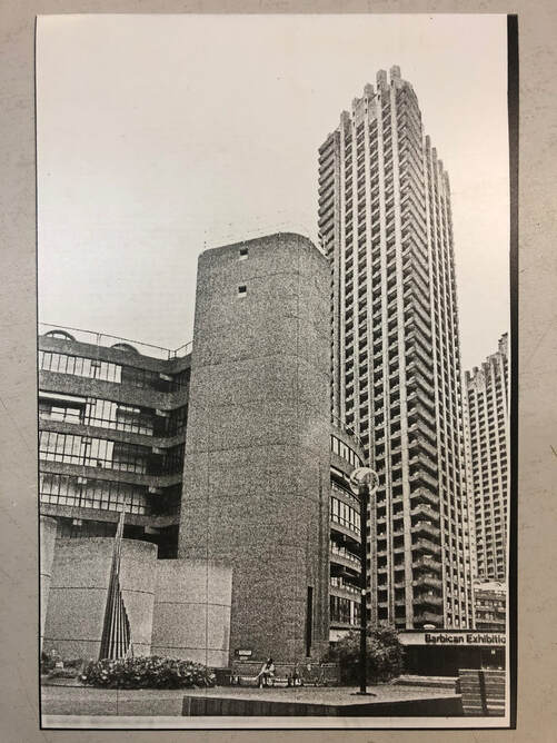
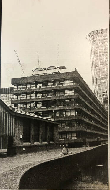
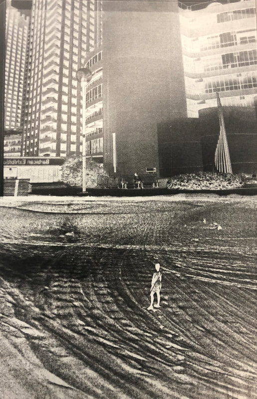
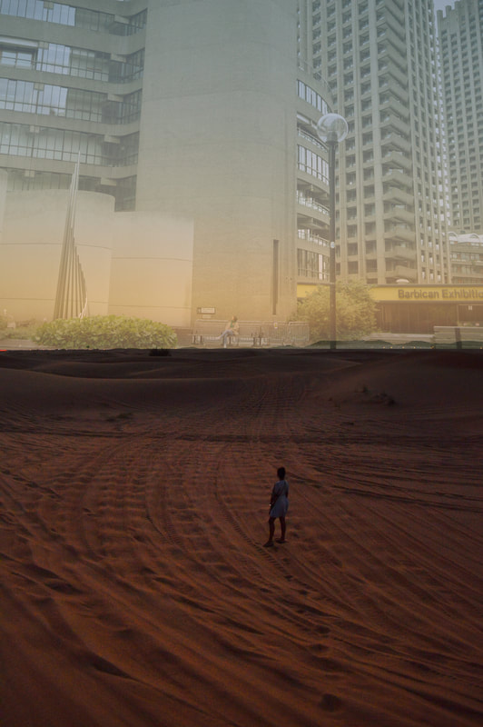
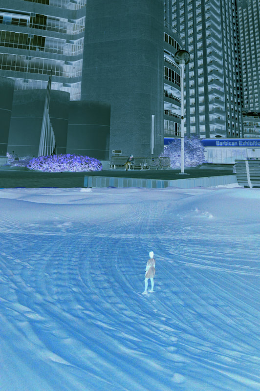
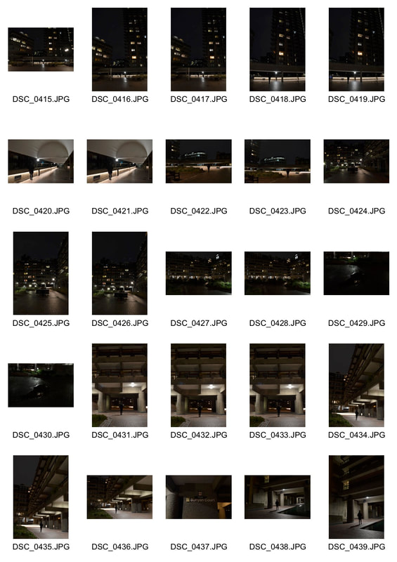
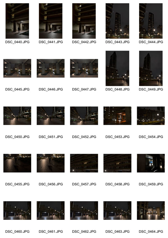
For my response to Kronentals work I visited the Barbican in East London. I felt these establishments linked well with the ones for his work as they both consisted of modernistic, brutalist architecture, so I was able to take with me this postmodern aesthetic. I wanted to deliver a similar atmosphere of his in which you place a lone figure amongst large buildings, therefore having the subject matter as the figure. I focussed on the scale of the images placing my figures both nearer to the bottom and took the image from far. This enabled me to convey the extensiveness of these concrete structures. This technique used in some of my images enables me to give the viewer a frame of reference. Not only this but it allows me to increase the perception of isolation. Although Kronentals main focus of his series was of the elderly residents in Paris housing estates, I also felt his images elicited notions of loneliness. The emotive quality from which one which one would take on from the kronental image and first sight would be a feeling of loneliness. I wanted to take this quality into my work. By increasing the grey colouring in my images as well as photographing grey buildings , I felt I was able to do this as these colours tend to represent these sorts of emotions. My images differed from kronetals in the way you could not see my subjects face. As my theme is concerned with the feeling of isolation creating a barrier between the face of the subject and viewer enhances this feeling. Not only a lone figure in this vast location but also isolates the viewer from the image itself. I felt I could improve these shoots however by visiting more areas where there was modernist architecture, to broaden the variety of buildings similar to the ones Kronental photographed. Shooting this series I began to enquire in the way a lone figure within an environment can evoke feelings of isolation. It has encouraged me to delve deeper into the ways different environments can create different feelings of isolation. My work relates to my word theme project of figure but also the isolation of the figure.
Development 10
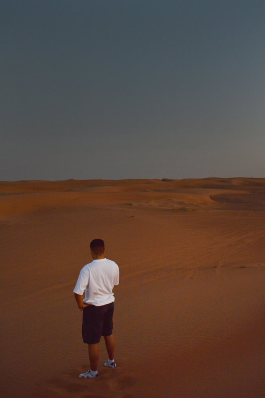
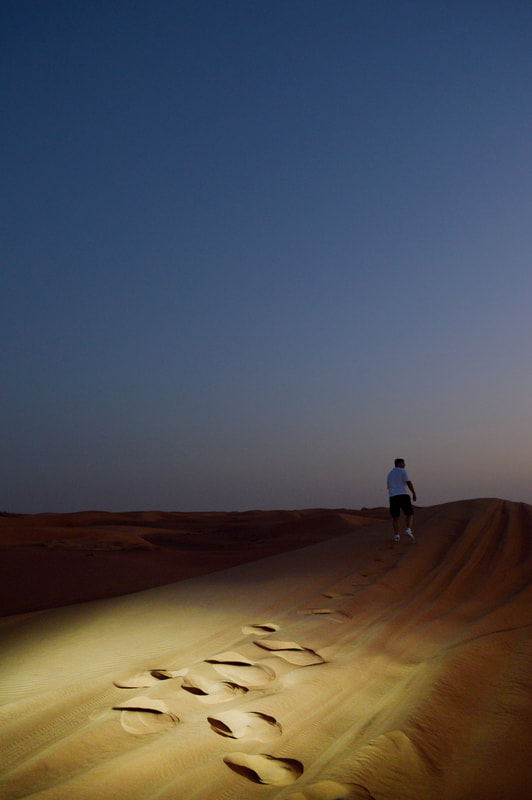
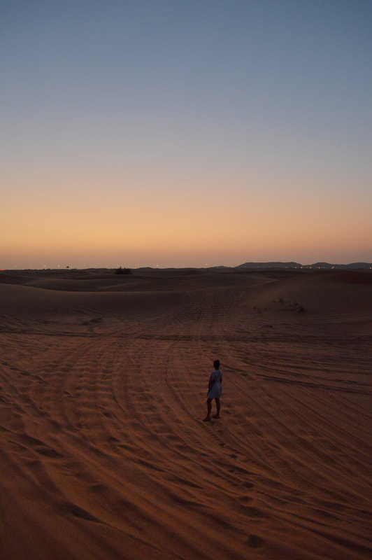
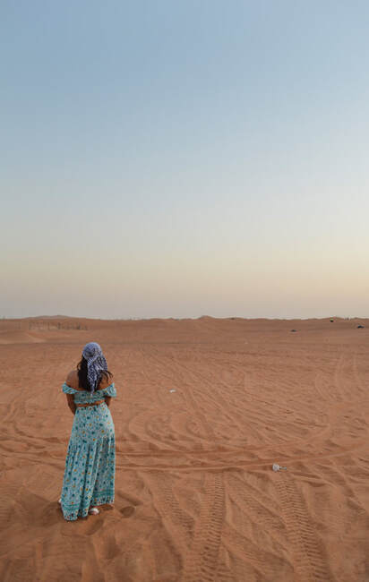
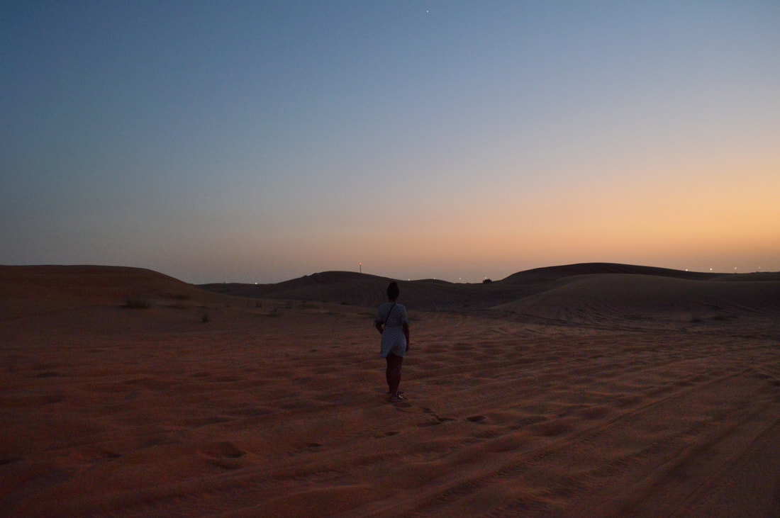
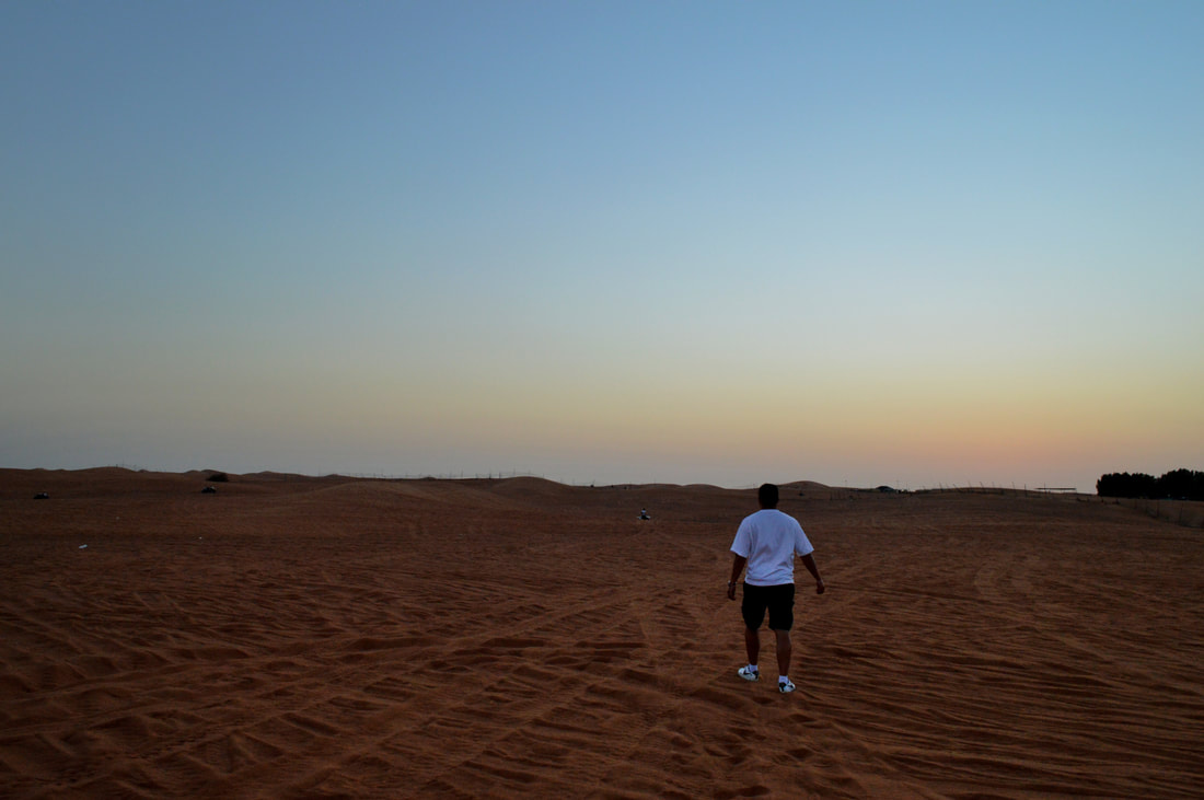
Figures in sand
Simon McCheung:
|
|
My response:
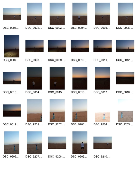
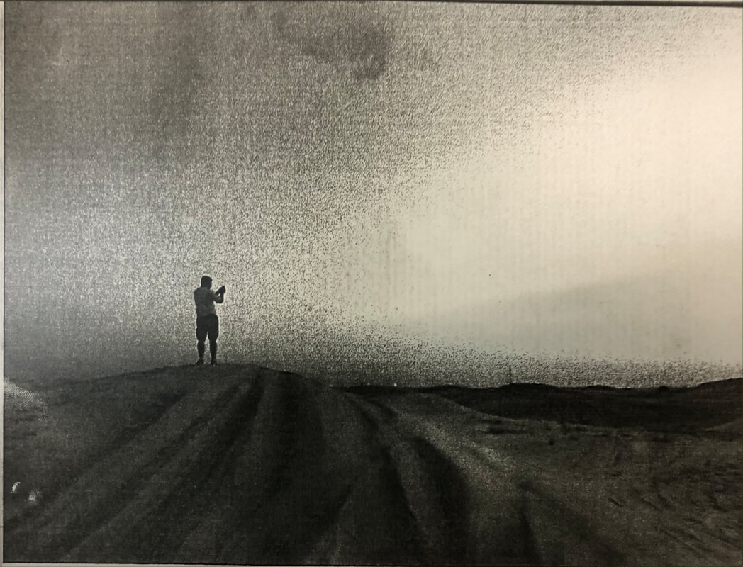
For this shoot I visited Dubai in the October holidays so decided to take images at the sand dunes in the dessert. I had a figure stand in front of the camera and photographed them. I wanted to do this I feel I ha e captured images of a figure standing in numerous environments such as in an urban environment (Barbican) and in rural environment (Coldfall wood) so wanted to add onto this. I feel what went well in this shoot is that I was able to capture images of lone figures in a vast environment. However I feel like I could of improved the composition of some the figures in some of my images as well as maybe shooting earlier in the day so you were able to see the textures and contrast of the sand dunes more. I feel like this would make the images more effective. AsI have experimented with shooting lone figures during day light in several way and locations it has led me to want to look at the ways of shooting figures at night. I feel as though this may be more of an effective way of shooting lone figures as it create more of an emotive quality in the images. I will experiment, as I did with my day photographs, in both rural and urban locations.
For this shoot I visited Dubai in the October holidays so decided to take images at the sand dunes in the dessert. I had a figure stand in front of the camera and photographed them. I wanted to do this I feel I ha e captured images of a figure standing in numerous environments such as in an urban environment (Barbican) and in rural environment (Coldfall wood) so wanted to add onto this. I feel what went well in this shoot is that I was able to capture images of lone figures in a vast environment. However I feel like I could of improved the composition of some the figures in some of my images as well as maybe shooting earlier in the day so you were able to see the textures and contrast of the sand dunes more. I feel like this would make the images more effective. AsI have experimented with shooting lone figures during day light in several way and locations it has led me to want to look at the ways of shooting figures at night. I feel as though this may be more of an effective way of shooting lone figures as it create more of an emotive quality in the images. I will experiment, as I did with my day photographs, in both rural and urban locations.
|
|
|
|
|
|
Development 11
Experimenting in the dark room and with photoshop:
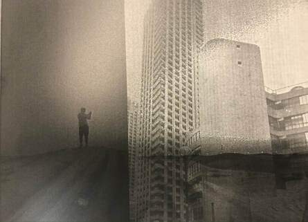
For this development I wanted to experiment with using the dark room with some pre-existing images. I picked out photographs I intended to use and printed them on acetate, printing both negatives and positive of the images. Firstly I creating positives of all the images but then went on to creating layers images, placing images of the barbican over sand dunes images. I did this to show the juxtaposition of the harsh lines and shapes of the buildings in the barbican compared to the soft curves of the sand dunes. When layering my images I had some inconvenience with being able to capture both images on the same photographic paper. This because they differed in the amount of transparent spots there were and where they were .First I tried to expose one of the images first and then expose the other after ,covering parts that I knew would over expose the paper making it too dark. This worked however it did make the image very grey tone. I then used the positive acetate and layered the images. I feel this worked better as I was able to capture both images to the same quality. Developing the negative (showed in the bottom image) also allowed me to see both the contrast of the sand dunes and the buildings a lot better that developing a positive
For this development I wanted to experiment with using the dark room with some pre-existing images. I picked out photographs I intended to use and printed them on acetate, printing both negatives and positive of the images. Firstly I creating positives of all the images but then went on to creating layers images, placing images of the barbican over sand dunes images. I did this to show the juxtaposition of the harsh lines and shapes of the buildings in the barbican compared to the soft curves of the sand dunes. When layering my images I had some inconvenience with being able to capture both images on the same photographic paper. This because they differed in the amount of transparent spots there were and where they were .First I tried to expose one of the images first and then expose the other after ,covering parts that I knew would over expose the paper making it too dark. This worked however it did make the image very grey tone. I then used the positive acetate and layered the images. I feel this worked better as I was able to capture both images to the same quality. Developing the negative (showed in the bottom image) also allowed me to see both the contrast of the sand dunes and the buildings a lot better that developing a positive
Teststrips + Acetate:
|
|
|
|
|
Layering with negative images in the dark room :
|
Positive image layering using photoshop
|
Negative image layering using photoshop
|
Development 12
Benoit Paille:
'Benoit Paille is an atypic artist, conscience agitator, creative genius, monstrously curious, absent and edgy'.
'Benoit Paille is an atypic artist, conscience agitator, creative genius, monstrously curious, absent and edgy'.
|
|
|
My response:
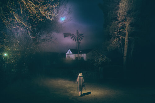
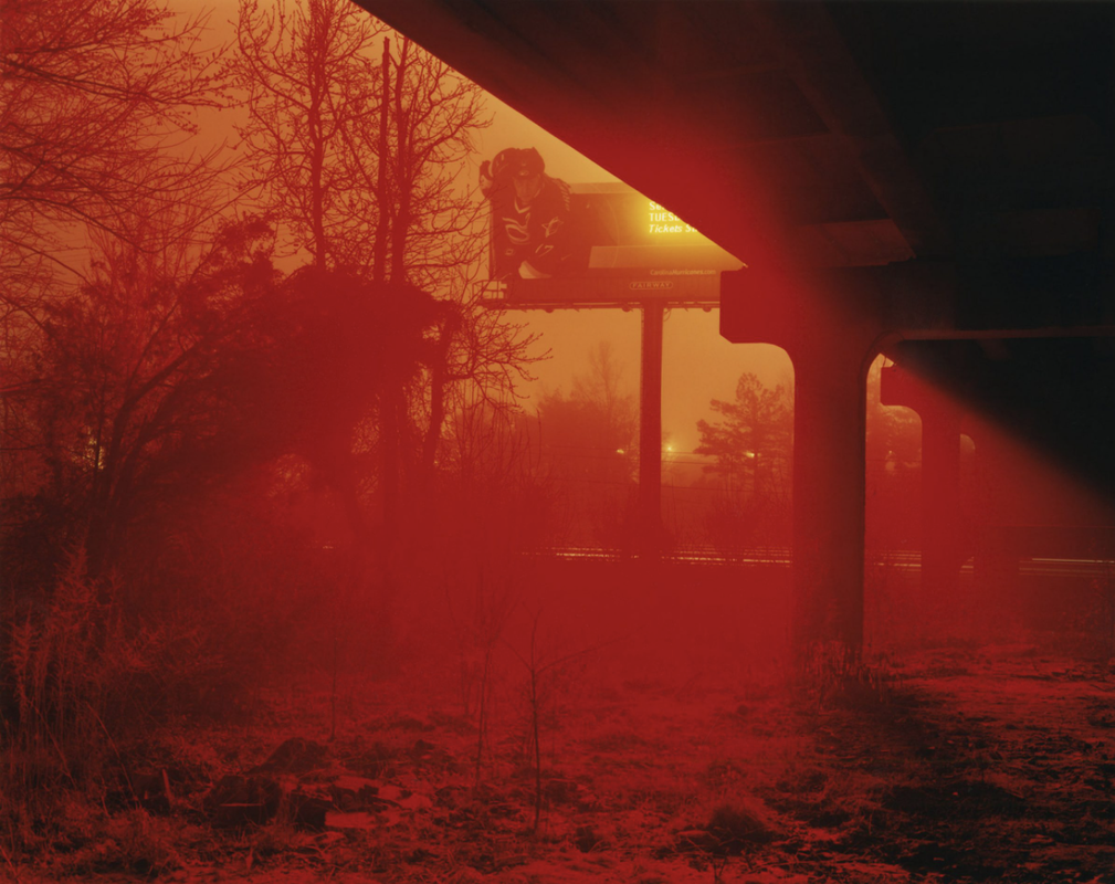
As I had just photographed a lone figure in day light environment i wanted to experiment with placing a lone figure in a rural environment at night . For this response I took inspiration from photographer Benot Paille with his experimentation with flash. In this development I went to Coldfall wood and photographed images of lone figures submerged in nature. To have as much light as possible I connected the flash gun to my camera and altered the shutter speed from 1/2 to 1/1 depending on the amount of light that was already available from street lamps. I then placed different coloured filters in front of the flash depending on the colouring of the image that I desired, this then lit the front of my images different colours like Paille's images above. I think what went well in these images is that I was able to experiment with different coloured filters and achieve the colours I wanted. However if I were to redo this shoot I would photograph in more vast areas so you could be able to see the contrast of colours from stronger colour at the front to weaker at the back. I was unable to achieve this in these images as the space I was photographing in was quite crowded.
As I had just photographed a lone figure in day light environment i wanted to experiment with placing a lone figure in a rural environment at night . For this response I took inspiration from photographer Benot Paille with his experimentation with flash. In this development I went to Coldfall wood and photographed images of lone figures submerged in nature. To have as much light as possible I connected the flash gun to my camera and altered the shutter speed from 1/2 to 1/1 depending on the amount of light that was already available from street lamps. I then placed different coloured filters in front of the flash depending on the colouring of the image that I desired, this then lit the front of my images different colours like Paille's images above. I think what went well in these images is that I was able to experiment with different coloured filters and achieve the colours I wanted. However if I were to redo this shoot I would photograph in more vast areas so you could be able to see the contrast of colours from stronger colour at the front to weaker at the back. I was unable to achieve this in these images as the space I was photographing in was quite crowded.
|
|
|
|
|
|
|
|
|
|
|
|
Development 13
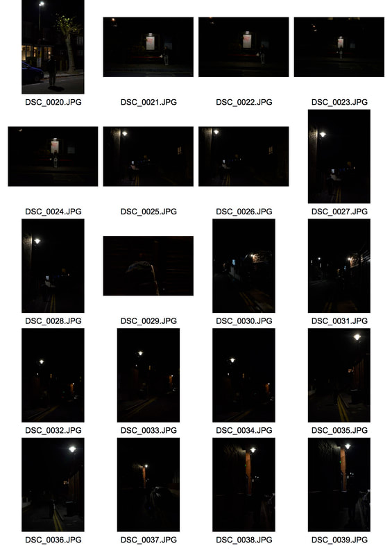
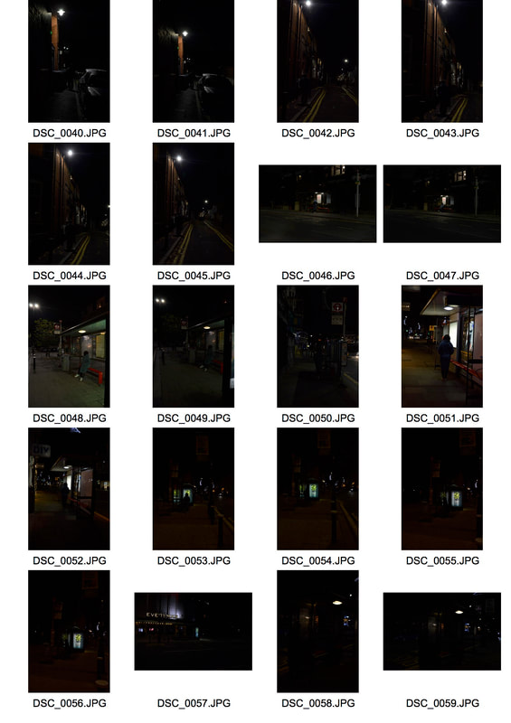
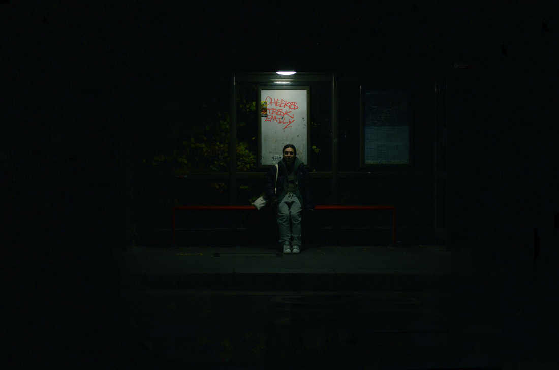
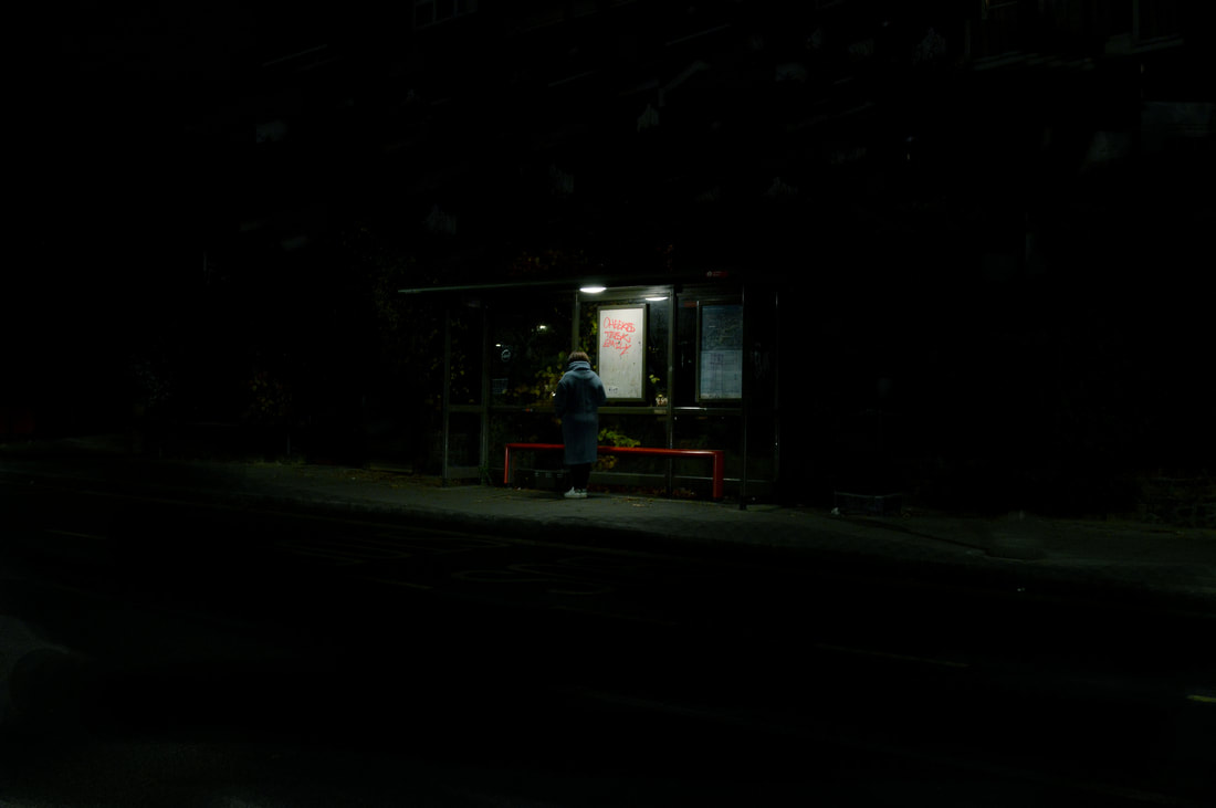
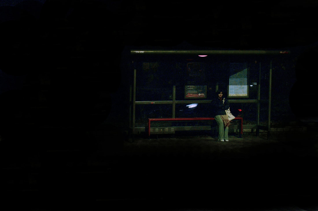
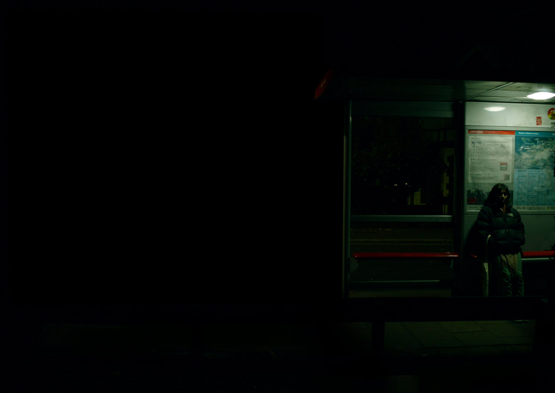
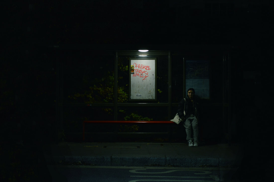
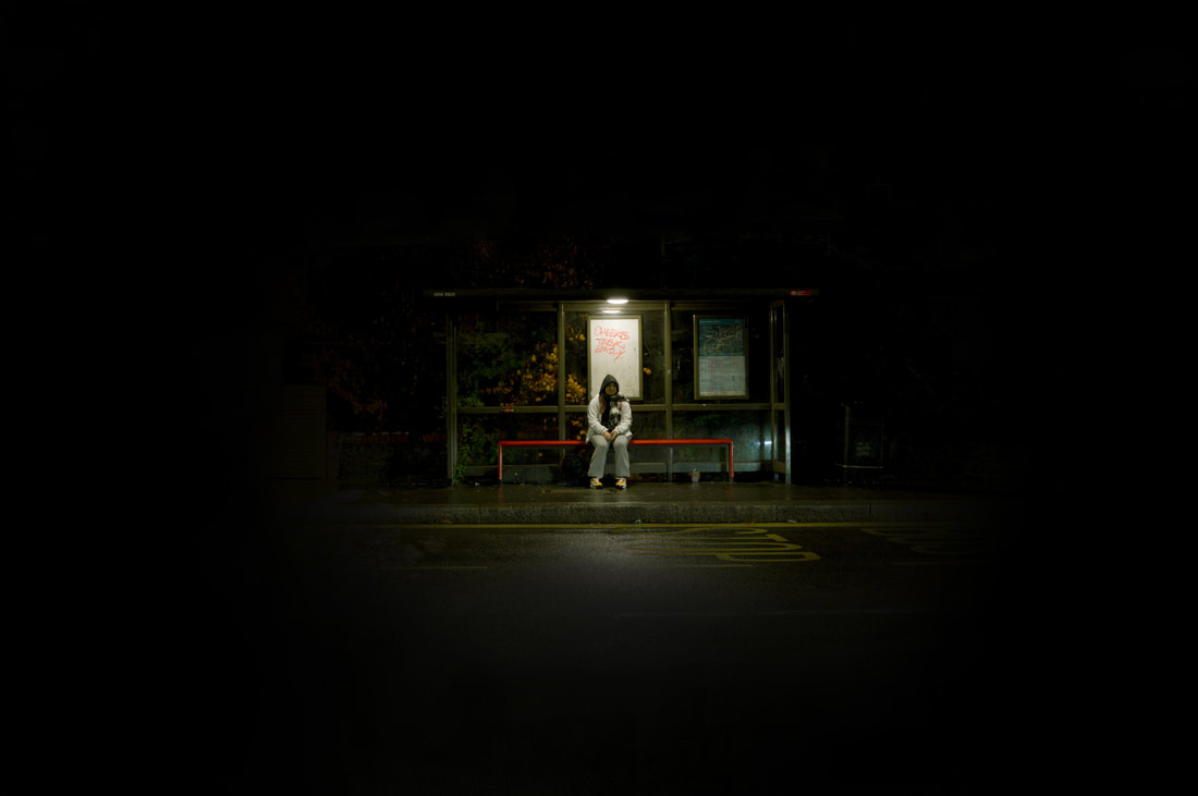
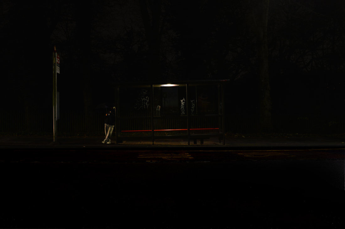
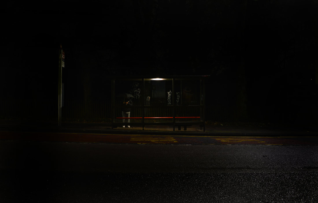
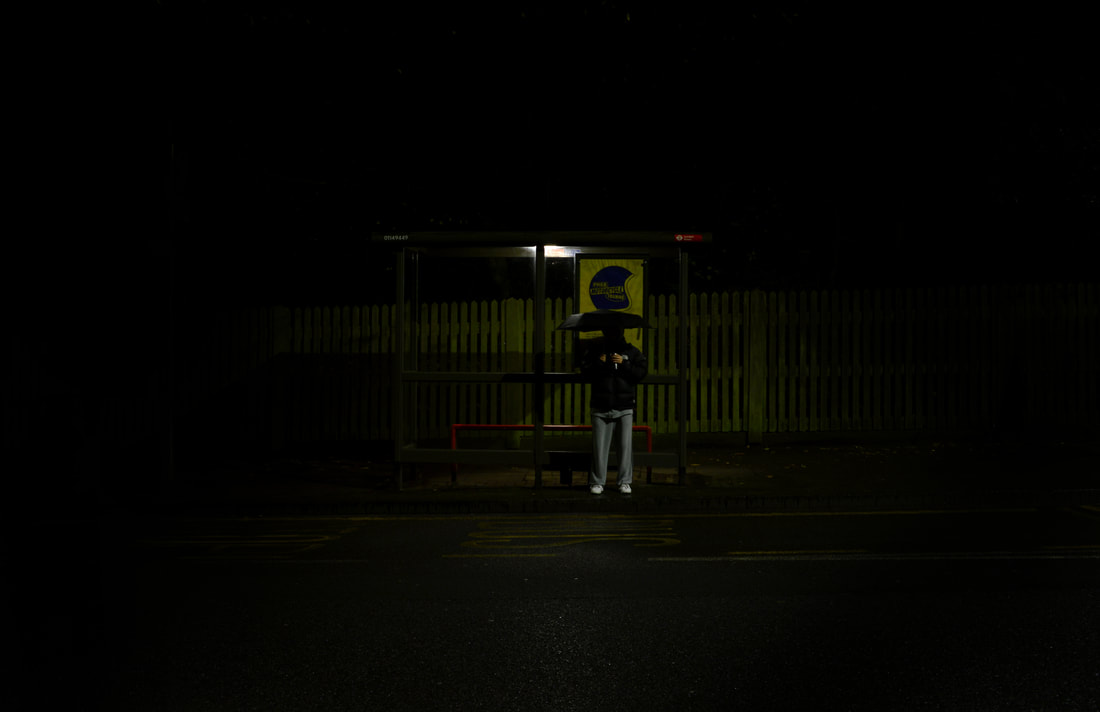
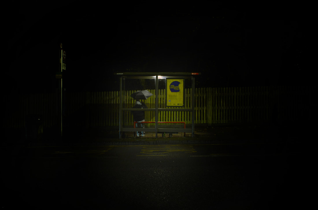
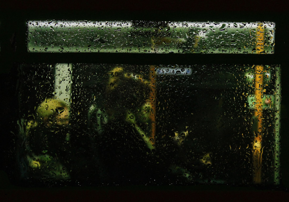
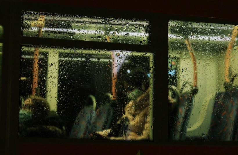
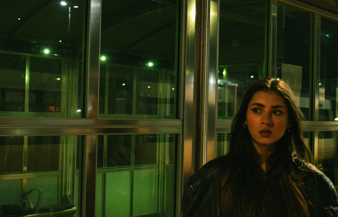
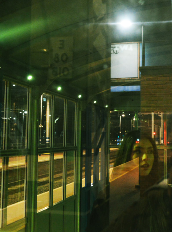
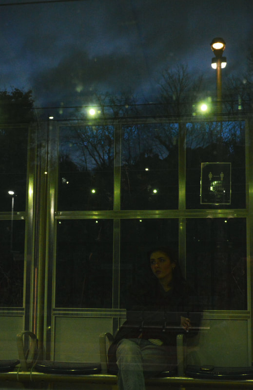
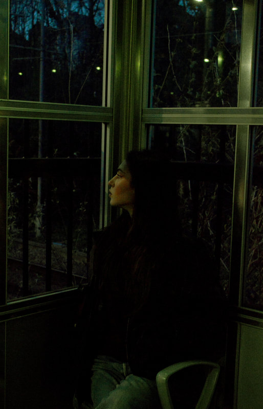
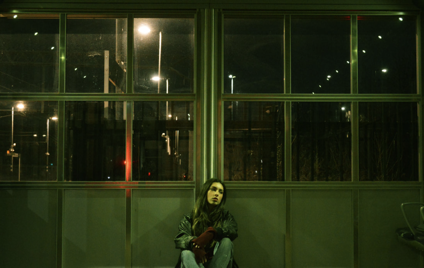
Bus stops at night:
|
|
My response:
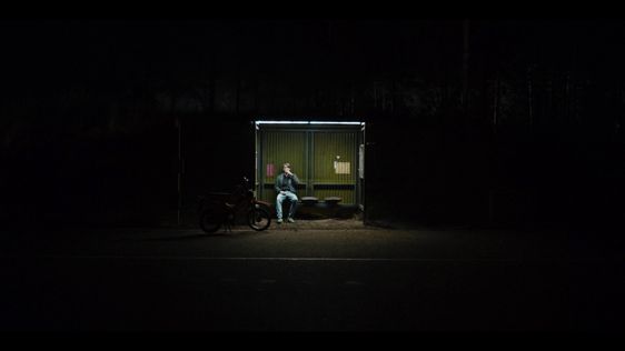
For this shoot I photographed lone figures at night lit up by street lights. After shooting these images I used photoshop to increase the brightness as well as altering the colour balances. For some of the images I increased the green tone of the images and other I increased the red tones. I think my favourite part of this shoot was shooting at bus stops as I felt the lighting was the best for highlighting only the figure and not any other other distraction. However I would like to reshoot these images by improving the locations and the compositions. As well as this I will bring a tripod out with me which I did not do when shooting this development. This will allow me to decrease my iso from 800, which is what I used in this shoot, to 200-400. I will also be able to decrease my shutter speed and increase my aperture which would give a brighter, crisp image. I am doing this as in this shoot my images came out quite dark due to not having a tripod. As they were dark I had to lighten them in photoshop which made the images look quite grainy. Therefore in reshoot I would like to shoot better quality images
For this shoot I photographed lone figures at night lit up by street lights. After shooting these images I used photoshop to increase the brightness as well as altering the colour balances. For some of the images I increased the green tone of the images and other I increased the red tones. I think my favourite part of this shoot was shooting at bus stops as I felt the lighting was the best for highlighting only the figure and not any other other distraction. However I would like to reshoot these images by improving the locations and the compositions. As well as this I will bring a tripod out with me which I did not do when shooting this development. This will allow me to decrease my iso from 800, which is what I used in this shoot, to 200-400. I will also be able to decrease my shutter speed and increase my aperture which would give a brighter, crisp image. I am doing this as in this shoot my images came out quite dark due to not having a tripod. As they were dark I had to lighten them in photoshop which made the images look quite grainy. Therefore in reshoot I would like to shoot better quality images
|
|
|
|
|
|
|
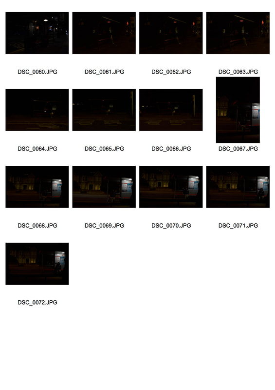
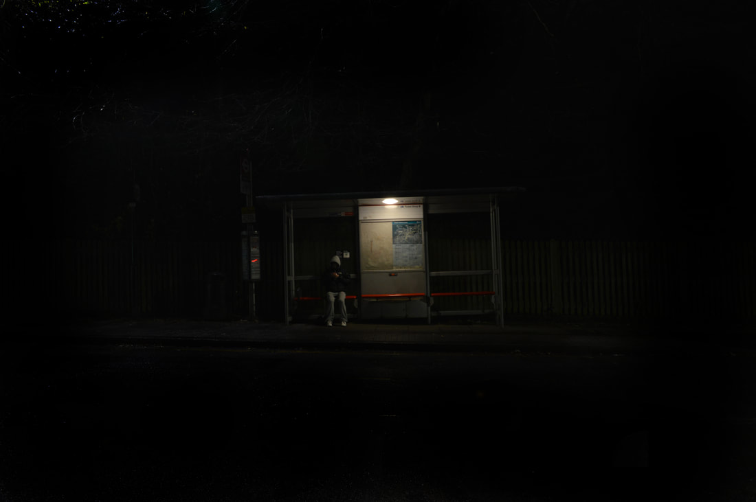
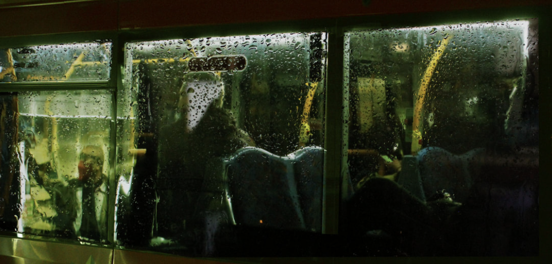
Development 14
Reshoot figures at bus stops:
|
|
|
|
|
|
Development 15
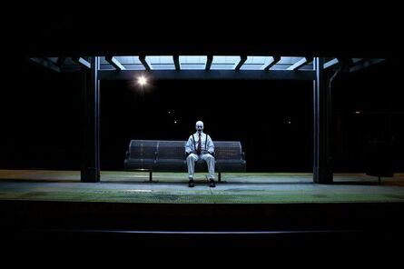
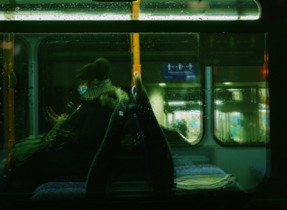
Nick Turpin : Figures on on the bus
|
|
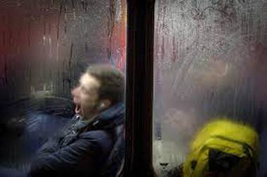
|
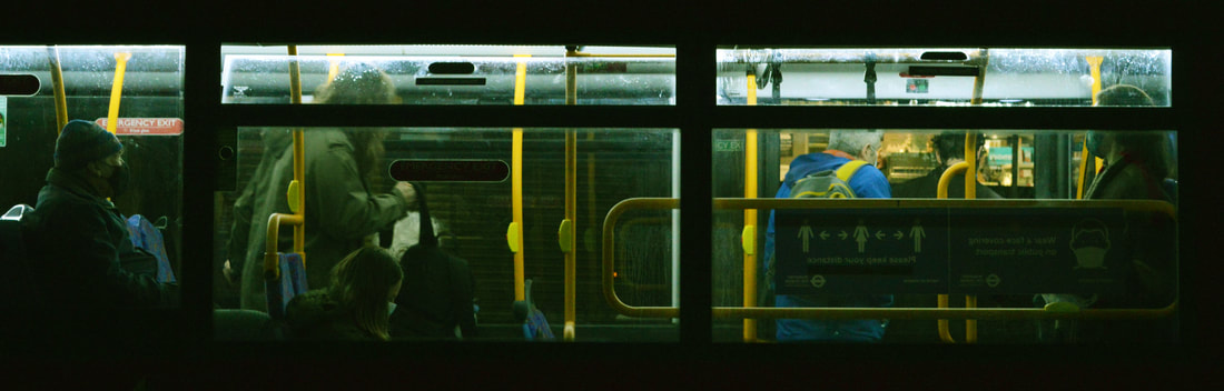
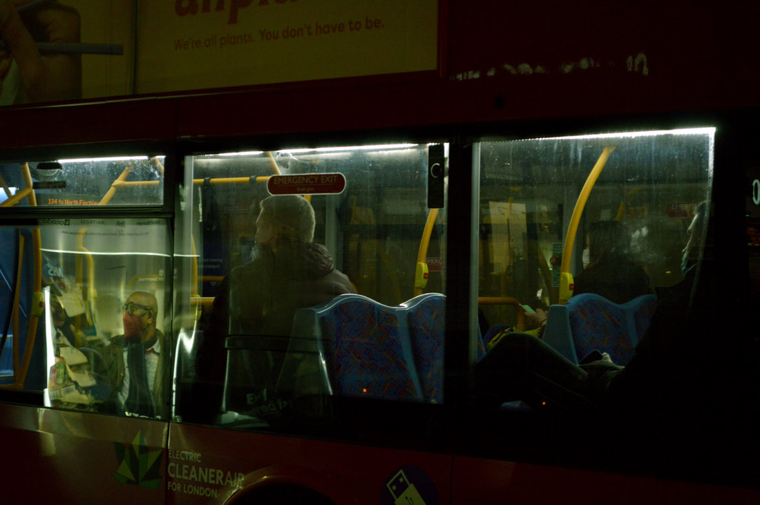
|
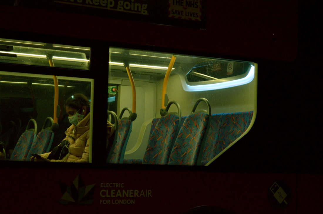
|
Experimenting using glass sheet and water:
|
|
|
|
Development 15
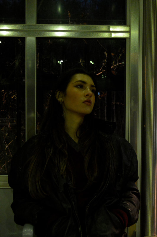
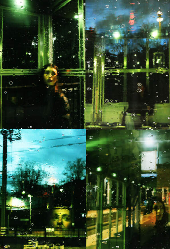
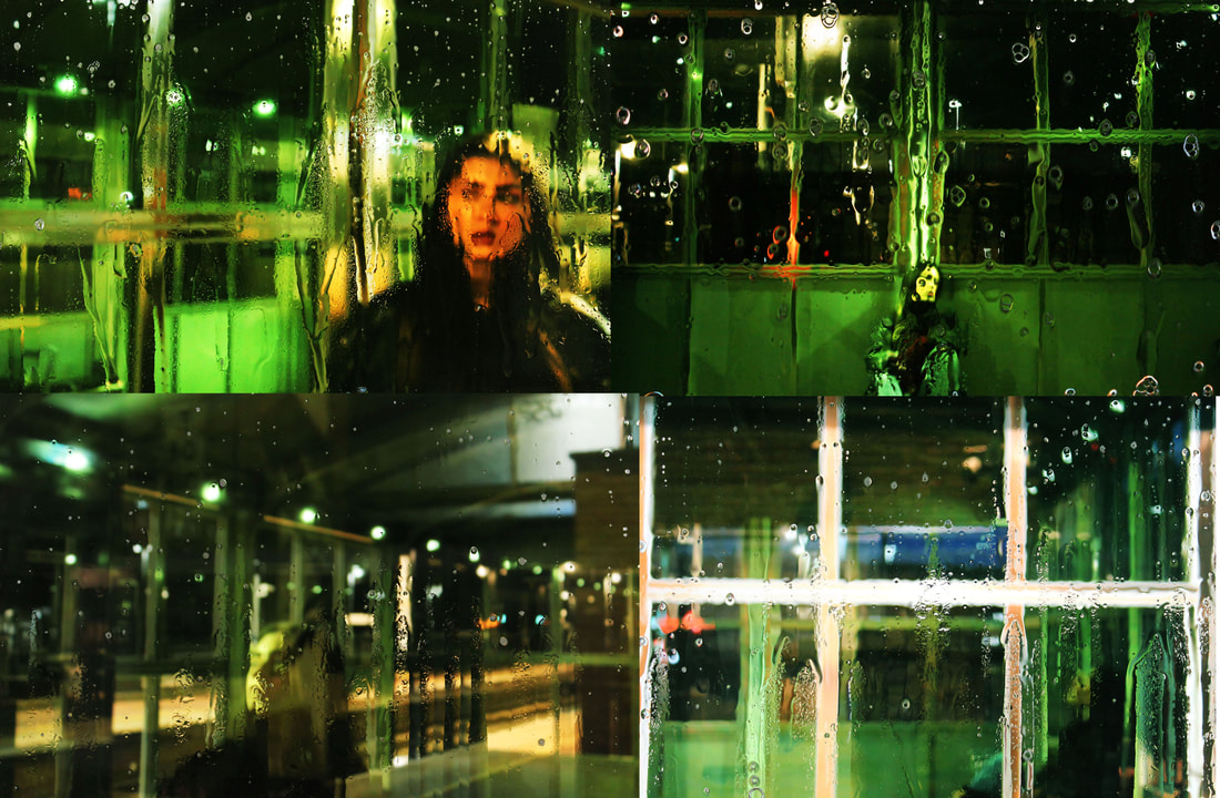
Lone figure at train station:
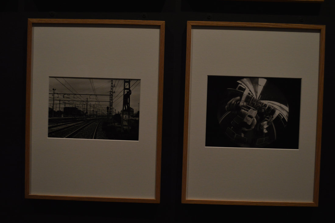
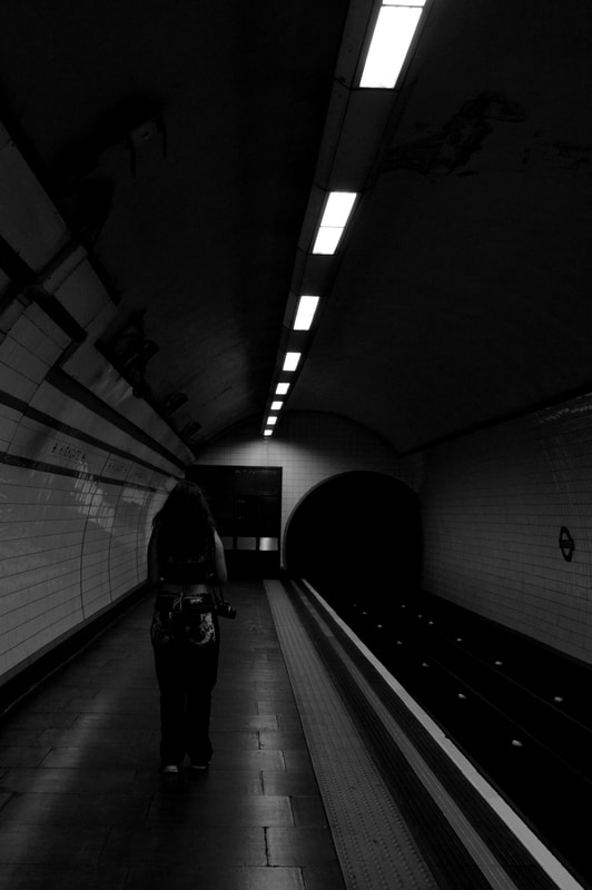
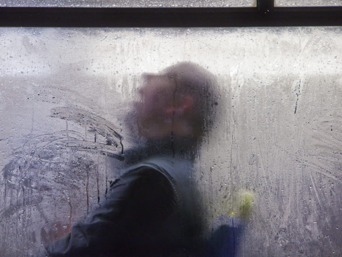
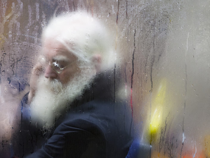
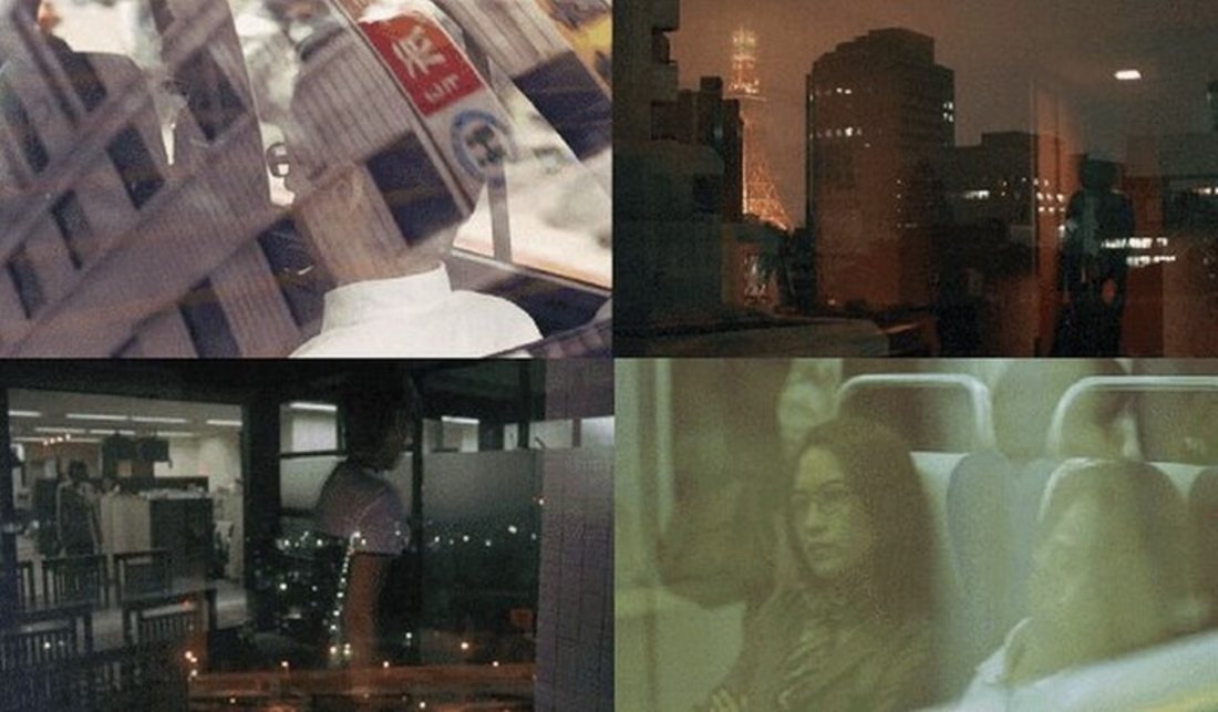
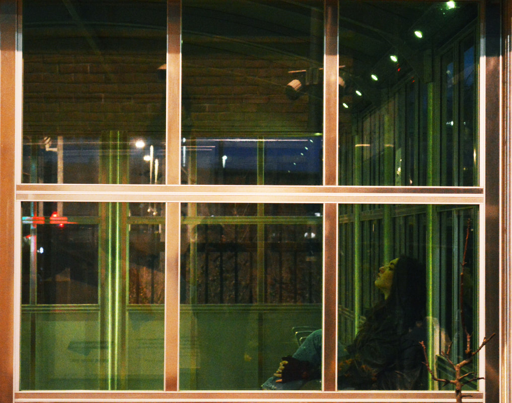
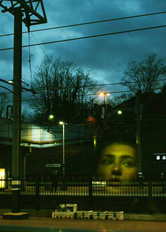
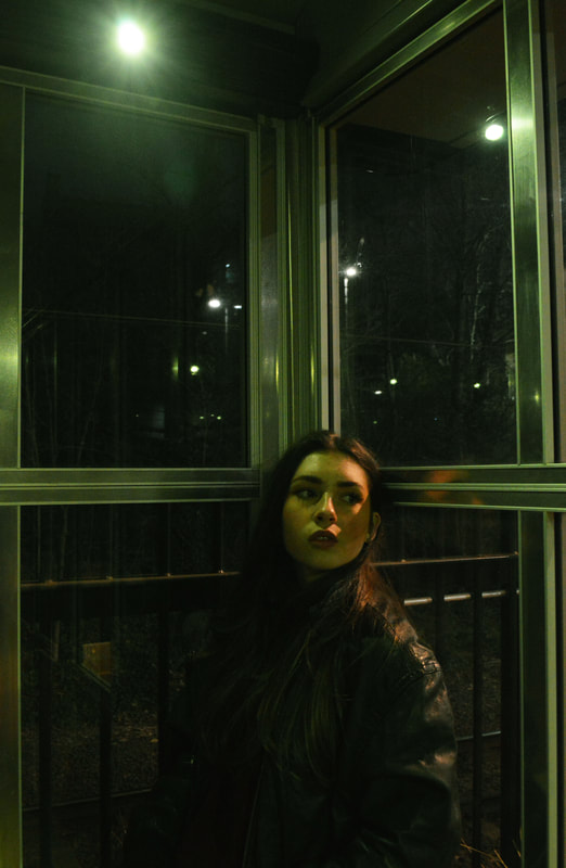
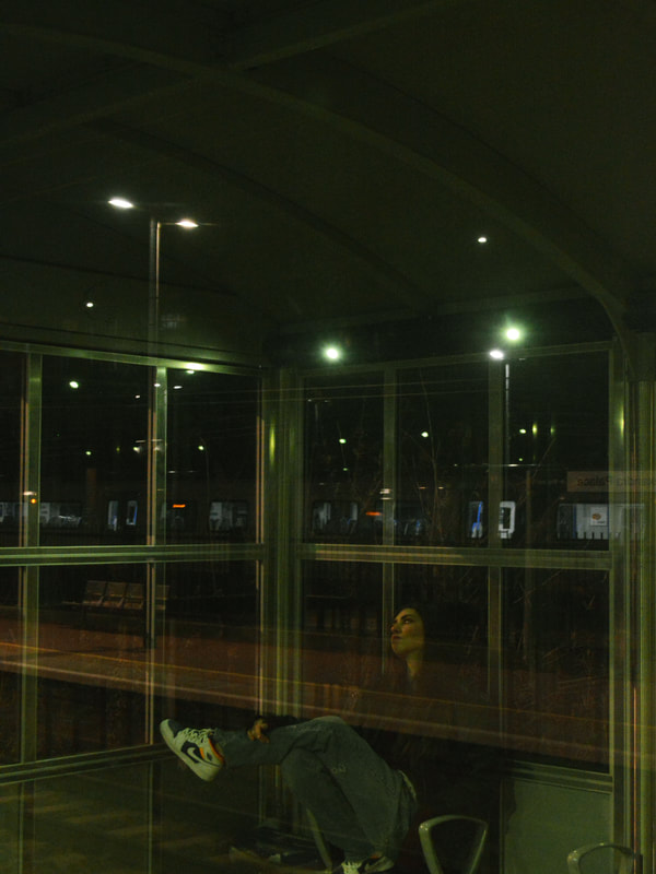
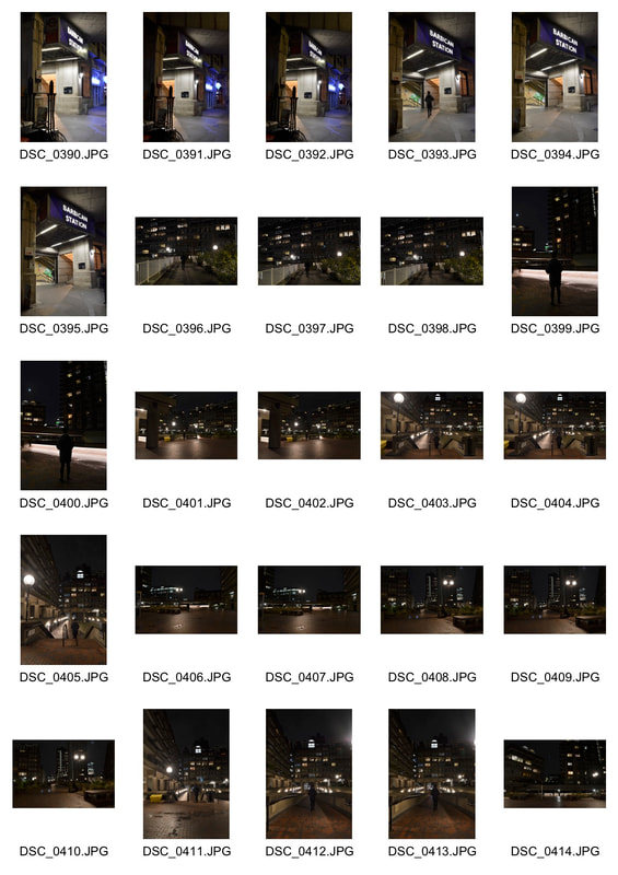
Edward Yang:
Yang was a Taiwanese film maker, most famous for his Best director award for his film Yi Yi. I think Yangs work is very effective as in the images below he has both incorporates at least one person and also catches the reflection of the outside which creates an overlap of two totally different images .
Contact sheet:
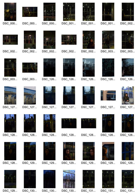
|
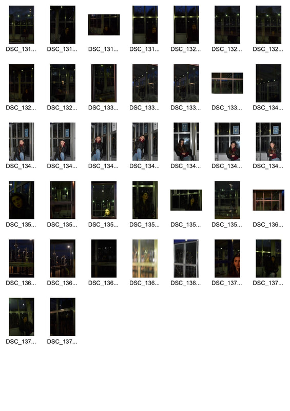
|
Edited images:
|
|
|
|
|
|
|
|
|
|
Experimenting using glass sheet and water:
Development 16
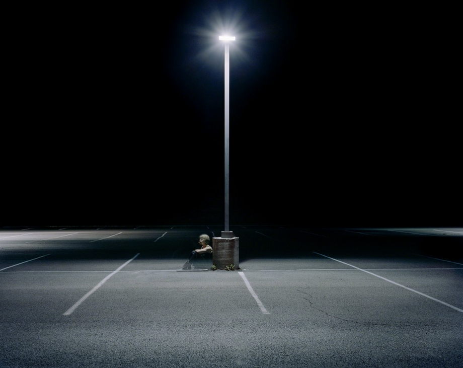
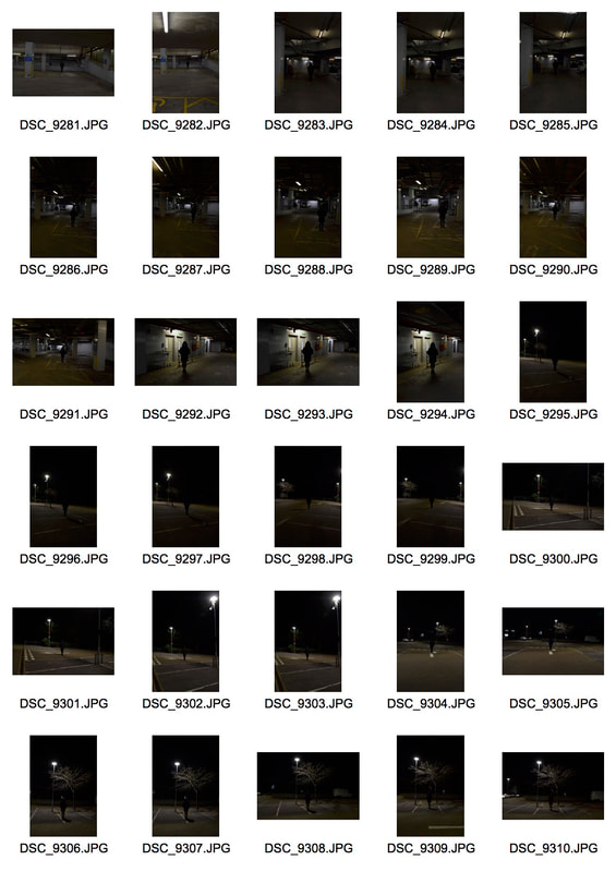
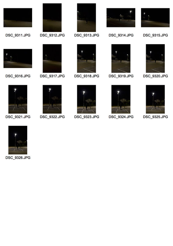
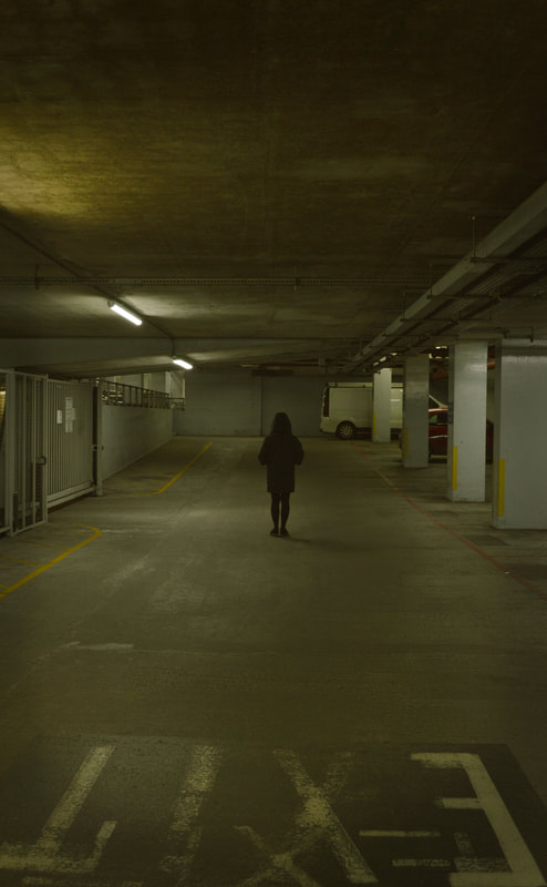
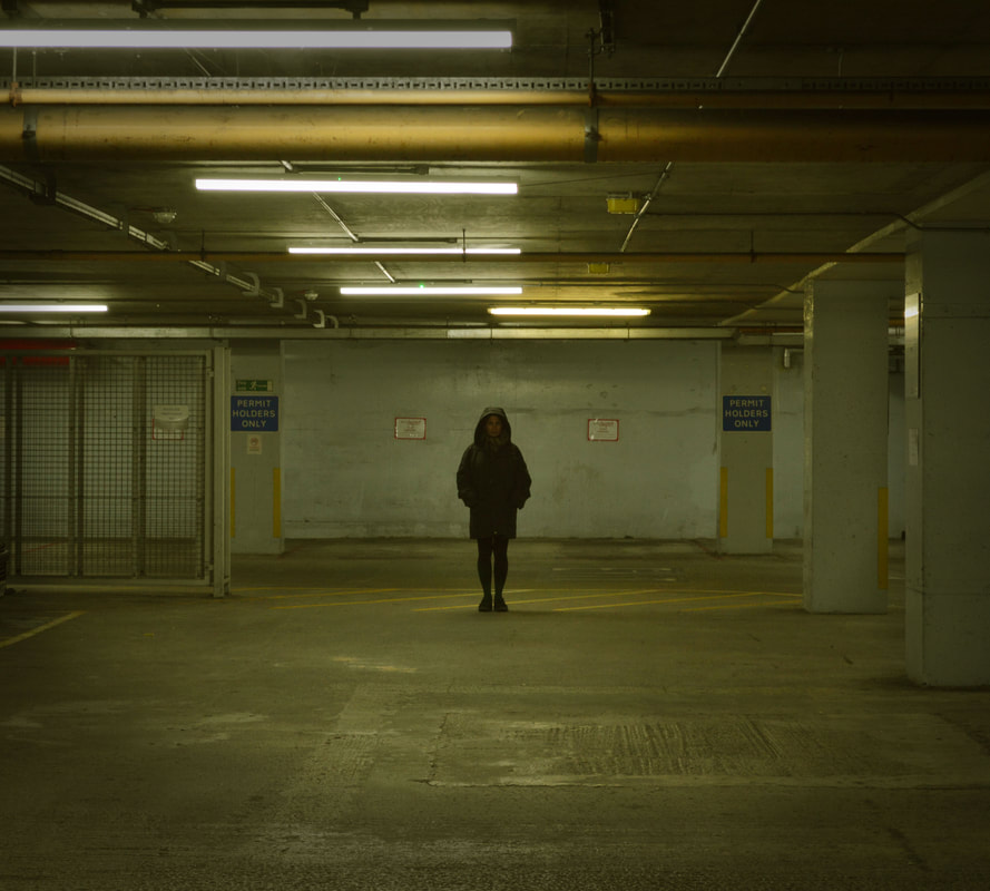
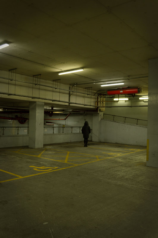
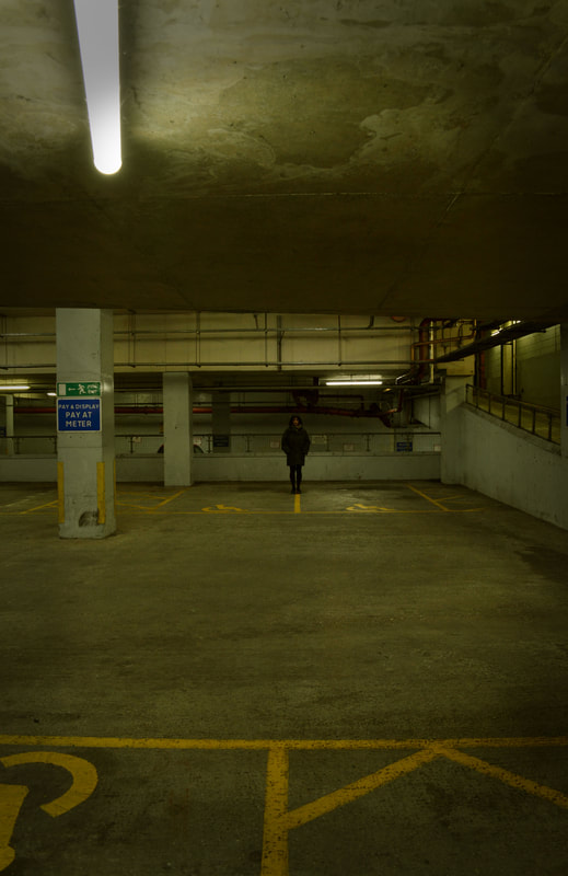
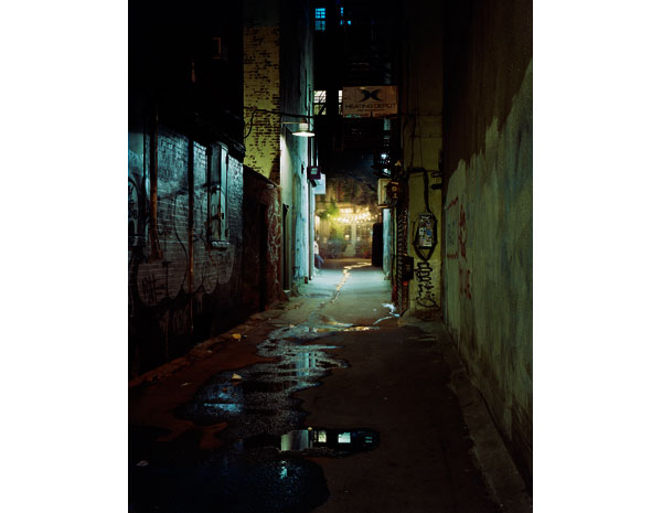
Isolated figures in carparks:
Maria Passarotti:
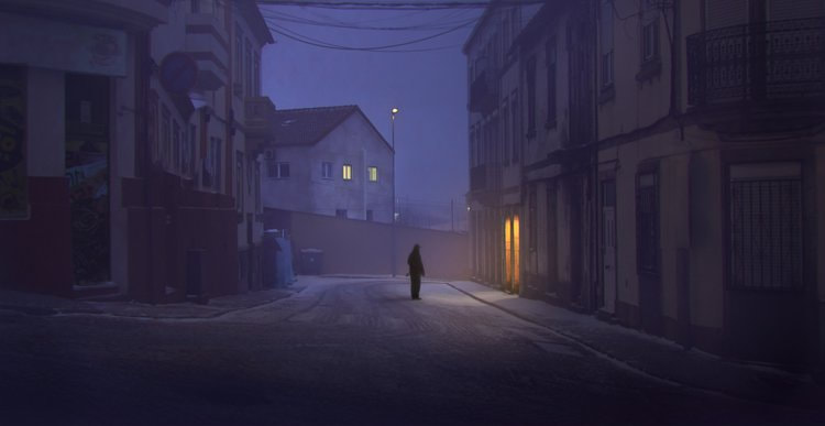
Passaroti explores the interaction between nature and humanity, honing in on how these environments have been redefined by man. Her images exemplify the effect of a haunting human presence in suburban settings. For example in many of her images, in parking lots, alleyways and dead ends which are filled with signs of human interaction, they are absent of physical presence. Passaroti describes this as "desolate, but charged with life". This stark contrast of the alienation of the figure and what would normally be a packed environment magnifies the way one's own thoughts could overpower whatever is going on around them. The absence of people evokes a haunting human presence through details such as darkness which, placing more emphasis on the figure as only the car park floor is lit up. Passaoriti had a bright street lamp in the centre of her images which created this. The use of the car park line present within the images has created a sense of depth. They have created a focal point in the image, being the lone figure. This is something I would like to take forward when responding to her work. Passaroti has placed the figure relatively far away from the camera. This creates a deeper feeling of anonymity and loneliness.
Passaroti explores the interaction between nature and humanity, honing in on how these environments have been redefined by man. Her images exemplify the effect of a haunting human presence in suburban settings. For example in many of her images, in parking lots, alleyways and dead ends which are filled with signs of human interaction, they are absent of physical presence. Passaroti describes this as "desolate, but charged with life". This stark contrast of the alienation of the figure and what would normally be a packed environment magnifies the way one's own thoughts could overpower whatever is going on around them. The absence of people evokes a haunting human presence through details such as darkness which, placing more emphasis on the figure as only the car park floor is lit up. Passaoriti had a bright street lamp in the centre of her images which created this. The use of the car park line present within the images has created a sense of depth. They have created a focal point in the image, being the lone figure. This is something I would like to take forward when responding to her work. Passaroti has placed the figure relatively far away from the camera. This creates a deeper feeling of anonymity and loneliness.
My response:
For this shoot I wanted to capture images of lone figures in carparks. I wanted to have my figure waring all black and with their hood up to create a feeling of suspense as it is hard to identify their face. Air shooting these images I brought them into photoshop. I first increased the brightness slightly and then ,using the colour balance, added a yellow tone to the images as I felt this made the images more effective in crating a sort of horror effect. After doing this I added a vignette around my images to highlight the figure more.
For this shoot I wanted to capture images of lone figures in carparks. I wanted to have my figure waring all black and with their hood up to create a feeling of suspense as it is hard to identify their face. Air shooting these images I brought them into photoshop. I first increased the brightness slightly and then ,using the colour balance, added a yellow tone to the images as I felt this made the images more effective in crating a sort of horror effect. After doing this I added a vignette around my images to highlight the figure more.
|
|
Before editing:
After editing:
|
|
|
|
|
|
|
|
Development 17
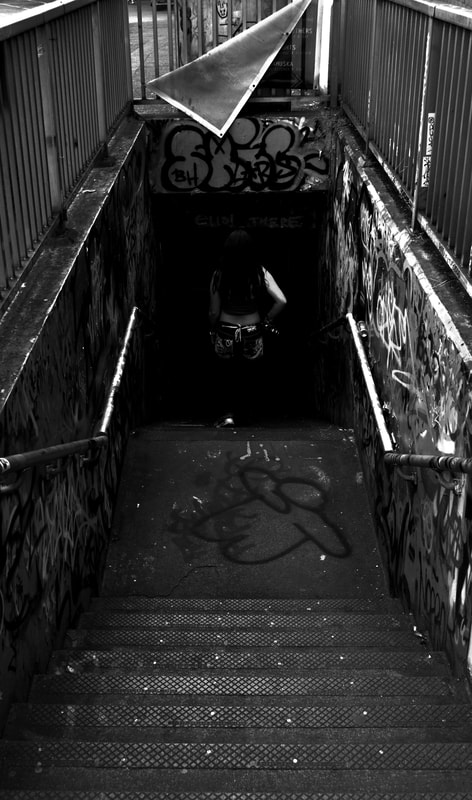
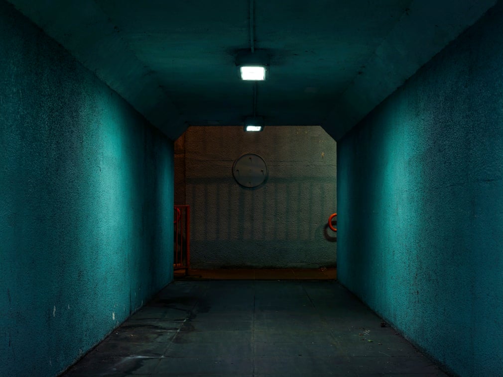
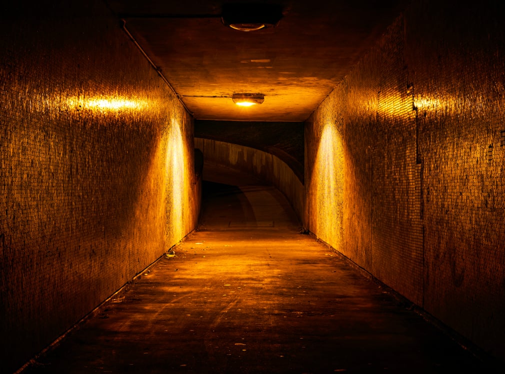
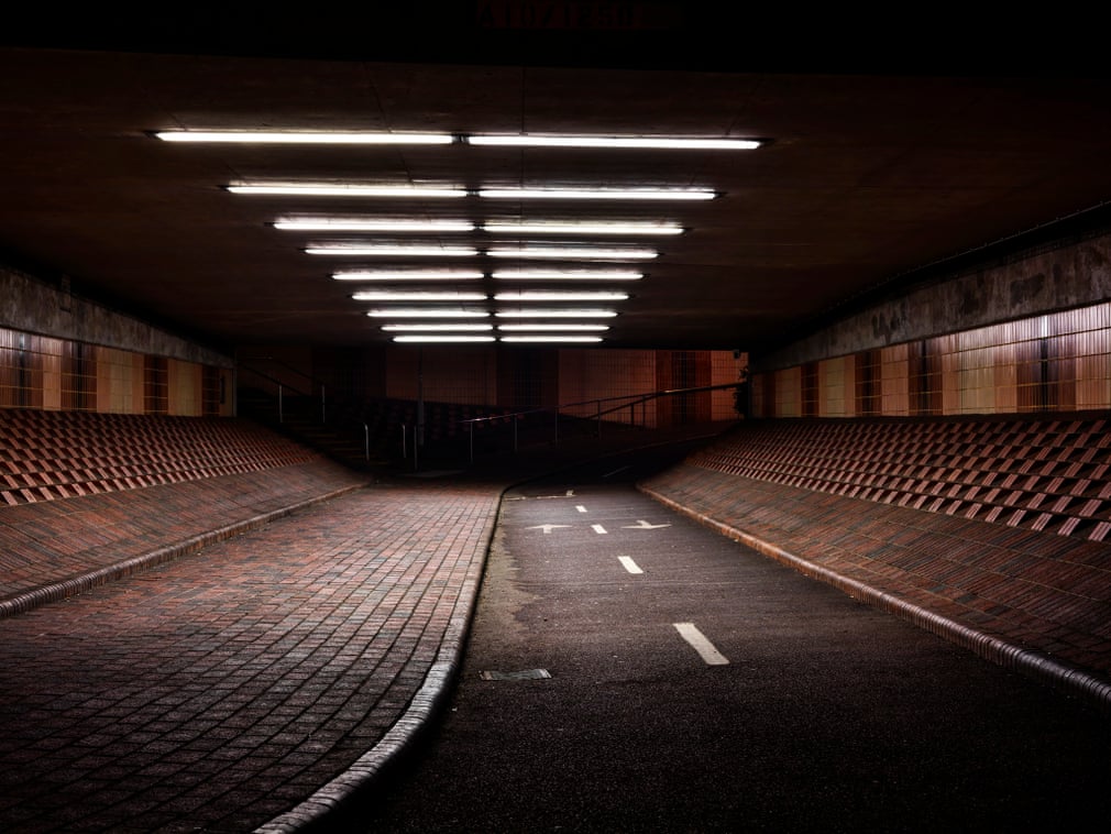
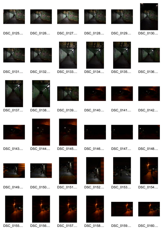
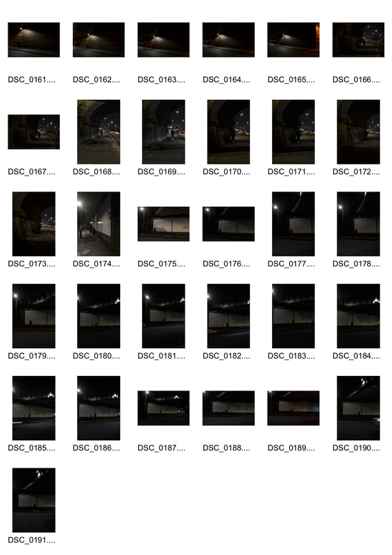
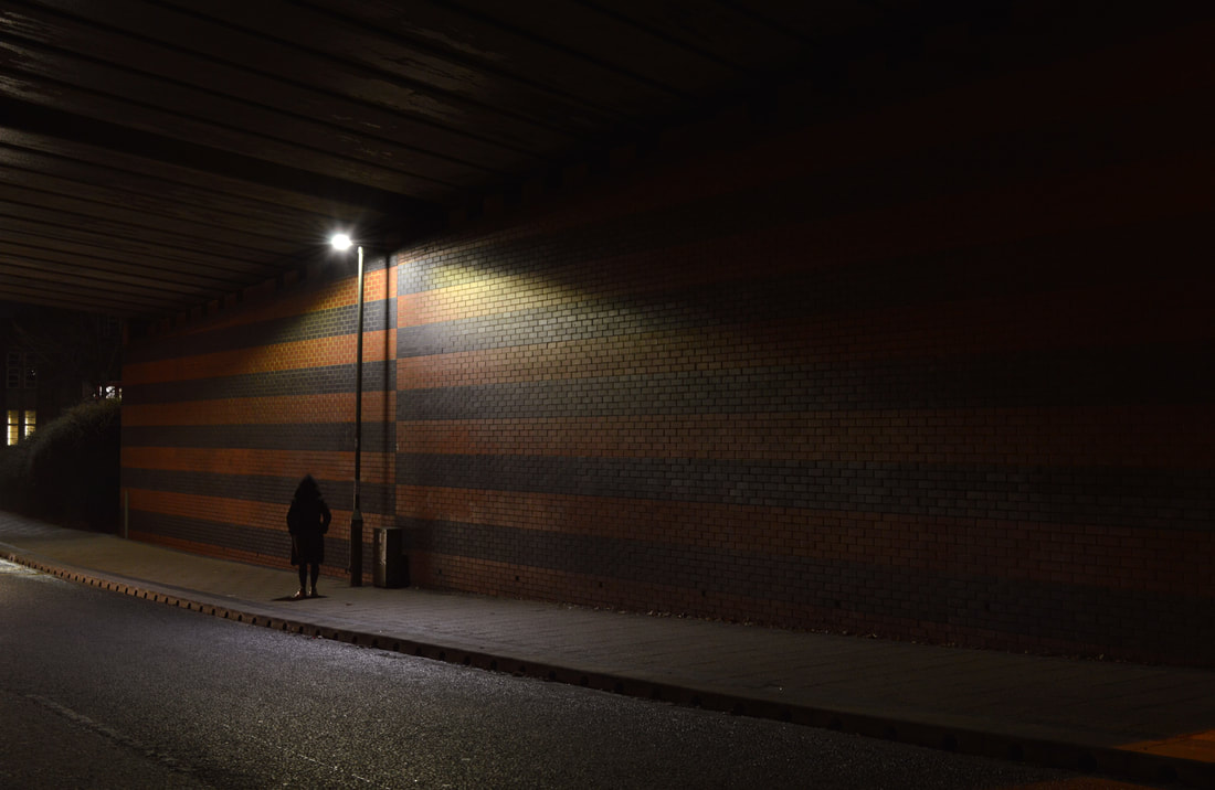
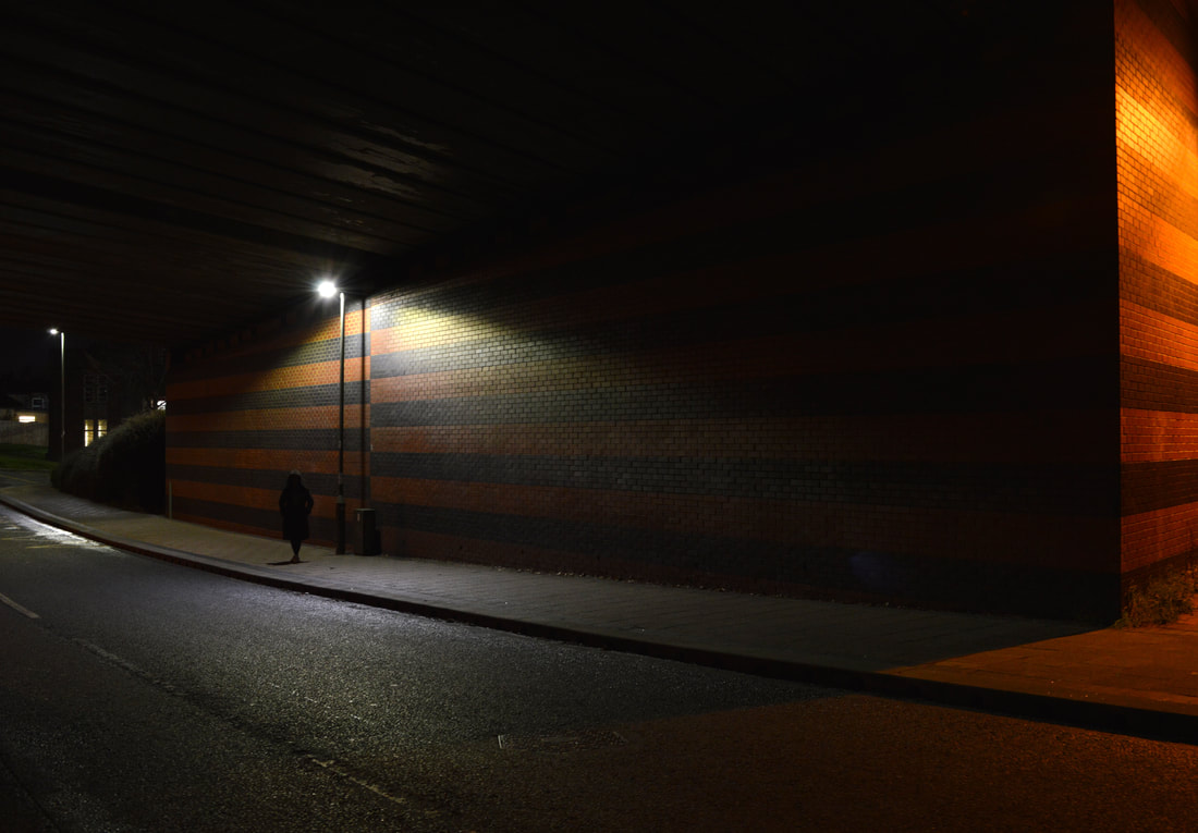
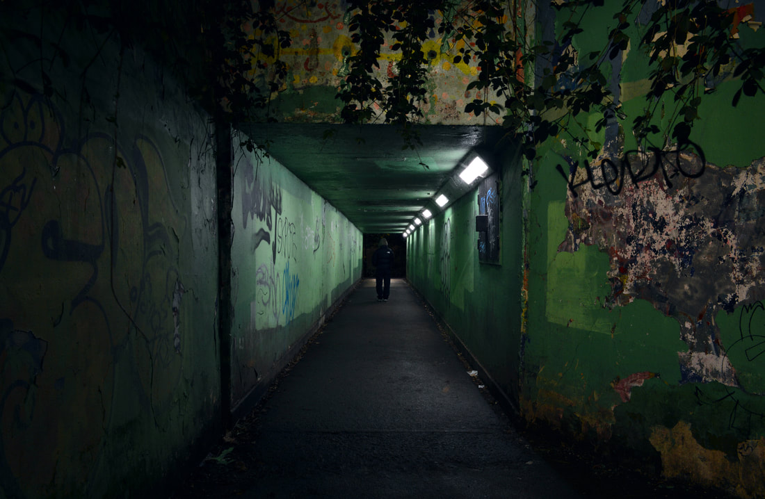
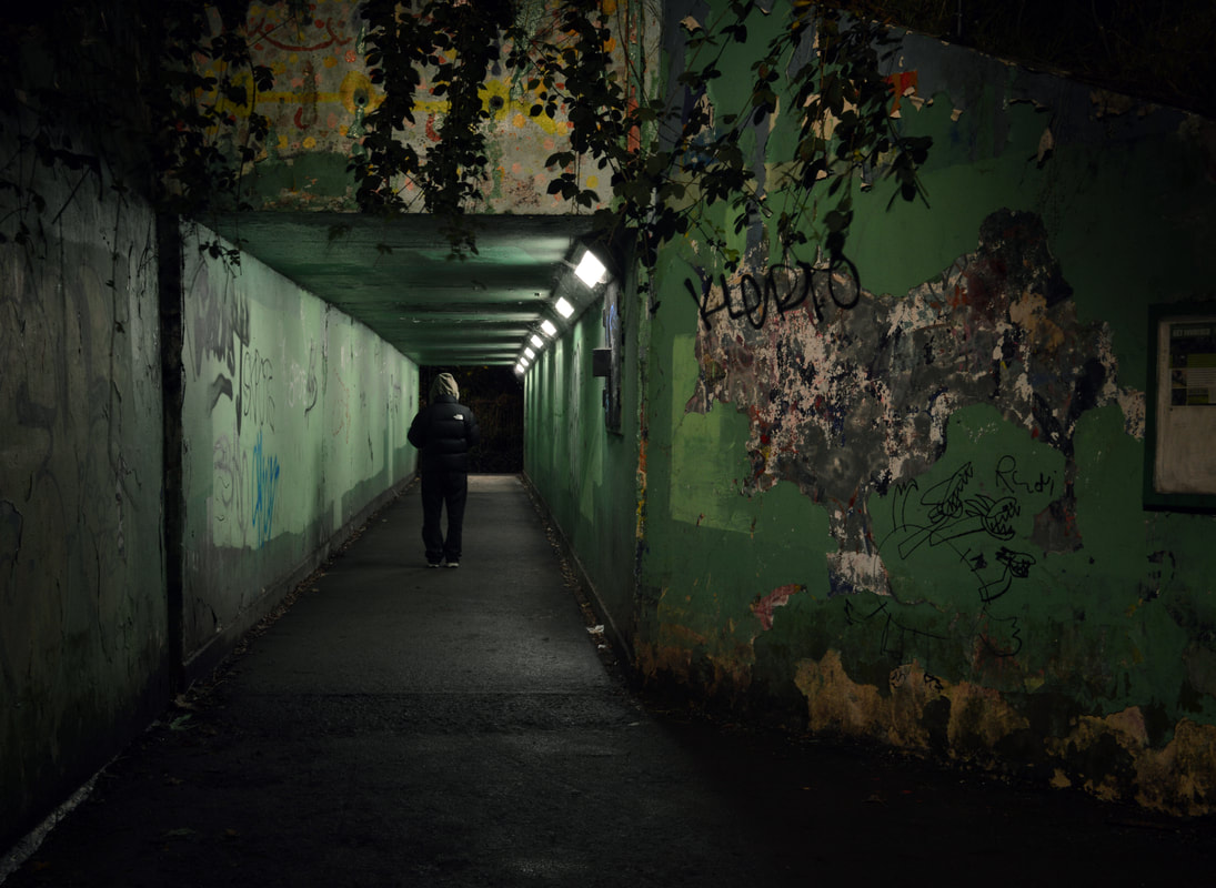
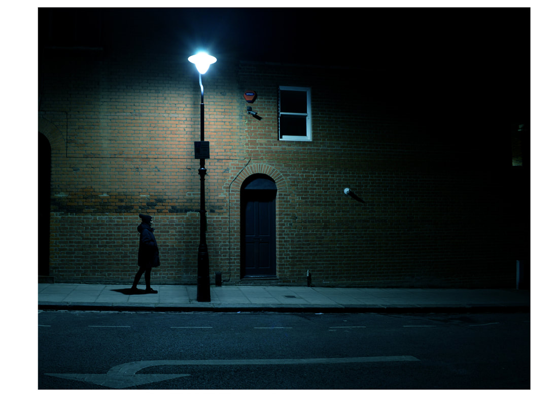
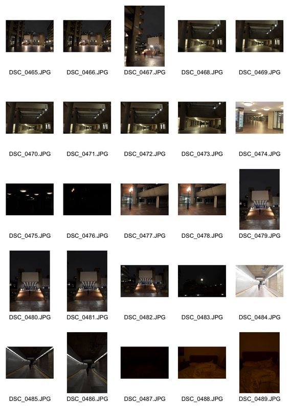
Perou:The nocturnal beauty of the urban underpass:
|
|
|
|
My response:
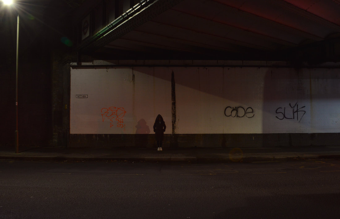
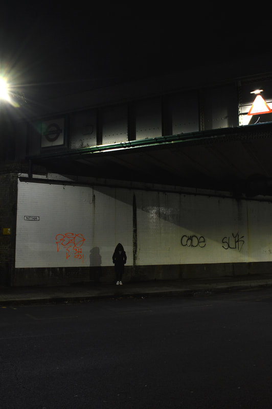
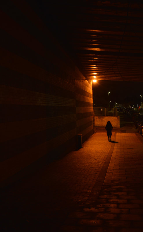
For this shoot I visited several underpasses around the area and captured a lone figure standing under them. I wanted to capture the figure lit up by the street lights however did no want to show the face of them. My inspiration was taken from Perou:The nocturnal beauty of the urban underpass where he shot grimy, deserted underpasses around England.
|
|
|
|
|
|
Development 18
c
Maria Passarotti:
|
|
|
|
My response:
|
|
|
|
|
|
Development 19
Henri Prestes:
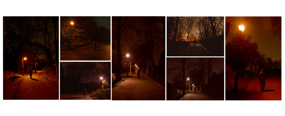
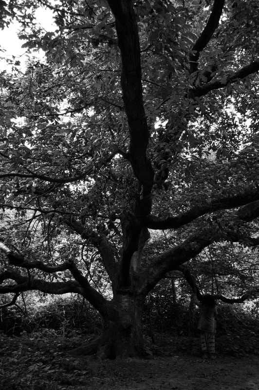
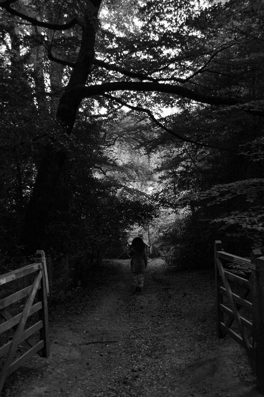
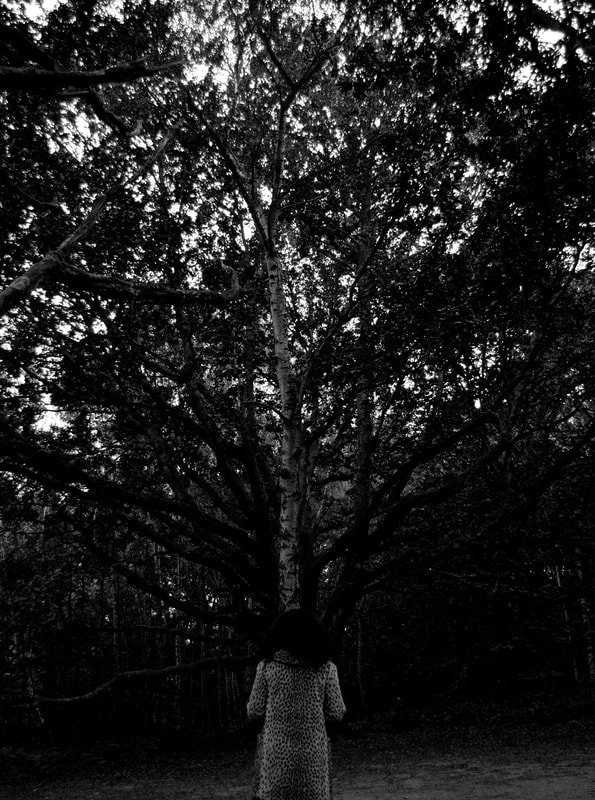
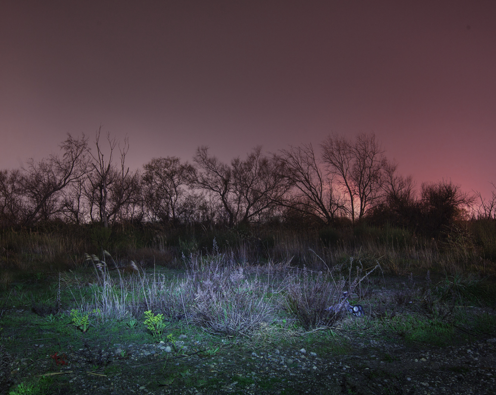
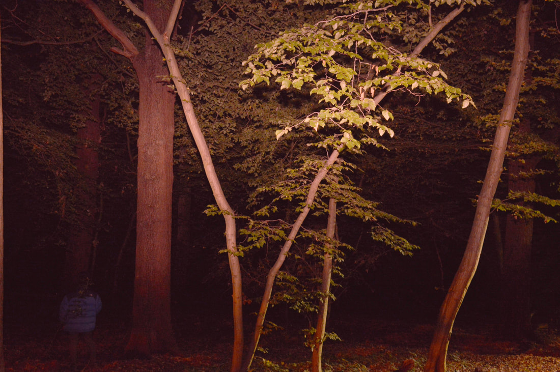
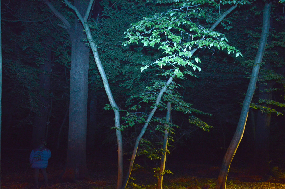
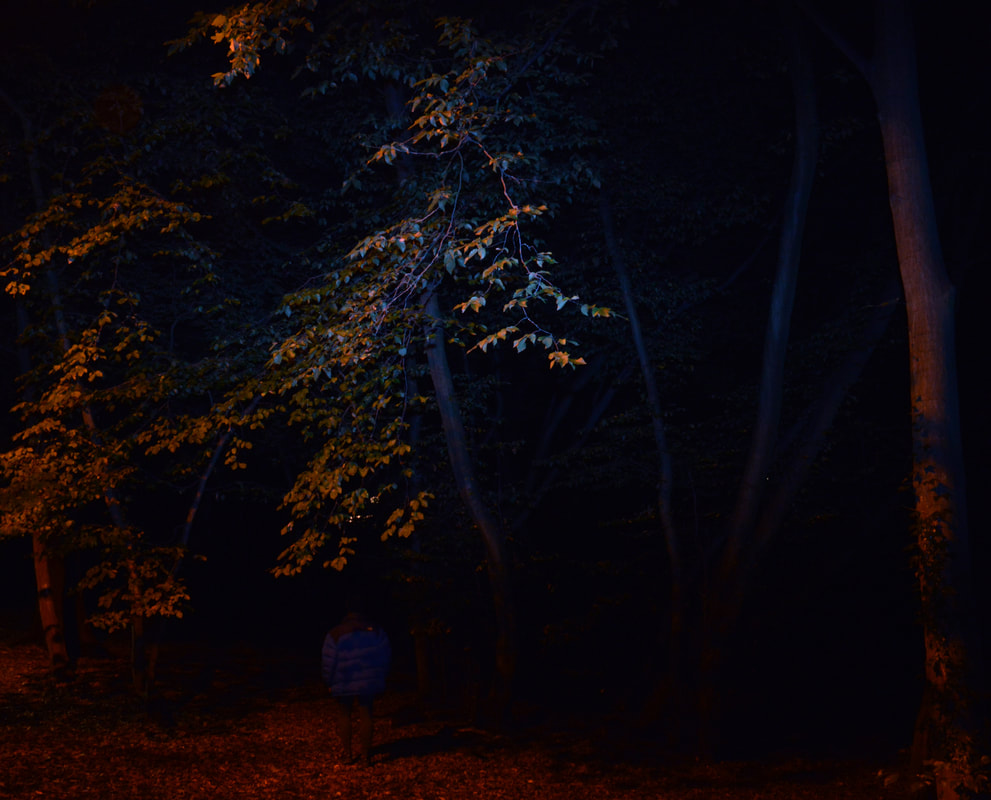
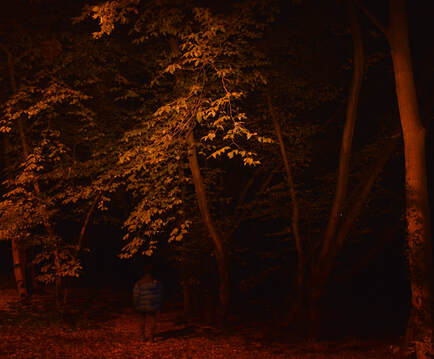
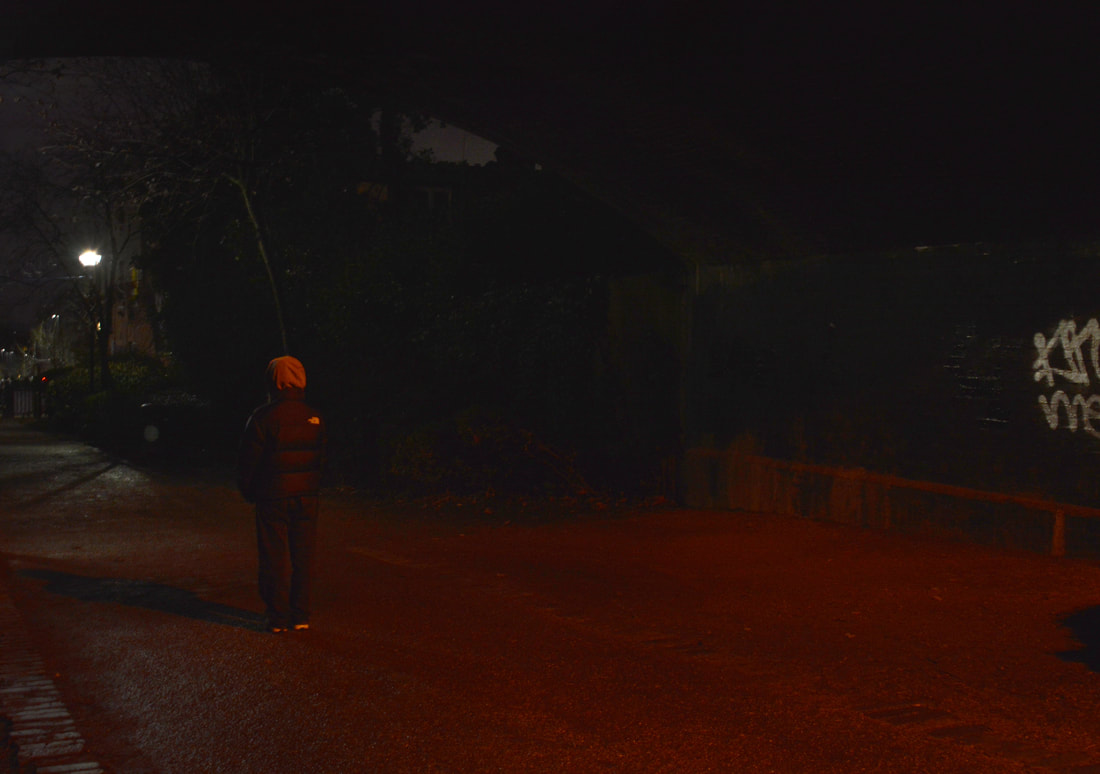
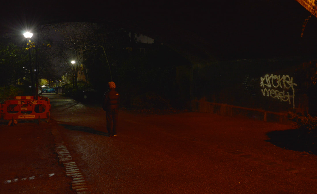
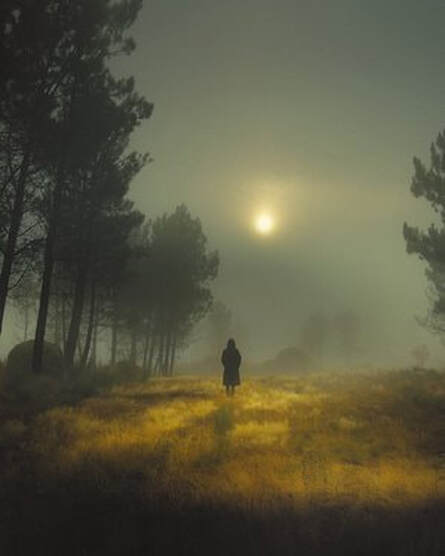
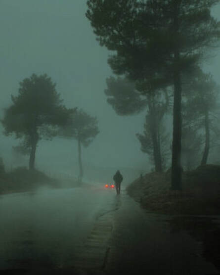
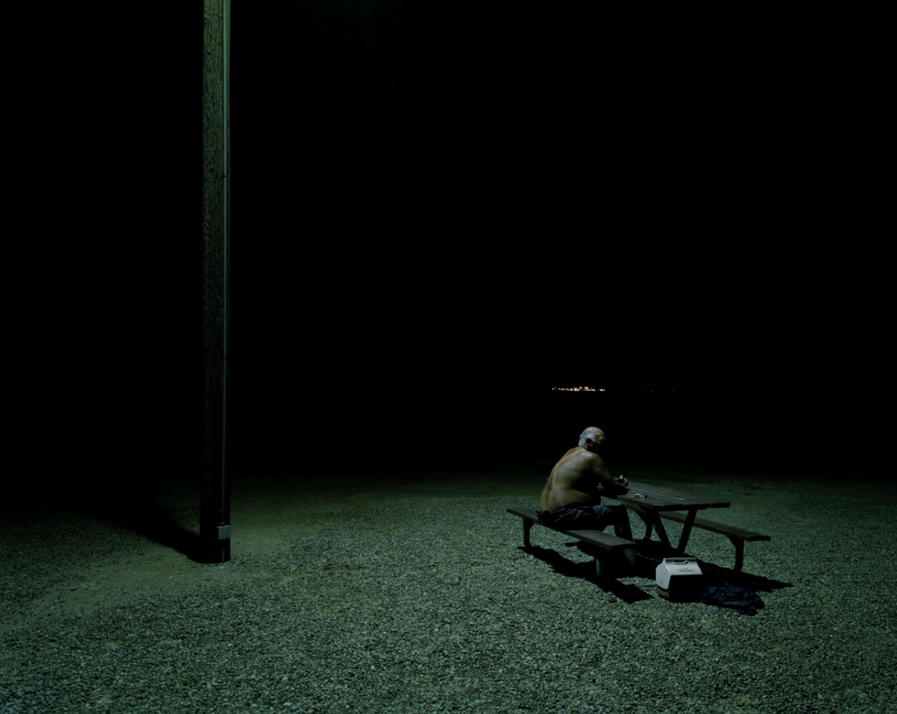
Prestes is a Portuguese fine arts photographer/cinematographer, who creates images that evoke cinematic films that evoke a strong sense of emotion and meaning. ’My photography work is mostly about exploring the cinematic and narrative possibilities of a single still frame, while also using weather conditions as a way to affect the emotional state of a photograph’. The colouring of his images set the mood creating a surreal feeling while using mostly grey/blue colours. He likes to explore secluded places at night, as it reminded him of his childhood, with the ones that most intrigue me having a lone figure within them. He wanted to go back to the villages, fields, and mountains that I remember travelling through as a kid alone with his family and wanted to depict the solitude but also the beauty that exists in these locations. This relates specifically to the velvet kingdom series “If it’s nighttime I always use long exposures, most of the time only relying on the ambient light present in the scene. As shown in prestes images he doesn't use flash at night to light up his surroundings but uses what is in front of him. I feel this makes his images much more powerful as it creates a more realistic environment, as if the camera is the viewer, walking behind this lone figure. Prestes wanted to tell a story within his photography whether it be one symbolism of him as a child and exploring in secluded environments or . Prestes was attracted to shooting in darkness and felt he wanted to create stories that elicited that. He wanted to create dark narrative moments, in order to have the viewer feel something that resonated with them when looking at these images. The sort of camera and editing he used is a Nikon d850, usually paired with a 24mm or 35mm lens and editing all his images in Lightroom and then using Photoshop for finishing touches: sharpness and slight adjustments to color. He argues that taking his images is just ‘the initial sketch’ in which he develops, manipulating the light and colours, allowing the image to reflect certain emotions intended to the viewer. Prestes didn't want to represent any specific time and place within his photographs where the shot could be anywhere, creating a more mysterious atmosphere. This adds to the already eerie climate of his images .
|
|
|
|
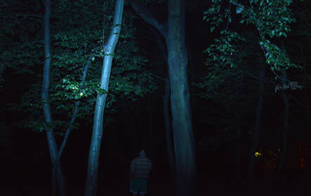
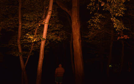
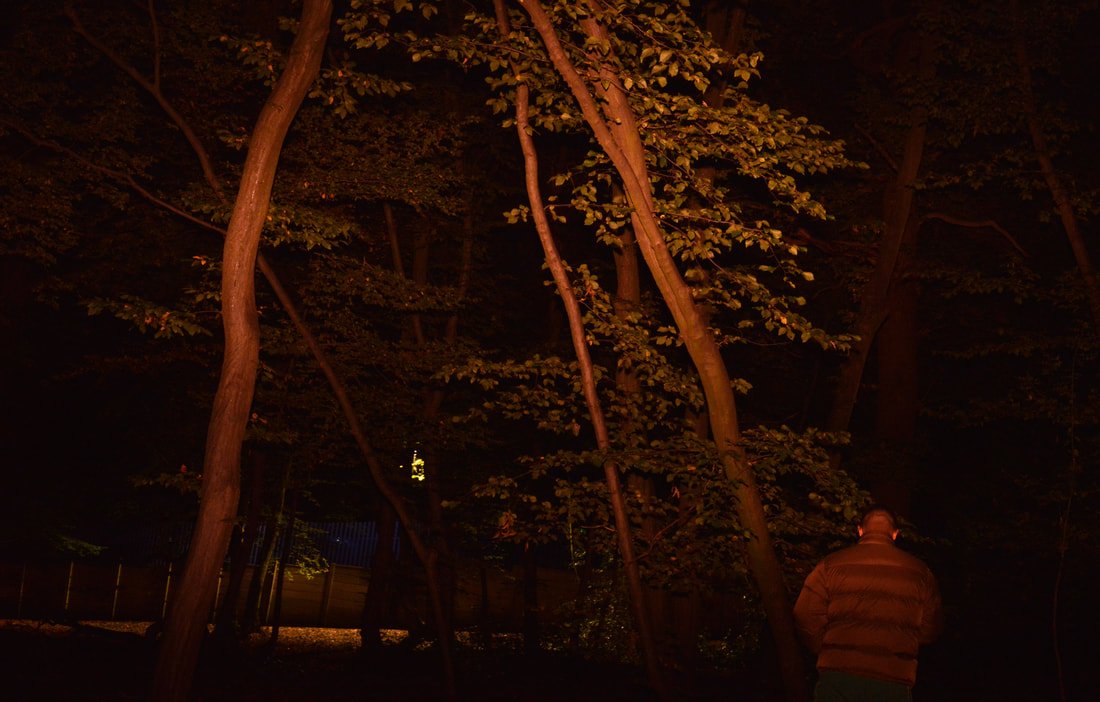
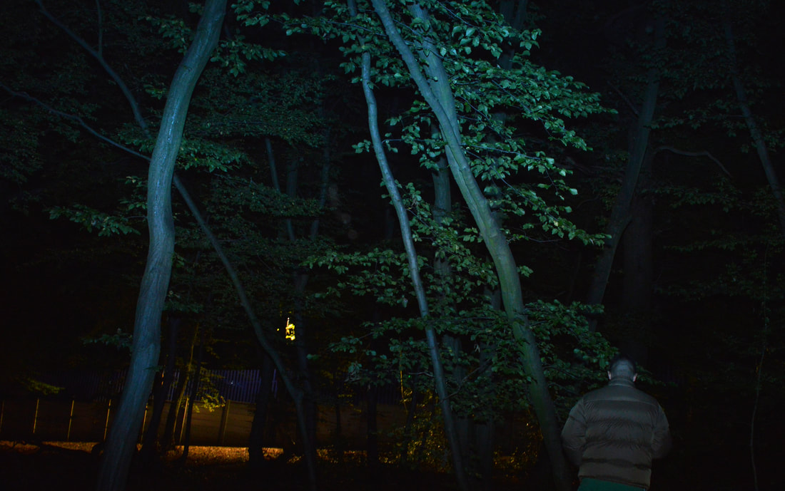
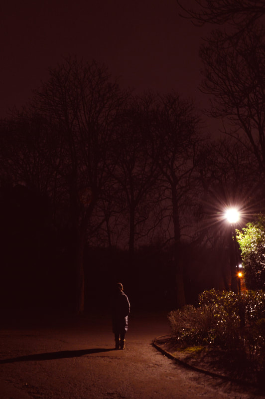
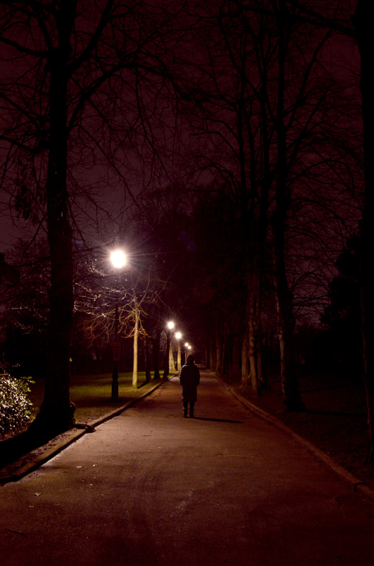
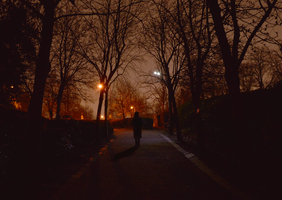
My Response:
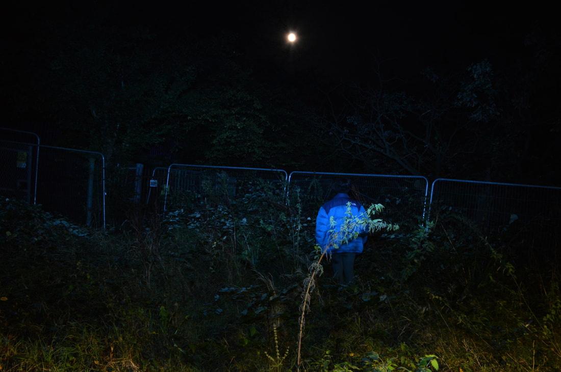
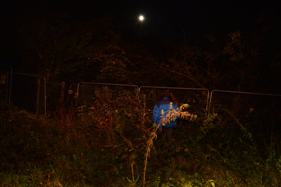
In response to Prestes I visited a nearby park. I wanted to focus on the use of lighting in order to create a certain mood. When shooting this response I used a tripod in order to get clear images. After the shoot I used photoshop to increase the brightness slightly and adjust the colouring of my images. In particular I was inspired by Prestes use of a lone figure, his subject matter, in a dark, desolate environment. I seeked out areas that were partially lit up to highlight the figure, but not enough to identify them. I feel as though the emotive quality of these images are high, they elicit feelings of loneliness and isolation, and bring the viewer to question what and why the figure is doing in this isolated environment. As well as this I focussed on the composition of my figure. The framing of my images, having the figure nearer to the bottom of the frame allows the viewer to place itself within the photo as if walking behind them in an eerie environment. I was unable to achieve the foggy/rainy environment Prestes normally looks for when shooting his work. Therefore if I were to redo this shoot I would photograph the images on a foggy day. This may have made the images more effective as giving the illusion of the unknown. I was also inspired by the way Prestes had trees towering over the lone figure which magnified the isolation, nothing but nature surrounding them. In contrast to Prestes work, my images have more of an orange tint to them. This was due to the street lamp lighting. However I feel as though the contrast between the orange and black was effective, placing even more emphasis on the figure. What led me to develop this idea from the previous is the light illuminating the figure, however I wanted to do this in a more natural environment.
|
|
|
|
|
|
Development 20
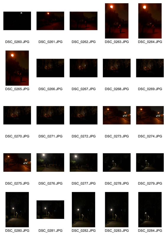
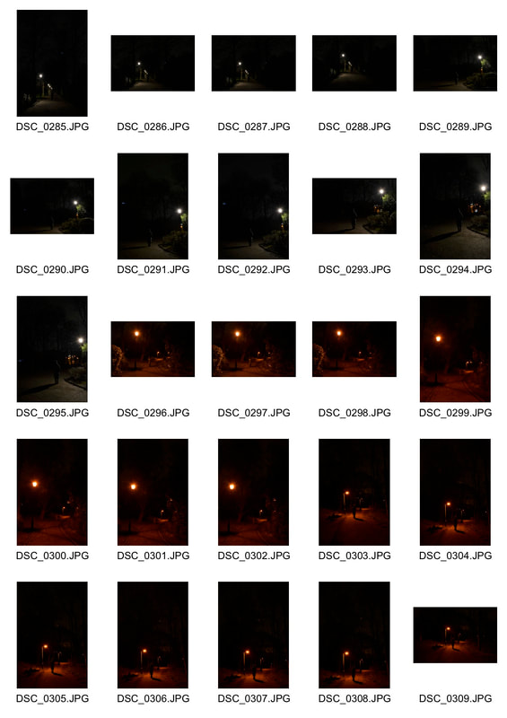
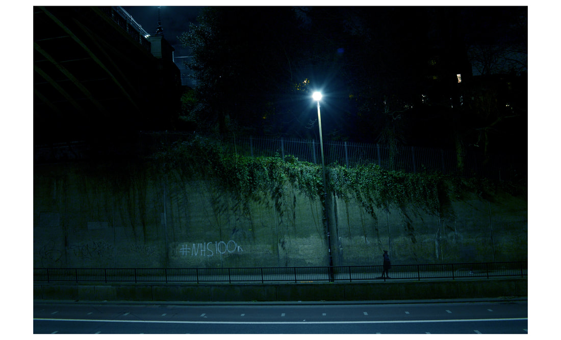
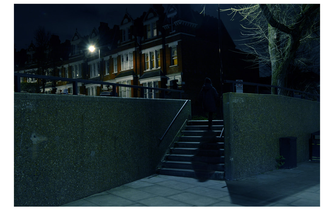
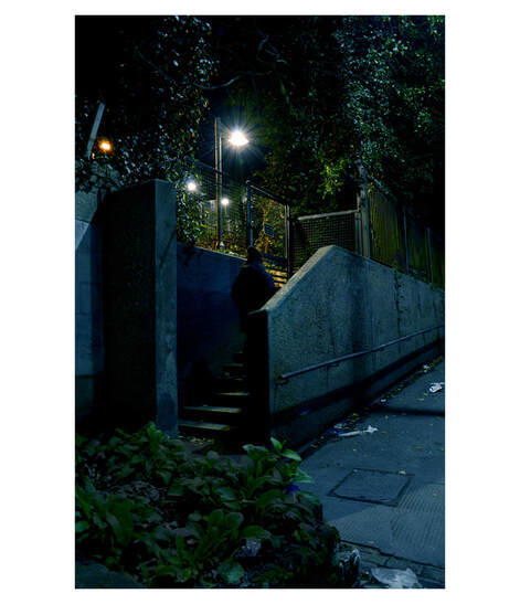
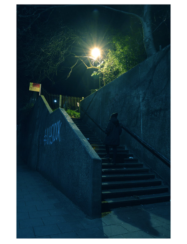
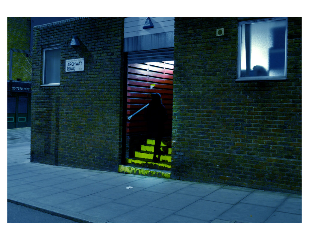
Walk around Archway at night:
For this development I
|

|
|
|
|
|
|
|
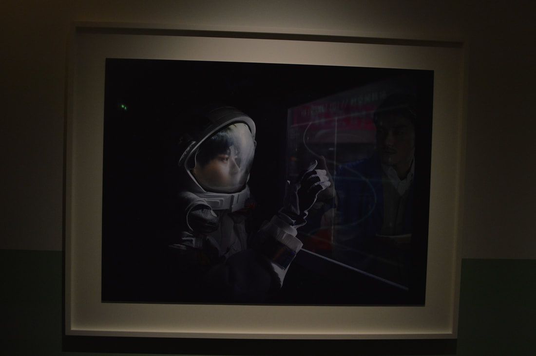
Nadav Kander:
|
|
Development 21
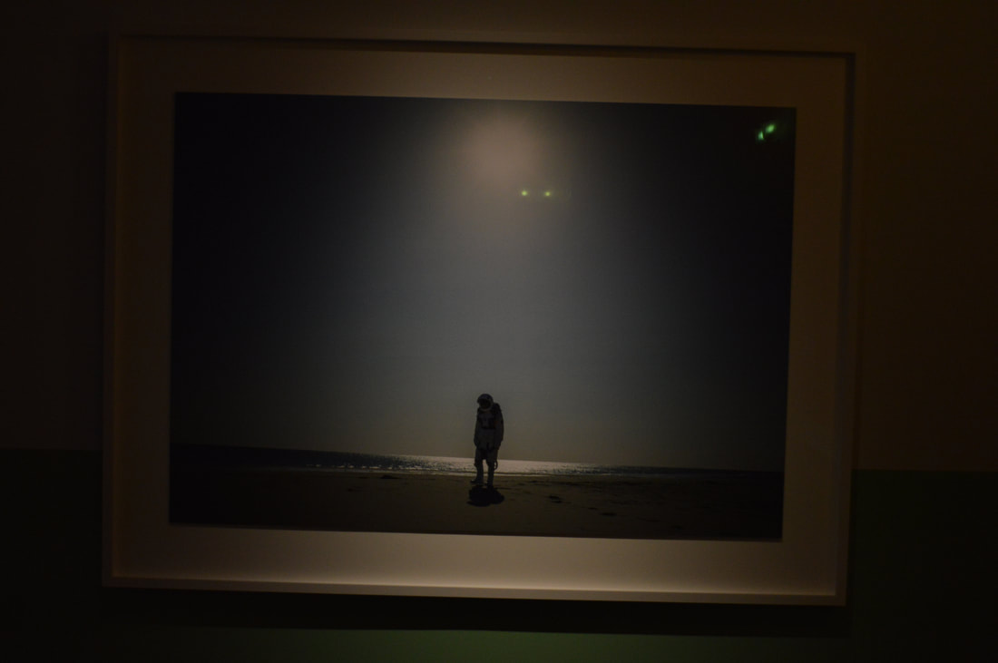
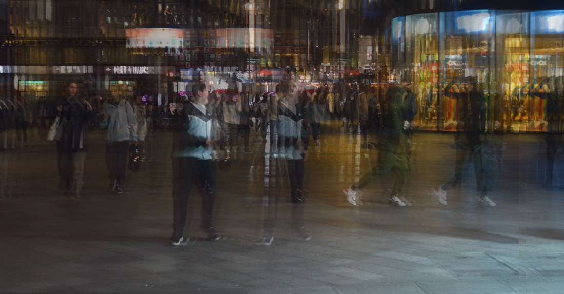
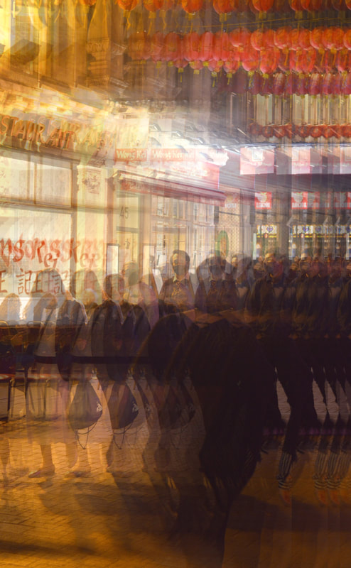
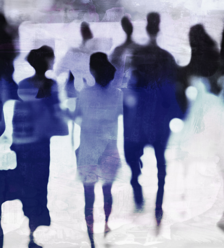
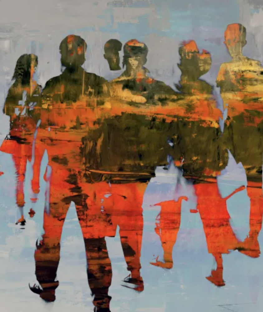
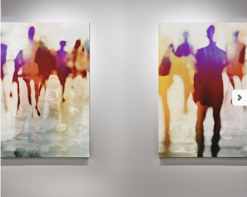
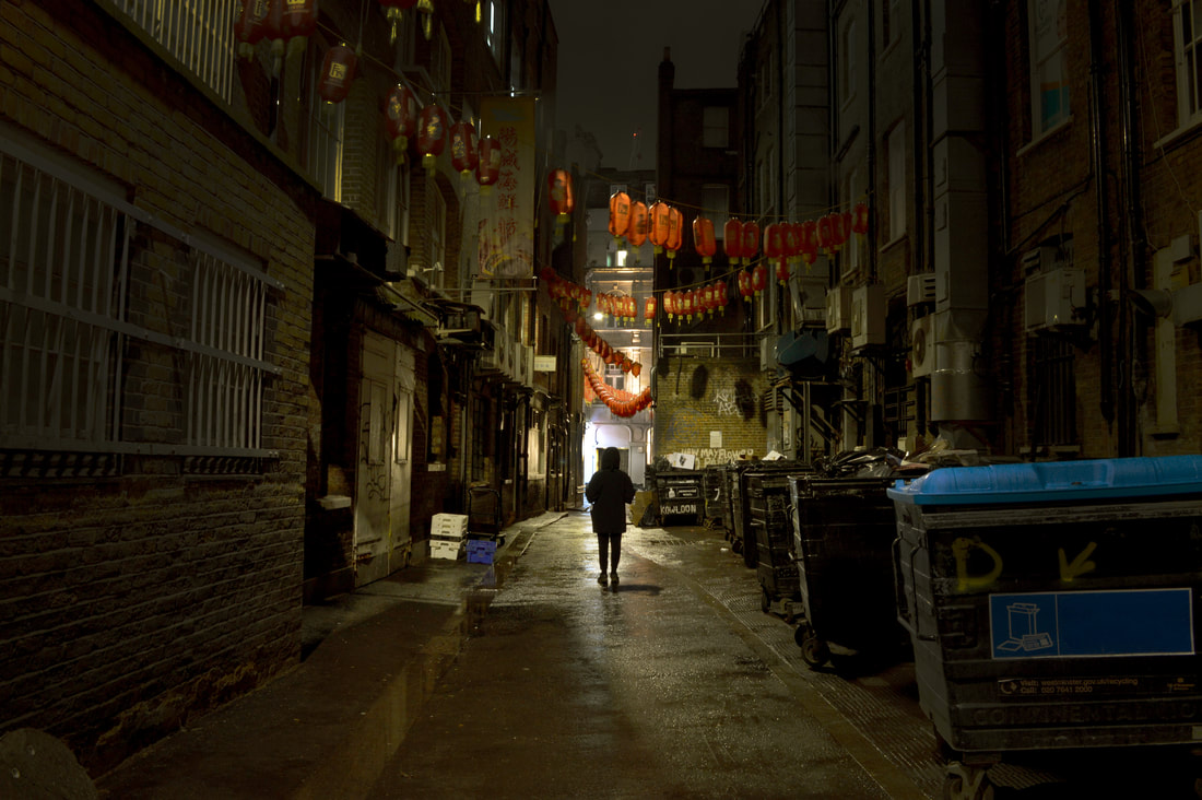
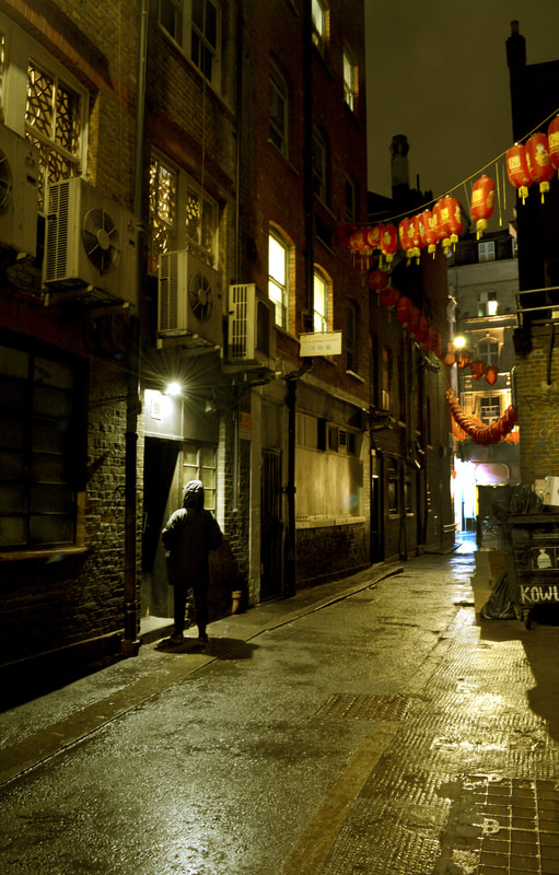
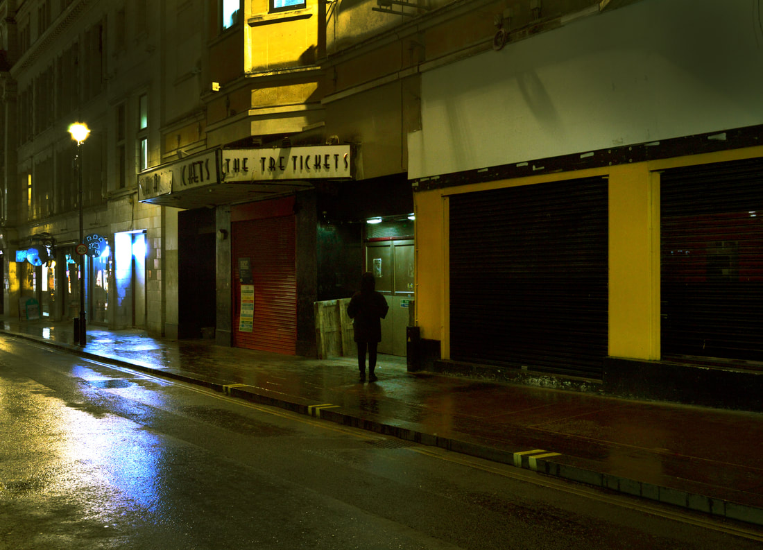
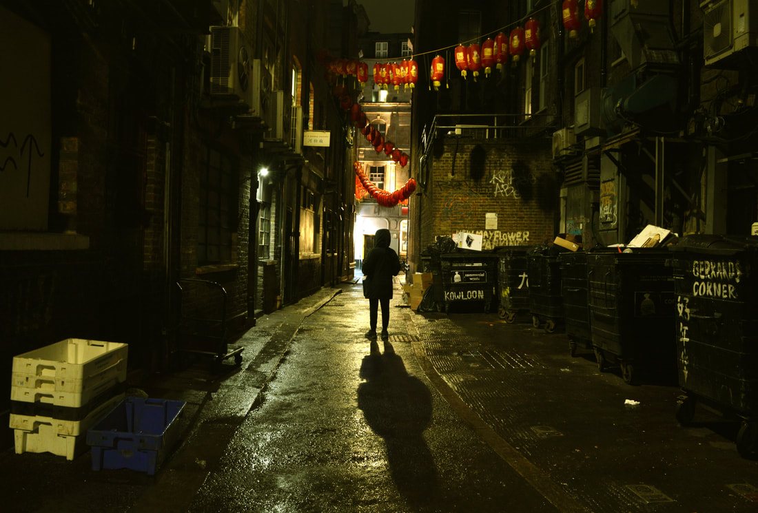
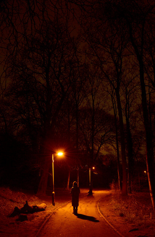
For my final piece I visited several location around London. I began to tell a narrative of an individual unable to sleep at night. They walk round the desolate streets exploring the scenes.
|
|
|
|
Final piece: